
Creating an effective pie chart starts with gathering quality data, but the real impact comes from how you present that data. In this guide, we’ll walk you through everything you need to know about making a pie chart in Google Sheets, from basic steps to advanced tips.
What is a pie chart in Google Sheets?
A pie chart in Google Sheets is a visual tool used to represent categorical data as proportional segments of a circle. It helps clearly demonstrate relationships or comparisons between different categories or groups.
Use cases for pie charts
Pie charts are ideal for:
- Displaying survey results (e.g., favorite menu items, preferred brands)
- Visualizing demographic breakdowns
- Comparing market share among competitors
- Showing budget allocations
How to make a pie chart in Google Sheets (Step-by-Step)
Here’s how to make a pie chart in Google Sheets:
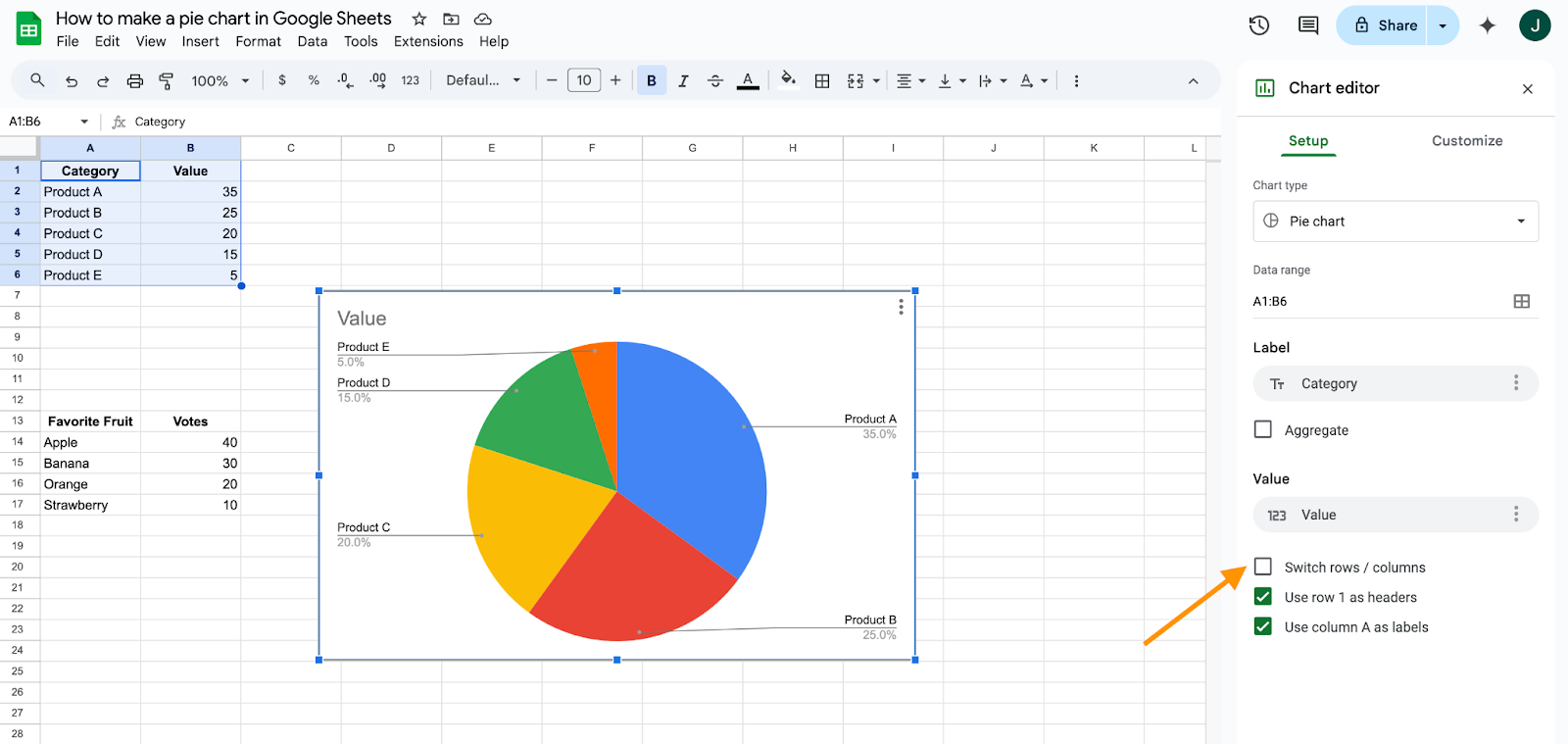
Step 1: Prepare your data
- Use two columns: one for categories (e.g., Product A, Product B) and one for values (e.g., number of sales).
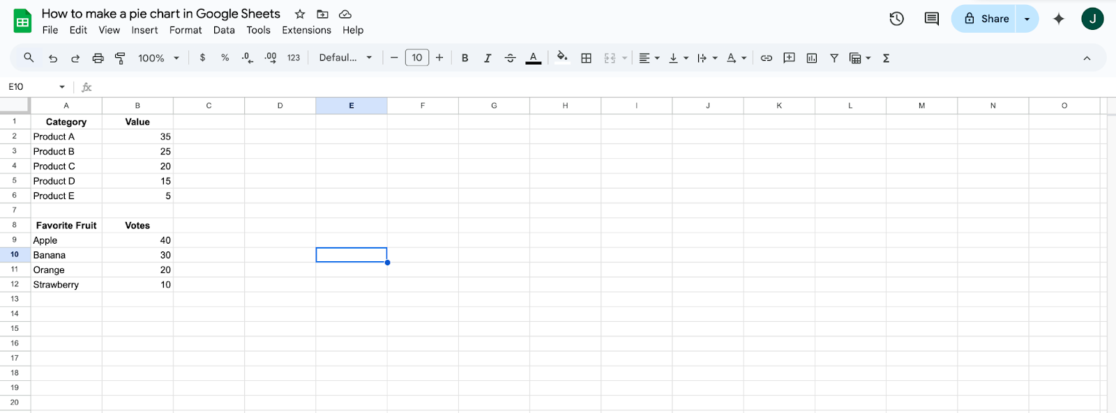
- Ensure there are no blank cells in your data range.
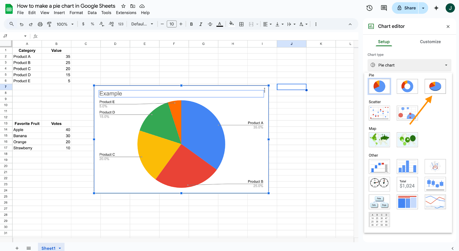
Step 2: Insert the pie chart
- Highlight your data.
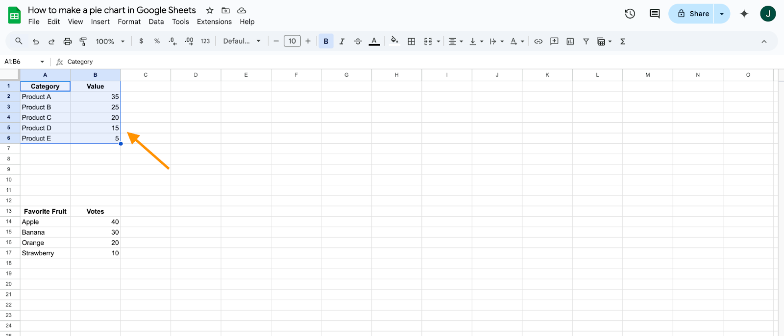
- Go to the top menu and click Insert > Chart.
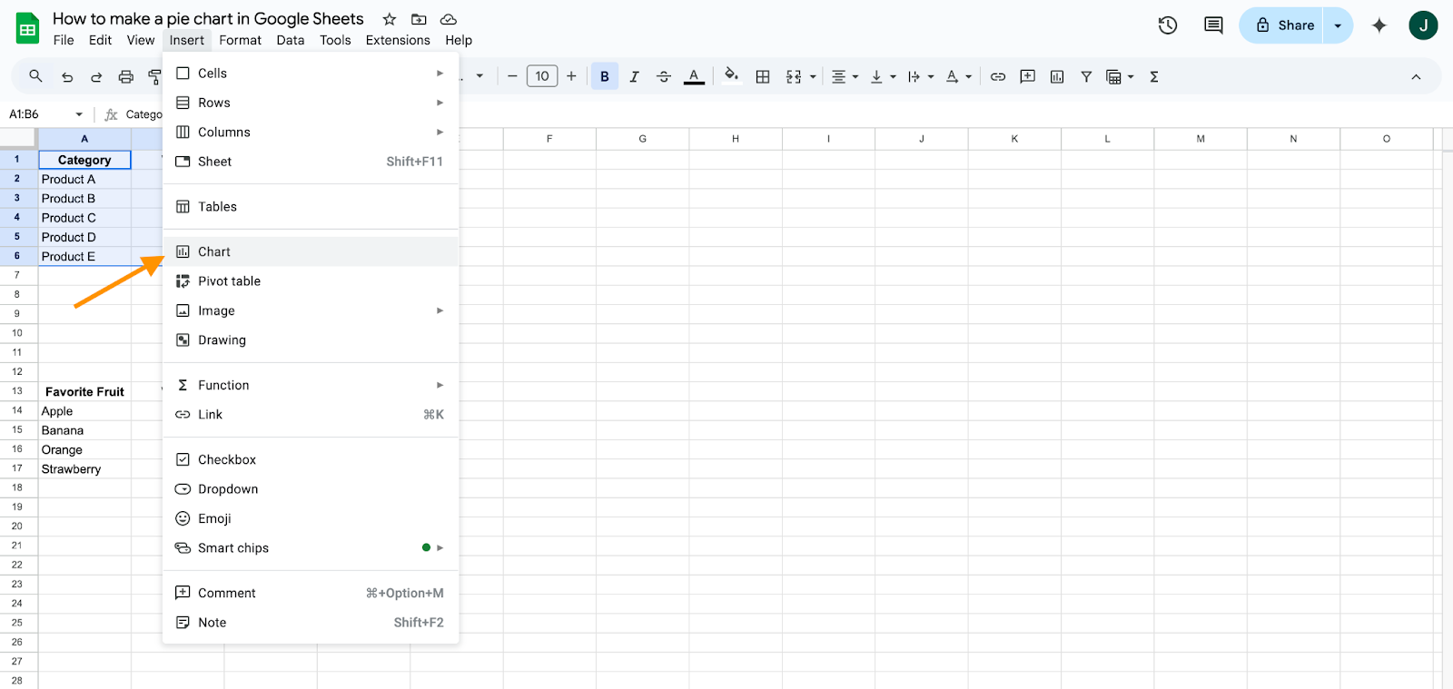
- In the Chart Editor panel that appears on the right, change the Chart Type to Pie Chart.
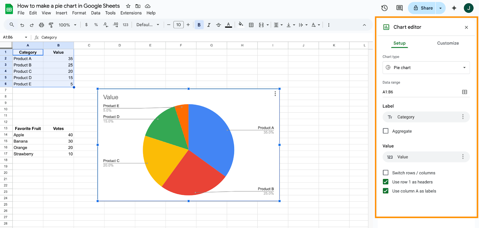
Step 3: Verify and adjust data range
- Ensure the correct range is selected in the Data range field.
- Use the “Switch rows/columns” toggle if your data isn’t displaying correctly.
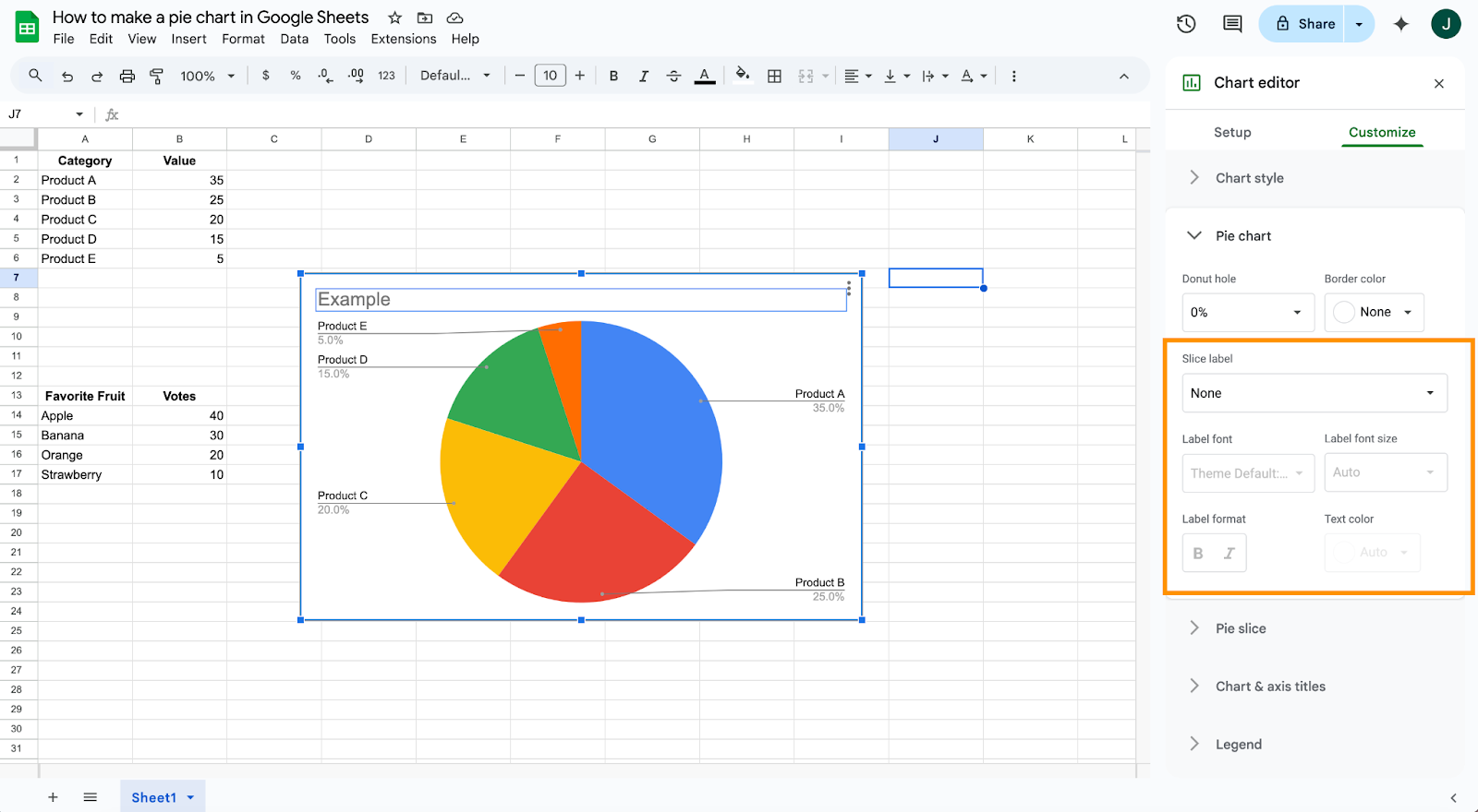
How to customize a pie chart in Google Sheets
Google Sheets allows you to customize your pie chart to enhance readability and visual appeal:
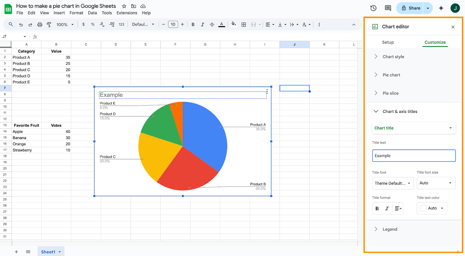
1. Title and labels
- Double-click the chart title to rename it.
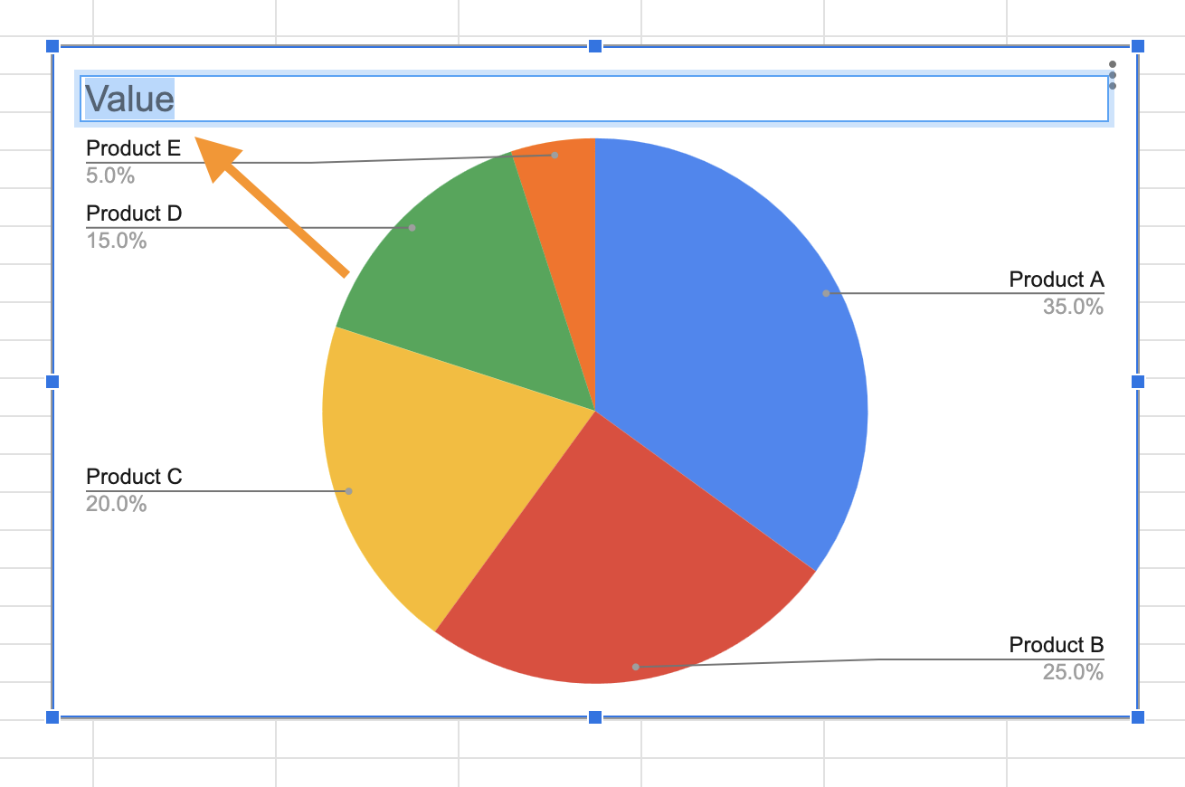
- Click the three-dot menu > Edit chart > Customize tab > Chart & axis titles.
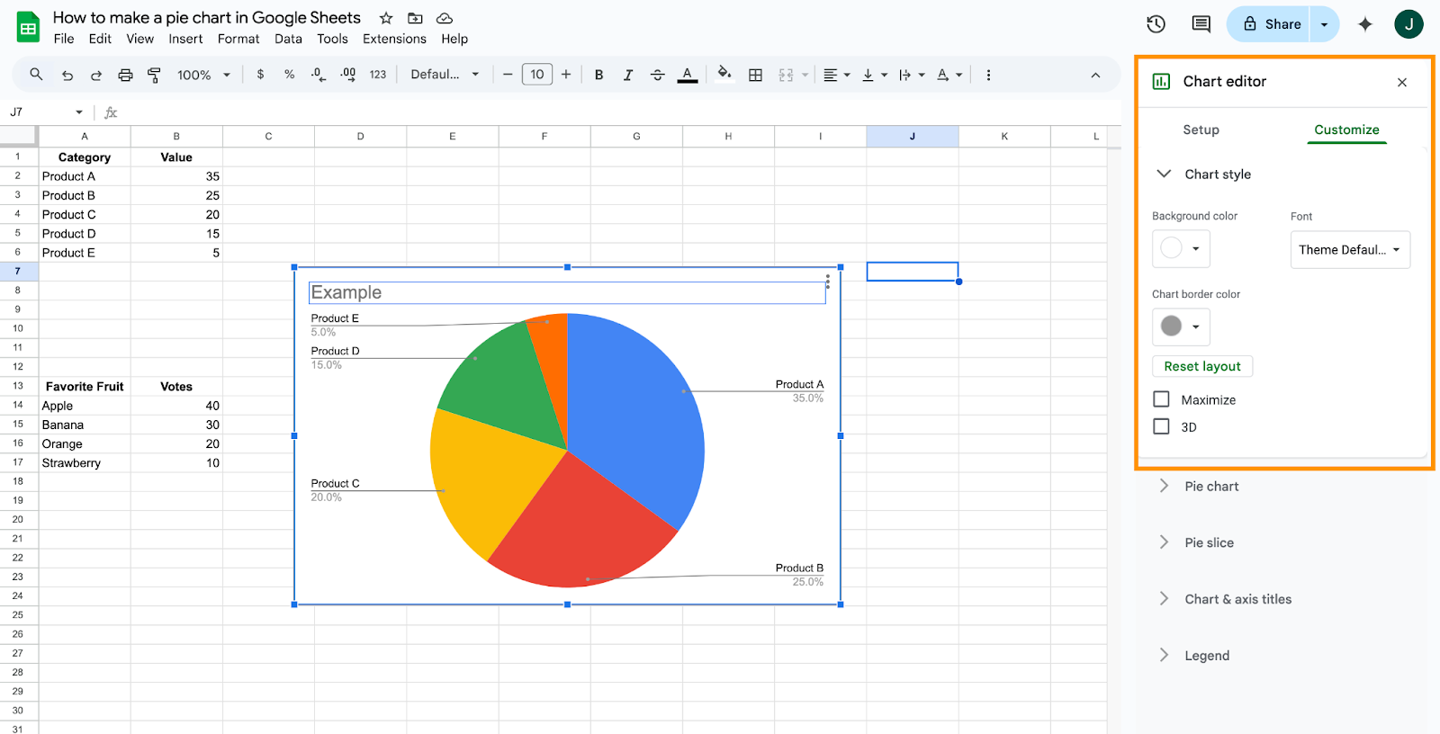
2. Font and style
- In the Customize tab, go to Chart style to change background color, border color, and font style.
3. Slice colors and labels
- Under Pie slice, choose colors for individual slices.
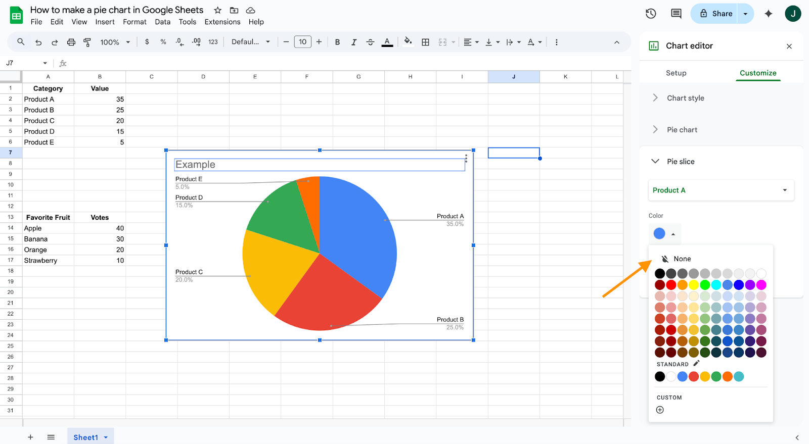
- Enable Slice label to show values, percentages, or both.
4. Legend settings
- Navigate to Legend to change position, font, size, and format.

How to create a pie chart with data from multiple sheets
If your data is in different sheets, use the IMPORTRANGE or ={Sheet1!A1:B5} formula to bring data into a single sheet first:
Step-by-step:
- In a new sheet, use formulas to pull your data together.
- Format this consolidated data into two columns (labels and values).
- Follow the standard steps to insert a pie chart.
What are the limitations of creating pie charts in Google Sheets?
Google Sheets pie charts have certain limitations, including:
- Limited design options: No animation or advanced formatting compared to tools like Jotform Report Builder.
- Not ideal for complex data: Pie charts aren’t great for datasets with many small segments.
- Static interaction: Pie charts are not as interactive as those in dedicated dashboard tools.
- Lack of drill-down: You can’t click slices to explore deeper layers of data.
Other things to know when creating pie charts in Google Sheets
How to make a pie chart with percentages
- Use percentage values in your data or select “Percentage” from the customize tab to display values as percentages.
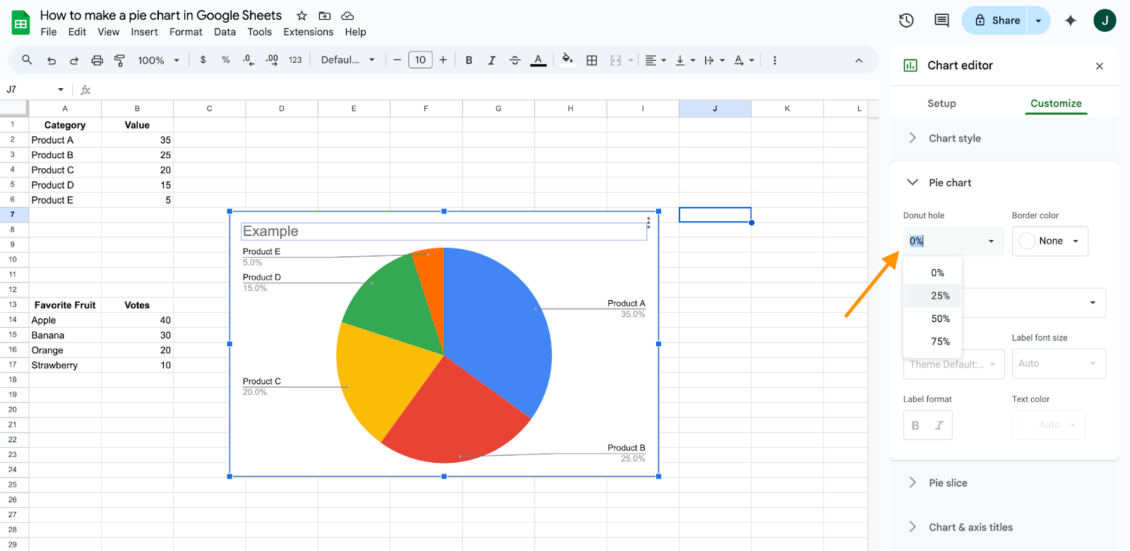
How to make a 3D pie chart
- In chart settings, choose 3D Pie chart from the chart type options.
How to label a pie chart
- Go to the customize tab under “Edit chart,” click Pie chart, then select appropriate labeling options (e.g., value, percentage, label).
How to rotate a pie chart
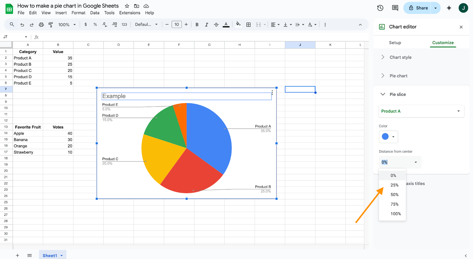
- In customization, under “Pie slice,” adjust the angle to rotate your chart for better emphasis.

How to add a title to a pie chart
- Click your chart, select “Customize,” go to “Chart & axis titles,” and enter your desired title.

How to add more slices
- Simply add additional rows of data in your Google Sheet, ensuring the data range includes the new entries.
Consider alternatives
Maybe you’ve built your Google Sheets pie chart and feel like something’s missing. If that’s the case, consider Jotform’s Report Builder and its pie chart capabilities. The Report Builder is designed to shape itself around your data presentation needs, creating visual reports in a matter of seconds.
You can design easy-to-read pie charts straight from data you’ve gathered using one of your Jotform forms and take advantage of the same customization options Google Sheets offers.
Even better, the Jotform Report Builder can display two charts on the same page if you have a lot of data to display. You’ll also be able to share your chart with anyone who needs access to it.
Put the pieces of the pie together
A pie chart is a versatile and effective method for displaying many different types of data. And knowing how to make a pie chart in Google Sheets — or in Jotform’s built-in report-building software — is a skill worth having.
Data is only as good as the methods used to gather and analyze it. So make sure that you collect data efficiently and know how to present it effectively to your next big client.


Send Comment: