Like almost everything else in graphic and web design, fonts are frequently exposed to trends. The number of fonts grows constantly – including Google Fonts – so finding something new is always easy. The following fonts and font combinations are the ones you should try in one of your next projects in 2025.
Big Headings With Serifs
Depending on the zeitgeist and the technological development, some fonts are bigger and some are smaller. In terms of headings, especially large headings have been trending for a while now. Instead of plain sans serif fonts like “Helvetica”, serif fonts are becoming more and more popular, as they provide more elegance and sleekness for the design.
Thus, the “Playfair Display” is a great pick for this kind of headings. Especially the bold italics give your oversized headings a special flair. In contrast to that, there’s the “Raleway“. It’s a sans serif font, but it’s much more customized and concise than other sans serifs.
Massive, Sans Serif, Yet Playful
However, massive sans-serif fonts will also dominate the web design of 2018. To increase the massiveness even further, headings are often written in all caps. A good example for that is the “Rubik Mono One“, which is only available as an upper case font as it is.
The brute feeling of this very bold font is relieved by the slightly rounded edges. These fonts are also great to add gradients or background graphics.
For the running text, a good complementary font would be another sans serif one, like the classic “Open Sans”.
An alternative to “Rubik Mono One” is the “Anton“, which seems to be even more massive due to its slim tracking and thick line width. It can be loosened a bit by adding a background graphic. As the font leaves little white space, detailed images can also work as the background, instead of a font color.
Sans Serif With a Handwritten Flair
Handicraft is trending as it is. This is shown by the “Craft” movement, which started out with “Craft” beer, but has now expanded to different products. In terms of typography, fonts with a handwritten flair to them are on the rise as well.
The “Titan One“, for example, is a sans serif font with a handwritten touch, due to its curves and different stroke widths, making it a good choice for craft products.
For those that want to go even further into the handwriting style, I recommend the “Pacifico“, which is an actual handwritten font. Due to the somewhat thick stroke width, it is more suitable for headings.
Once again, the “Open Sans” compliments both the “Titan One” and the “Pacifico”, making it a good additional font for the running texts.
The “Amaranth” looks like a handwritten font as well and can be read in all four classic versions. Thus, it’s suitable for running texts as well.
Solid Sans Serif Fonts Beyond “Open Sans”
It doesn’t always have to be fancy, big, and spectacular. Sometimes, a modest sans serif font is just what you’re looking for. You’re not forced to fall back to classics like “Arial”, “Helvetica”, or newer, but not trendy “Roboto” and “Open Sans”, either.
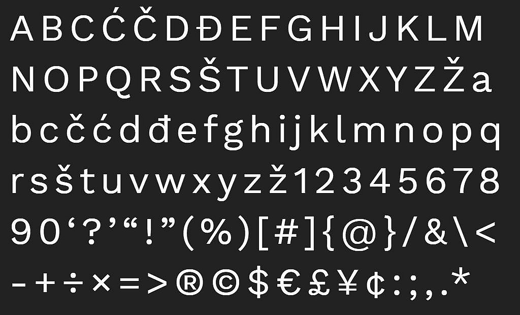
The “Work Sans” ranging from “Thin” to “Black”, is impressively simple, yet fresh and modern. The font is very easy to read and looks great in both very small and very large font sizes.
The “Nunito” is another well-elaborated font, which covers everything from “Thin” to “Black” in 14 different versions. The rounded edges give the font a slick look. It’s easy to read as well. In order for the rounded edges to stand out, it can also be used as a heading.
As a Tribute to Popular Styles: Classicism and Art Déco
People like to quote and reinterpret popular things. The same goes for fonts.
If you like something classicistic, you’ll enjoy the “Vidaloka“. This font is reminiscent of the “Bodoni”, a classic font from the 19th century. However, the “Vidaloka” is less stiff but has the contrasting stroke width that the fonts of that time are known for.
The “Vidaloka” harmonizes well with the sans serif font “Lato”.
The “Poiret One” looks similar to the art déco style, with its subtle lines, the curves, and the slightly tilted horizontals, giving off a playful and elegant vibe at the same time.
Conclusion
There is no lack of variety in new fonts – but finding the right font is not always easy – and I’m sure this year will bring us many interesting websites with fonts in the foreground which will be both dominant and playful. They will be joined by many universal fonts for daily use, suitable for almost any purpose.
Photo by Markus Spiske on Unsplash


Send Comment:
1 Comment:
More than a year ago
Very interesting and understandable blog, really helpful. I would like to share this on my network. Keep updating.
Thanks and regards