The Configurable List widget is responsive by default on all display sizes. It is configured to automatically display the elements on a desktop browser side by side or vertically on mobile devices. Its Custom CSS setting is still present, and you can use it to change its layout. For example, you may want to display the input elements vertically on a desktop or adjust the number of columns.
Below is the list of customizations you can do with the Configurable List Widget.
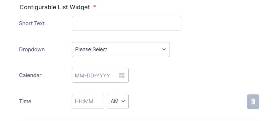
Vertical Layout
To change the layout of the elements from a column format to a vertical one, you would need to inject the following custom CSS codes.
@media (min-width: 600px) {
#listContainer .configurable-list-field-label {
min-width: calc(150px - 8px);
}
.configurable-list-field-row {
-webkit-flex-direction: column;
-ms-flex-direction: column;
flex-direction: column;
align-items: flex-start !important;
}
.configurable-list-field-wrapper {
flex-direction: row !important;
}
#listContainer
div.configurable-list-field-row-wrapper:not(:first-child)
span.configurable-list-field-label {
display: unset !important;
}
}
The custom CSS codes have a desktop-only query to keep its responsive styling on mobile devices. Here’s the result of that:
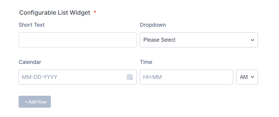
Column Layout
You can adjust the layout from fluid to fixed columns — for example, two columns by using the following custom CSS codes.
@media (min-width: 600px) {
.configurable-list-field-wrapper {
min-width: calc(50% - 8px);
}
}
Adjust the 50% width to create a Three or Four column layout of the elements. Below is an example of a two-column layout:
Note:
The above styles conform with the classic default theme. If you notice a problem after applying the custom CSS codes and are hesitant to switch to the default, kindly contact us for assistance.
Send Comment: