A modal window is a design element that can temporarily disable interaction with the rest of your form until the user addresses the content within the modal. You can use it to show important messages, confirmations, or information to your form fillers.

To create a modal window
- In the Form Builder, add a Paragraph element to your form.
- In the Paragraph’s editor, select Source Code (“>_”) at the top.
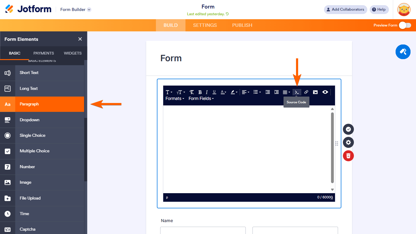
- Paste the following HTML code into the Source code editor. Edit the highlighted texts to your liking:
<p><a class="button" href="#openModal" rel="nofollow">Click Here!</a></p>
<div id="openModal" class="modalBox">
<div>
<p><a class="close" title="Close" href="#closeModal" rel="nofollow">X</a></p>
<h2>Hey there!</h2>
<p>Here's a modal window.</p>
<p>You can customize this with your own message.</p>
</div>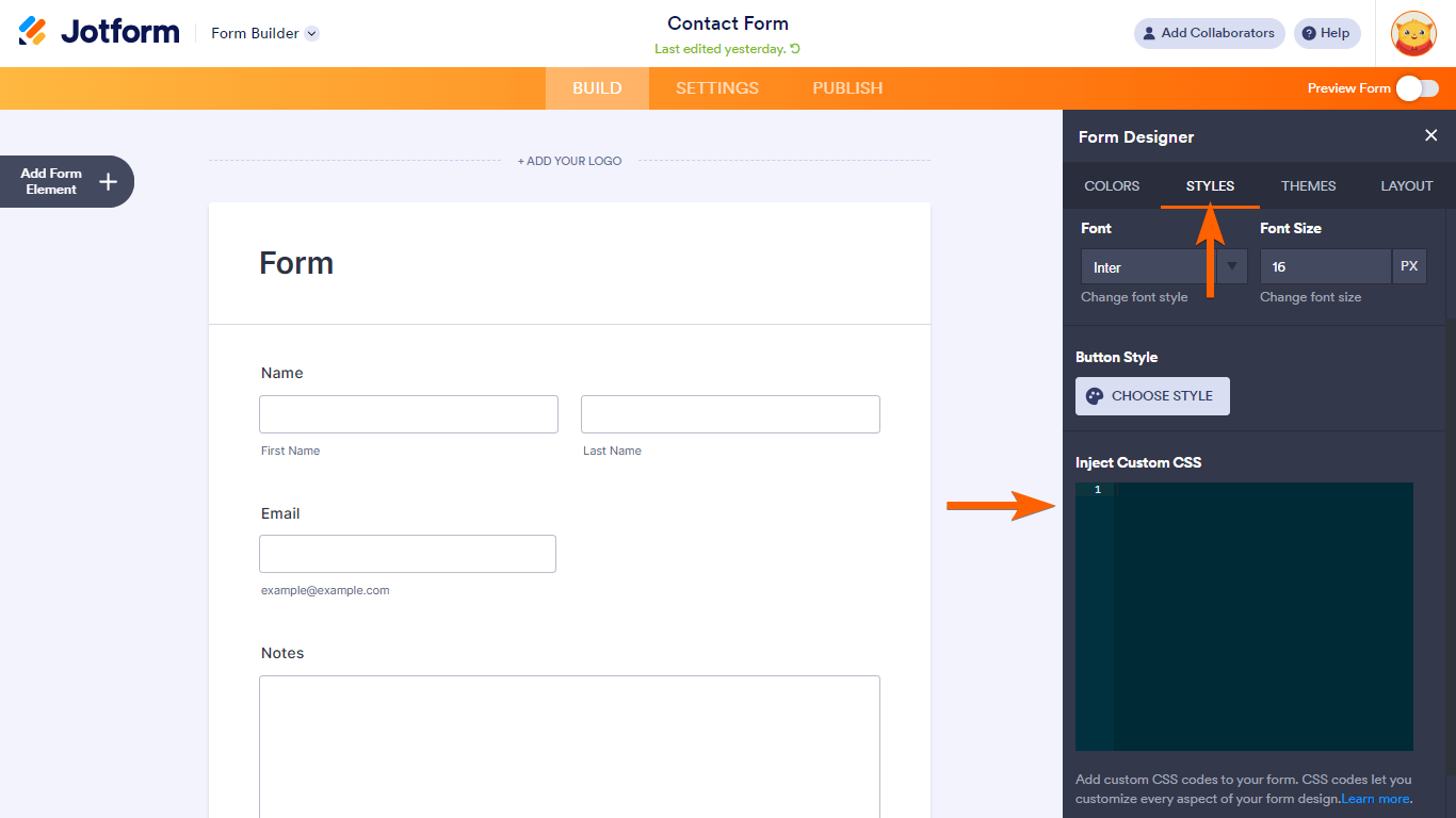
</div>- For the CSS, open the Form Designer on the right.
- Go to Styles at the top, then enter the following code under Inject Custom CSS:
/* Main Box Content */
.modalBox {
position:fixed;
font-family: Arial, Helvetica,sans-serif;
top:0;
right:0;
bottom:0;
left:0;
background: rgba(0,0,0,0.8);
color:black;
z-index:99999;
opacity :0;
-webkit-transition:opacity 400ms ease-in;
-moz-transition:opacity 400ms ease-in;
transition:opacity 400ms ease-in;
pointer-events:none;
}
/* Style for target elements */
.modalBox:target {
opacity: 1;
pointer-events: auto;
}
/* Positioning of the child box */
.modalBox>div {
width:400px;
position:relative;
margin:10% auto;
padding:5px 20px 13px 20px;
border-radius:0px;
background:white;
}
/* Positioning and style of the close button */
.close {
background:white;
color:black;
line-height:25px;
position:absolute;
right:1px;
text-align:center;
top:1px;
width:35px;
text-decoration:none;
font-weight:bold;
-webkit-border-radius:12px;
-moz-border-radius:12px;
border-radius:12px;
-moz-box-shadow:1px 1px 3px #000;
-webkit-box-shadow:1px 1px 3px #000;
box-shadow:none;
border:none;
}
/* Style when mouse hovers on the close button */
.close:hover {
background:black;
color:white;
}
/* Default style of the open button */
.button {
background-color:black;
border:none;
color:white;
padding:2px 10px;
text-align:center;
text-decoration:none;
display:inline-block;
font-size:16px;
margin:4px 2px;
cursor:pointer;
}
See How to Inject Custom CSS Codes for more information.
You now have a modal window on your form. Appending #openModal to your form URL will open the modal window automatically when the form loads: https://www.jotform.com/221332168199458#openModal
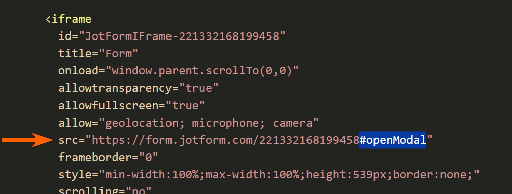
For embedded forms, append #openModal to the iframe’s SRC attribute to automatically open the modal window when the page loads.

Send Comment:
10 Comments:
More than a year ago
Hi, is there a way to change the colour and shape (ie. rounded corners) of the button?...
More than a year ago
should be a drag and drop option to add a pop up message if a particular option is selected on the form.
More than a year ago
I don't have a Styles tab in the Form Designer Tool - does this still exist?
More than a year ago
Can you provide the code that I can add to this so that when the user clicks outside the modal, it closes it, instead of needing to click the X button at the upper right corner of the modal?
More than a year ago
Hi this is not working for me. Im trying to do this and without even modifying any text nothing appears in preview mode
More than a year ago
This doesn't work! When I copy and paste the text above into the paragraph field there is no Yes button at the bottom to click on to get rid of the pop up!
More than a year ago
Can you edit the code to make the modal popup in a new window?
More than a year ago
I am not able to scroll. The pop-up works but I have a lot of text but is not able to scroll down, is there a code for that?
More than a year ago
hello, does this work if I wanted multiple modal pop ups on my form? I tried having 3 different ones, but the text wouldn't change/make each button unique. It looks like I copied and pasted it to all 3.
Form: https://www.jotform.com/build/221717579030152
More than a year ago
Great advise... It was actually simple as I just copied code from No 1 into CSS for field and it works fine!!
Now wonder if each time the 'add' function is evoked if a todays Date field could be a constant beginning for the text field..
Date: 03/23/2022 space space. The note begins here...