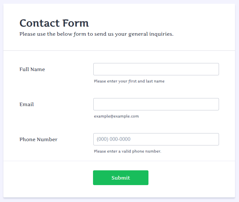
Sometimes, reformatting your form is necessary for website design. For example, our default form field spacing is like this:
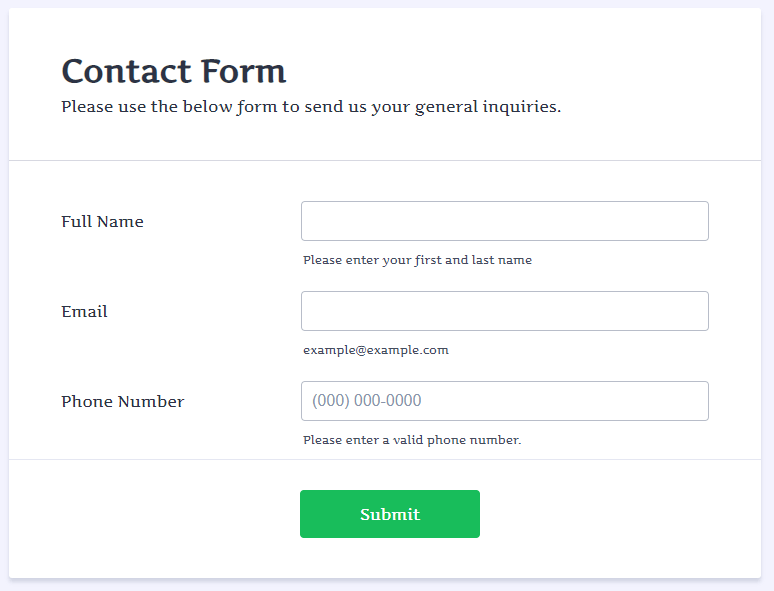
And sometimes you might want more compact spacing:
To accomplish that, please follow these steps:
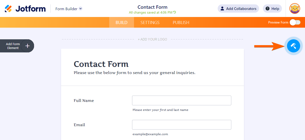
- In the Form Builder, click the Form Designer icon.
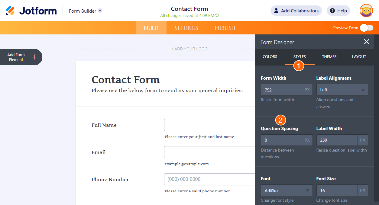
- Navigate to the Styles tab.
- Change the value of the Question Spacing section.
You can further customize the spacing with custom CSS codes. Please visit the following user guide for the details.


Send Comment:
30 Comments:
More than a year ago
Is there a way to do this same thing in the pdf editor? I've already changed the line spacing to "Compact" but there is still a lot of padding around each text box. I had it in a table at one point but not all the questions displayed properly...particularly the configurable lists. Those didn't really work at all.
More than a year ago
Try -1 / -2 / -3, etc.
More than a year ago
I'm sorry to dissapoint this, but I have an android wear smartwatch since 2014, as others milions of users
More than a year ago
please guide me how can i use
More than a year ago
Sweet any plans to update this for Pebble Time
More than a year ago
Great! As always improving the user experience. Love Jotform!
More than a year ago
When for Android Wear?....
More than a year ago
Why should i want a apple watch? Please make something for android wear...
More than a year ago
All f this it is very cool, but there are some important problems that you would need to solve as well. Nobody is helping me with the SSL Warning I got on mobile devices when I use jotform https://www.jotform.com/answers/587214-AGAIN-Unsecured-SSL-Warning-when-Secured-Form-is-Submitted-on-MOBILES#9
More than a year ago
Awesome!
Congratulations and regards from Costa Rica.
More than a year ago
WOW, Can't wait to try it.
More than a year ago
Wooow pretty cool!!!
More than a year ago
One word: yeah!!!!
More than a year ago
Wow earlier today I was online working on a form and voila, not even a day after the release of the new apple watch, you guys already have it covered! You guys Rock!! Its AhJot (About)that time! Thanks Jotform
More than a year ago
simply superb. most innovative idea of the year :)
Thanks a lot.
More than a year ago
Okay I got it. I read it. So if I now press DISMISS on your watch popup, one would expect it to go away, but it only launches to this page again.
I thought jotform was better than that, my bad.
More than a year ago
Be honest... you guys did this so you could expense your Apple Watch purchases.
Looks great though! Congrats!
Chris
More than a year ago
How about the Samsung S gear?
More than a year ago
Oh that is AWESOME! You guys are on top of your game.
More than a year ago
Well done!!!
More than a year ago
No matter what value I place in "Question Spacing" the spacing remains the same.
More than a year ago
Does anyone know how to reduce the space between the frame/start of the form?
When I insert the form into my website the gap between the end of text (HTML on page) and the form pushes it below the fold (or off the screen). People then have to scroll to find it...
I can't work out how to do this bit... any suggestions? Thanks!
More than a year ago
I have tried reducing to 1 on my communication authorization form. However, the vertical spacing on the form still seems very wide. Didn't compress it at all. Thanks in advance.
More than a year ago
Thanks........ very thanks!
More than a year ago
i have a problem i am alien text box and select box in 1 row vertically but it is not working can you solve my problem pleas....