Top 5 Weebly websites to inspire web design
Creating an engaging website is all about “striking the right balance between usability and visual design,” says Neil Andrew, founder of PPC Protect. “Simplicity is king in web design, and with Weebly websites, that is no different.”
So how do you use the Weebly website builder to design a site that will drive business? Start by getting inspired. We asked web-savvy online marketers to list their favorite websites built on the Weebly platform. Here are the sites they chose, along with a brief discussion about what makes these sites great. (Listings do not constitute endorsements.)
1. Patterson Fan
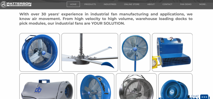
South Carolina industrial fan manufacturer Patterson Fan turned to Weebly to build its online headquarters, which includes an e-store. The site’s highly visual design shows the power of a striking presentation, even for industrial business-to-business companies.
“Patterson Fan’s site features large, vibrant images that showcase its products both in use and similar to how they’d appear in a printed catalog,” says Flynn Zaiger, CEO of Online Optimism. “It manages to showcase a significant number of products while utilizing categorization to nimbly get potential buyers to where they need to be.”
Advanced features include popup live chat, integrated quote-request forms, and social media widgets. “When all of these elements are put together, they make the Patterson Fan website stand out from its competition,” Zaiger says. “You might even say that I’m the site’s biggest fan.”
2. Kiko Rodríguez
Kiko Rodríguez is a Miami-based graphic designer, so it makes sense that his website consists largely of pictures. The homepage is a grid of images — many of which Rodríguez sells on T-shirts, postcards, and art prints — along with links to About, Contact, and Shop pages.
The Shop link sends you to Rodríguez’s Redbubble store. This is an important reminder that, even if you sell online, you don’t have to use Weebly’s e-commerce features; you can link to a storefront elsewhere.
Andrew calls Kiko’s site “an online store that has a real wow factor to it.” It’s a simple, functional website that does exactly what the artist/owner intends without any superfluous content. If you sell art or artisan products, consider how you can create our own standout homepage using colorful, varied images.
3. ImmuneSchein Ginger Elixir
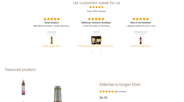
“ImmuneSchein Ginger Elixir has a great Weebly-made site that fits the brand well,” says Elliot Reimers of Rave Reviews. That brand consists of handmade ginger syrups for use in mixing drinks, baking, or making any other culinary creation that could use a gingery kick. The site’s honeycomb scheme of colors and images keeps the emphasis on the brand’s freshness, health, and natural ingredients.
“[The site] uses a very minimalistic design and few colors to let the images on the main page do the talking,” says Reimers. It also incorporates a strong e-commerce experience with prominent call-to-action links and lots of images on every product page. A Recipes page provides plenty of useful content, which is not only valuable for readers but also helps attract the attention of search engines for greater online visibility.
4. Farm Lighting
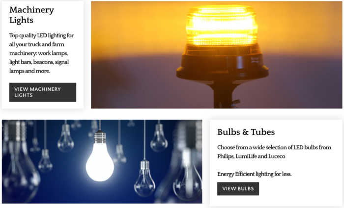
This Irish seller of lights and bulbs for agriculture makes it easy for visitors to find exactly what they’re looking for without a click-heavy hunt. Farm Lighting’s products are divided into categories based on application, and they’re listed first thing on the homepage, removing friction for buyers. Scroll-over dropdown menus provide clutter-free navigation.
“This may not be the most visually appealing website, but it has a very good user flow,” says Andrew. “That makes it easy to see what they do and to buy their products.” For an e-commerce site, user experience is the first priority. This site provides a clear path from landing page to checkout.
5. Leadapreneur
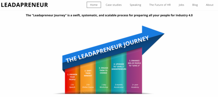
Digital industry consulting agency Leadapreneur provides guidance for business leaders making the leap into cloud-based, internet-of-things-driven workplaces — what they call “Industry 4.0.” Offerings include speaking engagements, online courses, workshops, and consultations.
Because the company traffics mostly in ideas and education, the Leadapreneur website is heavy on text and infographics — but it organizes these elements logically on the page to avoid confusion. Visually, this site has less pop than others on this list, but that keeps the emphasis on stories of past successes to inspire new leads.
This is “a high converting site that shows you don’t need to spend big bucks to build something that drives sales,” Andrew says.
One thing you’ll notice with all five of these Weebly websites is that the designers dramatically altered the base Weebly themes. That’s an important lesson.
“Using a template out of the box means there’s hundreds of other websites out there that look exactly like yours, so you’ll get lost in the crowd,” says Andrew. “Even just a few small tweaks — changing some colors, changing the placement of an image or two, adding some brand styling — will really help to improve the overall look of your site and turn it into something truly unique.”
For more inspiration, see Weebly’s list of “awesome” Weebly sites.







Send Comment:
1 Comment:
More than a year ago
Hi, the link back to Rave Reviews featured in the article is a no follow, I was wondering if this could be changed? Thank you