Like a brick-and-mortar storefront, the appearance of your Weebly e-store can have a major effect on sales — and that appearance is determined largely by a template. A Weebly template controls everything from page layout to color to font, and it’s the single strongest element in your site’s appearance.
If you want a site that invites customers to take a closer look, you need to pick a template that will appeal to your target audience. Weebly makes free templates available by the dozens, but not all of them are designed specifically for the e-commerce experience.
The business owners and digital design experts we spoke to have strong opinions on which free Weebly templates create the best looking e-commerce websites. Here are a few of the ones they recommend.
1. Squared 2
Research suggests that product images have a significant influence on purchasing decisions for 83 percent of online shoppers. Squared 2 is a Weebly template that shines the spotlight on product photography, making it ideal for highly visual inventory like jewelry, fashion, and home furnishings.
Sidebar navigation keeps the large image fields front and center, and minimal text avoids cluttering the page. “It’s designed in such a way that it creates an instant impression on shopping enthusiasts,” Ayushi Sharma, business consultant at iFour Technolab, says of Squared 2. “It gives a beautiful look to your storefront.”
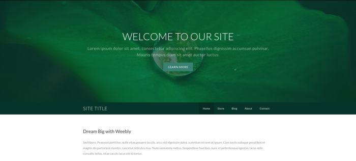
2. Dusk
Dusk leaves a lot of room for written content outside of the actual e-store. That makes it ideal for sellers in hobby-driven niche markets — think fishing tackle, sporting goods, or quilting supplies.
The e-store links to product pages through large square images, and pages themselves have plenty of room for product information. Page templates include Home, Store, Blog, About, and Contact.
“The Dusk e-commerce theme offers a professional look,” Sharma says. “Its design elements perfectly position brands and content on all pages.”
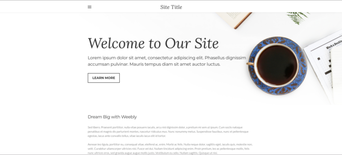
3. Paper
While Paper’s e-store is standard Weebly fare — large images that link to detailed product pages — the Home, Store, Blog, About, and Contact templates feature a unique, newsprint-inspired font and a minimalistic black-and-white color scheme that Traithost digital marketer Andrew Daniels calls “engaging” and “dynamic.”
Paper also has a built-in hover-effect tool, which is rare among Weebly templates. Hover-over effects are animations that are triggered when a user places the cursor over a particular image. While some Weebly apps provide hover-over effects you can apply to other themes, Paper’s is there from the start.
Art and fashion sellers have used Paper to excellent effect.
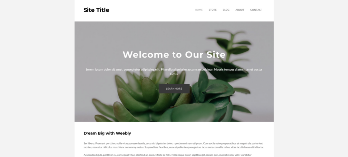
4. Unite
Both Daniels and Mike Falahee, owner of Marygrove Awnings, recommend Unite for online sellers. With five page layouts and multiple color palettes available, this template provides plenty of customization options. Weebly recommends Unite for “sophisticated lifestyle brands” and “artisan eCommerce.”
“Unite is a great choice,” Falahee says. “It looks classic and is not too in-your-face, allowing your business to take center stage rather than the site.”
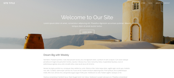
5. Birdseye
The Birdseye homepage places headline text against a screen-filling background image. This creates a “great impression,” says Sharma. It can also invite shoppers into the e-store by showing them detailed product images immediately. Call-to-action elements help convert visitors into buyers.
The Readydesk e-commerce site was built on Birdseye and clearly demonstrates the template’s focus on the product.
If none of the templates on this list is right for your e-store, don’t worry. You can browse the whole collection of free Weebly templates — all of which support e-commerce — here.




Send Comment:
1 Comment:
More than a year ago
do you offer ACH and Credit card processing.