Jotform Report Builder is here! To help you get the most out of this robust tool that can instantly transform your form submissions into presentation-ready reports, we’ve hosted a webinar to show you all the tips and tricks you need to know.
Collecting data is only half the battle; the other half is communicating that data effectively. Jotform Report Builder turns Jotform into your one-stop shop for data acquisition, analysis, and presentation, by taking form responses and turning them into fully customizable reports you can share at the click of a button.
The use cases for this feature are practically endless but can include real-time results submitted for
And those are just a few examples! This tool is 100-percent free to all Jotform users.
Watch our webinar (held via our integration partner Zoom) and don’t miss out on the opportunity to discover more about this new feature. The full transcription of the webinar is given below.
Intro: Jotform Report Builder
Elliott: Hey guys, my name is Elliott, I’m a marketing communications manager here at Jotform, and I’ll be one of your hosts today for our webinar on the newly released Jotform Report Builder tool. Before we go any further, I’ll turn it over to my co-host to introduce himself — Chad?
Chad: Hey guys, I am Chad Reid, I’m the vice president of marketing and communications here at Jotform, and we’re so excited that you can join us today for our webinar on How to Use Jotform Report Builder.
Elliott: Awesome, thank you. Yeah, so I just want to extend a warm welcome to everyone turning in today as we show you the ins and outs of Jotform Report Builder. We’re really excited to bring you guys this feature, it will help you analyze and share your submission data in new and insightful ways, and most importantly, it will save you time by creating a presentation-ready report in really just a matter of minutes. With that said, let’s get right into it.
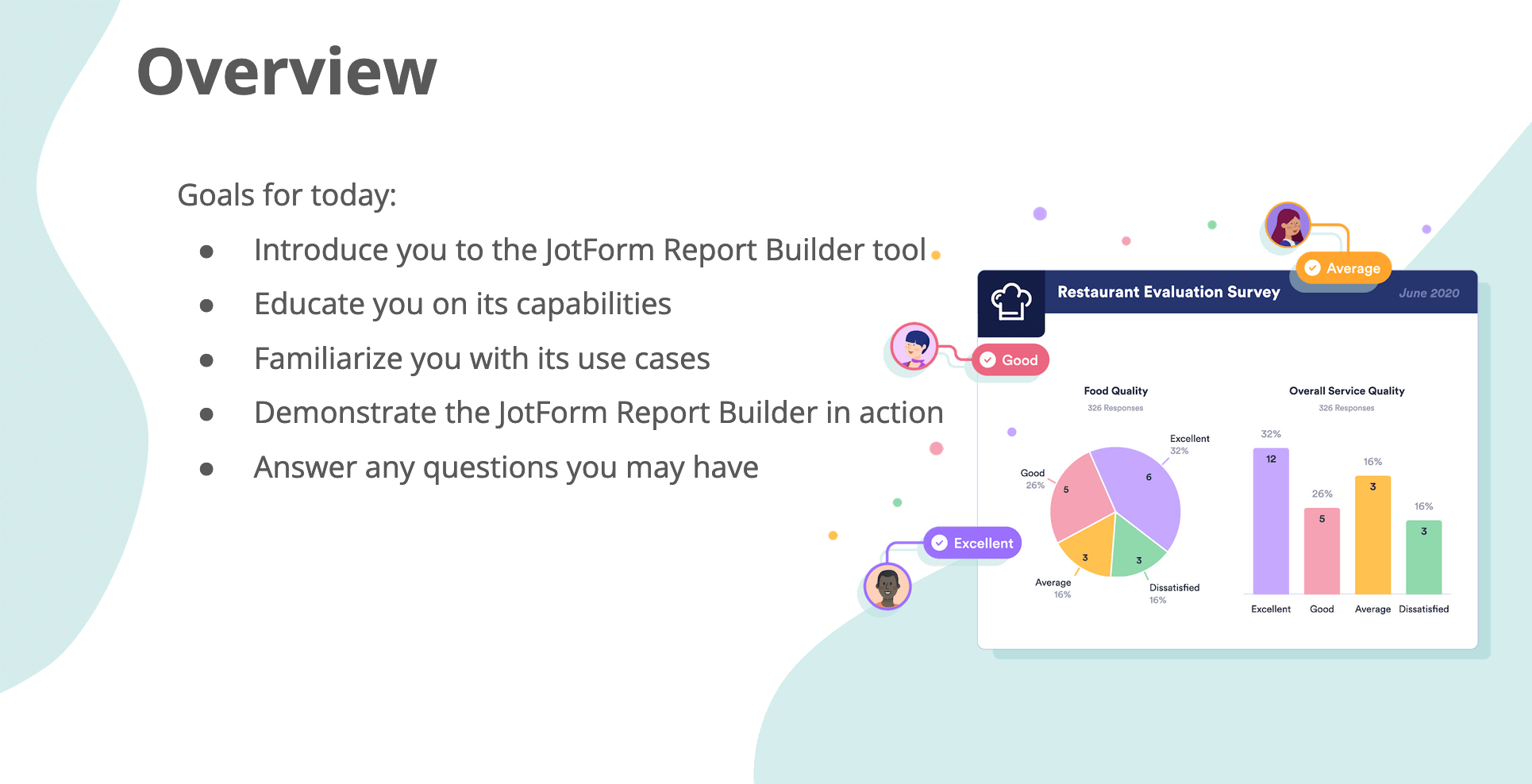
So today what we want to do is properly introduce you to the Jotform Report Builder tool. We’ll teach you about its capabilities and a few examples of its use cases, before of course demonstrating the report builder in action. Then at the end we’ll finish up with a Q&A if anyone has questions. By the way if you do want to ask a question, you’ll see a button on your screen that says “Q&A” so you can just click on that and then hit submit to send in a question our way.
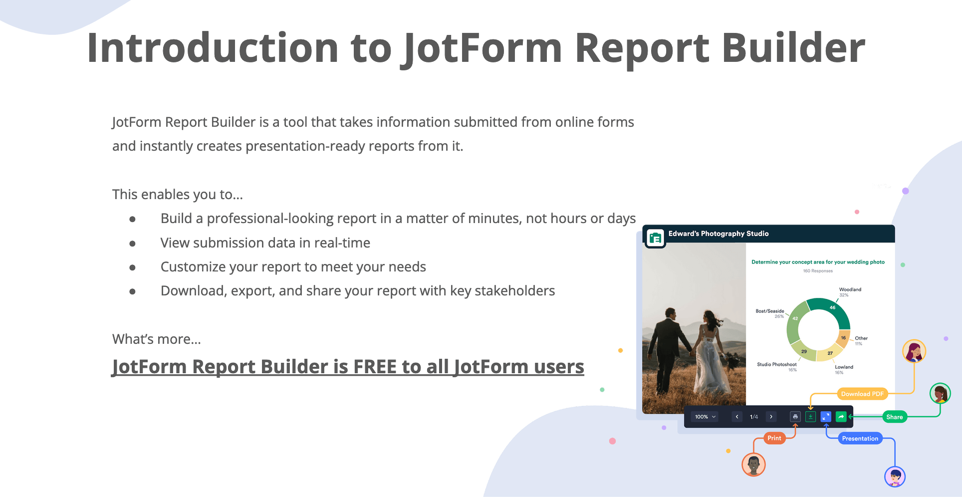
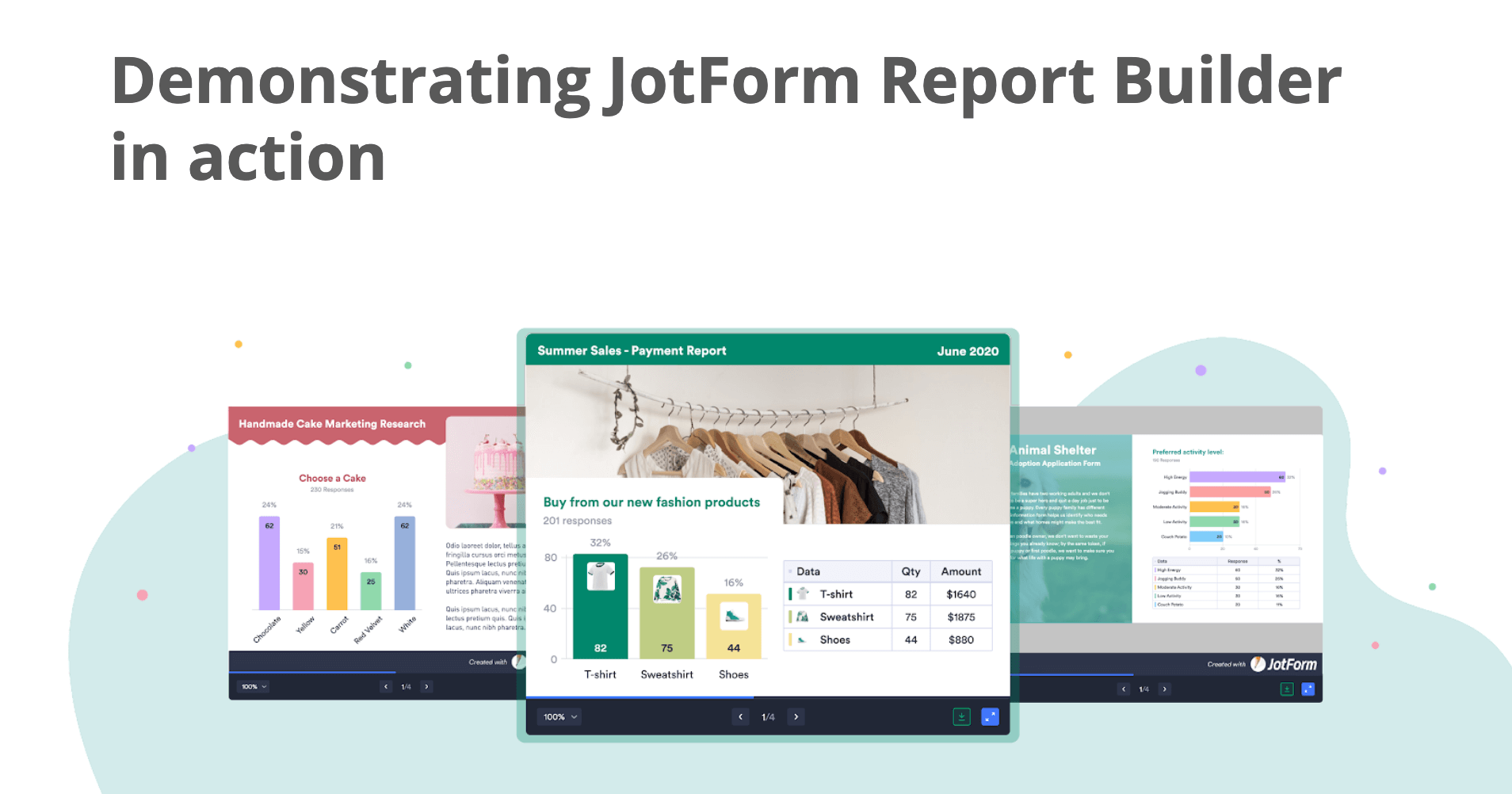
So, a little introduction to Jotform Report Builder. In a nutshell, this a tool that transforms information submitted from online forms into professional-looking reports. So it essentially creates a full presentation with visualizations of your submitted data, and then lets you customize virtually everything about it just the way you need it. So you can change the type of graphs or charts you want, adjust the look and feel, all of that. You can spend as much time as you want customizing, or it’s really pretty polished from the get-go to be honest, so it totally depends what you need out of the report. Then once you’re done, you’ll be able to share the deck as a PDF or a link. And we want to make it clear from the beginning, this tool is FREE to all Jotform users, even the basic complimentary version of the Jotform platform has this capability, so it’s really a tremendous value.
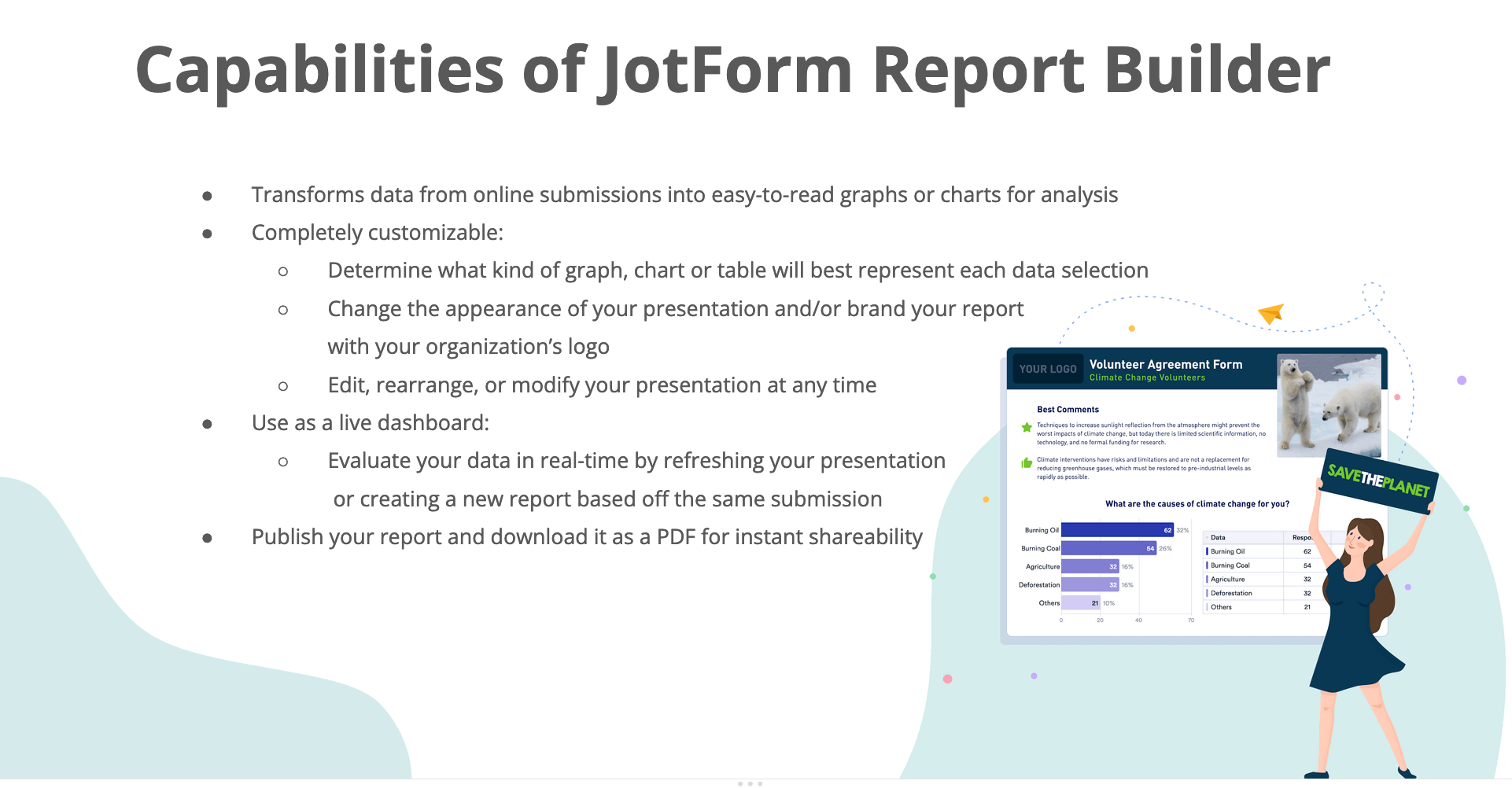
But now, a closer look at what the report builder can actually do. As I mentioned, the builder essentially takes real-time information that’s been submitted to your online form, and turns each data point into a graph or a chart for easy review and analysis. Every form entry will have its own graph, so your report will vary in length depending on how extensive your form is. As you’ll soon see, you can adjust exactly how your data is visualized in each case, so whether that’s a pie chart, or a bar graph, a simple graph table, what have you, that’s fully adjustable. As mentioned you can also change the look and feel of the report aesthetically to match your company colors and branding, insert a logo, and so much more. And it’s worth mentioning that the way Jotform Report Builder transforms submitted data in real-time even makes it viable as a sort of live dashboard. So even if you’re still getting submissions for your form, all you have to do is refresh the report, and it will automatically update every chart with any new submission data that’s been received. And then of course, you can export and download a PDF version of the report for easy shareability.
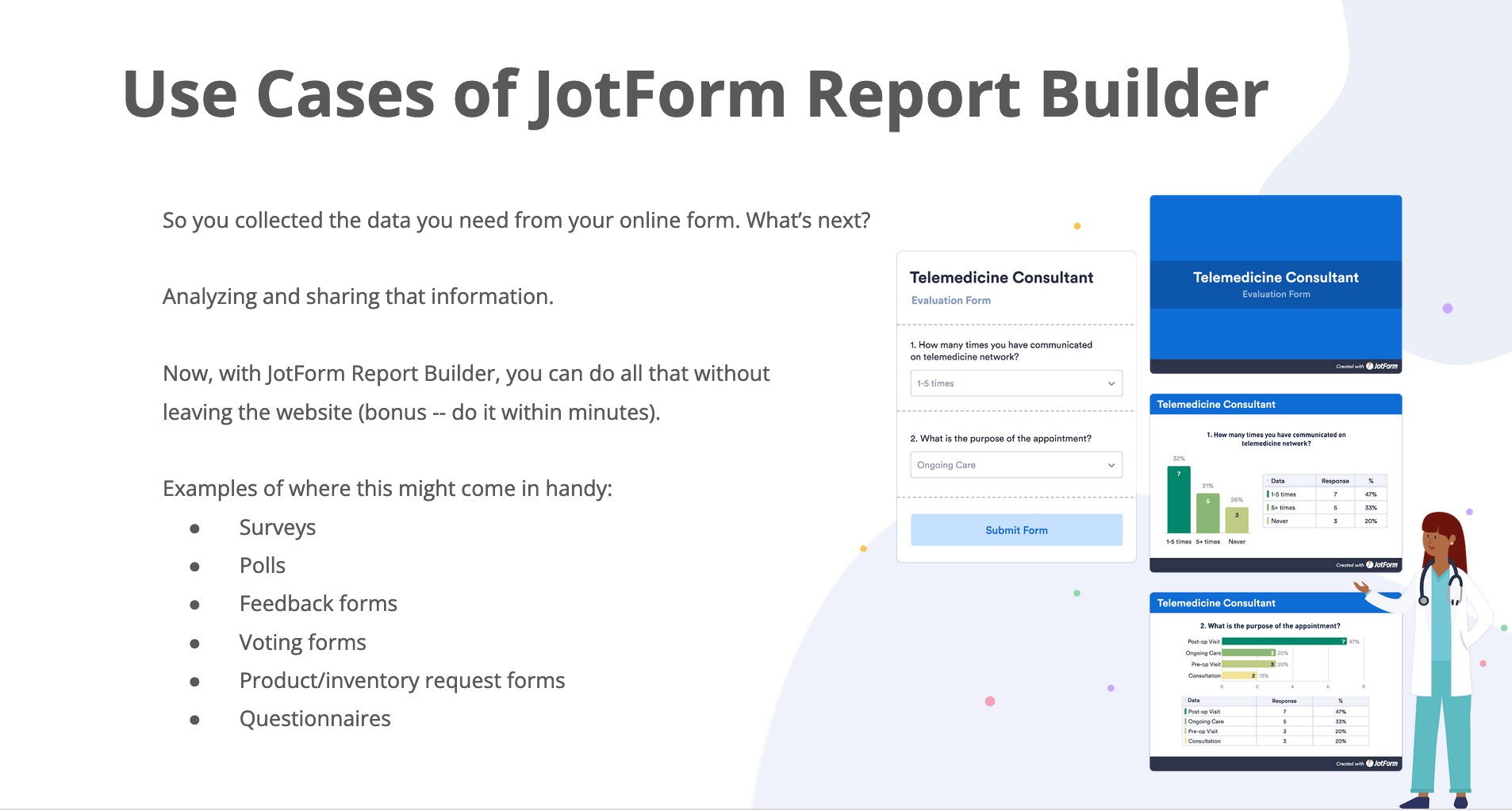
So really, when you consider where Jotform Report Builder might be useful, there are so many instances that come to mind, basically whenever you collect data from an online form, that’s so often only the first step of the process, because then you still need to communicate that data. And so we made Jotform Report Builder to help with that next step. Once you get the submission data you need, the report builder lets you analyze and share it at the click of a button, and all without leaving the website. Real-world uses for this are really kind of limitless, just a few listed here as you can see include surveys, polls, feedback forms, voting forms, product request forms, questionnaires, the list goes on — you can now instantly visualize the response data for all these forms with the Jotform Report Builder, as we’ll demonstrate.
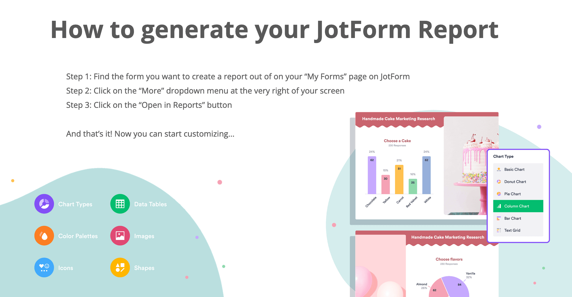
So to get there is really simple, and we’ll show you in just a second, but an overview is to first find the form you want to create a report out of on your My Forms page, click on the dropdown menu that says “more” at the very right of your screen, and then move down and click on ‘Open in Report builder’, and that’s all there is to it, now you can start customizing. And to take you through that process, I’m going to pass it off to Chad to demonstrate. Chad, you can take it away.
Demo 1: Functionality
Chad: Thank you Elliott, and now we’re going to show you how to get started with jot form Report Builder. We’re going to start from the My Forms page. We created this demo social media poll form, just to see what kind of form we’re dealing with, let’s go ahead and take a look at the form builder.
As you can see, it’s nothing too fancy, but you can see this poll was filled with several single choice and multi-choice questions, as well as a rating question right here at the end. And this form has already been filled out about a dozen or so times just to give you a sense of how the data is going to look in the Jotform Report Builder. Let’s go ahead and take a look at how that looks.
In the top left, you have an option for a Report Builder. Let’s go ahead and click on that. Here you can name your report, and then you have the option to either start a report from scratch, or use an extended or compact report option. We’re going to go ahead and show you the extended report.
And just like that, you have a report that is ready to use and ready to present to your clients, to your colleagues, and to your friends right out of the box — that’s the great thing about Jotform Report Builder is that it’s ready to use [right away]. But there are a number of customization options.
If you’re familiar with Jotform and building a form, this basic elements panel on the left will look pretty familiar to you. This is where you can add text, a header, image, shapes, icon, or a grid. And just to give you a sense of how some of this can look in action, we’re going to add a text field to this slide… and change the orientation of the graph itself.
So in this instance, this might be a good chance to elaborate or to explain some of the data that’s being shown; so this question asked if the respondent uses social media — 63% said yes, so maybe you say [or type] something to the effect of, “In our poll, most of the respondents use social media.” And that’s a great way to add context to data.
Now if want to change the way the graph looks itself, we have a number of different options. By default it has a pie chart, but there is a basic chart, a donut chart, a column chart, and a bar chart. You can choose whether or not to have a legend. And then also whether to include a table at the bottom. And it has a number of orientation options as well.
And if you wanted to play around with how the data looks or is presented within the chart, you have options for doing so. For instance, if you wanted to change the order, or the colors. It’s all very easy.
I want to call to attention something that pops up at the bottom here as well. So as you saw on the form originally there was a star rating question for “How would you rate how happy social media makes you a Nazi?” Not so many people say it makes them very happy in the form when asked, but it develops and gives you a piece of data without having to actually do any math. So, I didn’t have to manually figure out that it was an average response rate of 2.78. Jotform Report Builder developed that automatically so if you aren’t a math person — which I’m not — then you have a smart piece of data analysis to present automatically.
If you’re happy with your presentation or if you think that you want to give it a go, or just see how it looks in action, there’s a preview option right in the top right. This can be downloaded with a single click as a PDF. Just a great clean format.
And then you have a number of publishing options as well — actually, before I get to that, I want to show you how you can also add a new slide. So on the right, when you’re editing or your report, if you click on that icon, [you can] add a new page. And then anything that wasn’t presented initially, when it was automatically generated, you can go back to these basic elements. I think grid view is really fantastic, it gives you all of the response data that you have. So if you want to show in your presentation a really holistic view of the data that came in, or what you were working with, that’s a great addition to any presentation.
Okay, so back to publishing. There are a number of publishing options. Let’s go ahead and first make this a public report. As a standalone link you can send this [as-is]. But we also have embeddable options if you wanted to put this on your website. Elliott had mentioned that there’s a live dashboard functionality, it would be great to have an embeddable live dashboard. Then we also have WordPress and Medium links as well — this is really cool, I write on medium fairly frequently so I was excited when we were able to build this. This is a great way that you can add visuals to help tell your stories a little bit. Data-driven stories with great visuals are really compelling and shareable, and that’s something that we’re really excited to be able to share with everyone as well.
And now I want to kick it back to Elliott, that includes what I wanted to show you as far as creating a report, but he’s going to show you how a report can look if you take just a little bit of time to design it according to your brand.
Demo 2: Branding
Elliott: Thanks Chad! As Chad mentioned, this is an example of a report that I’ve spent a little bit more time with to more closely approximate our company’s colors and branding. So as you can see, this is a bit more polished — it has the translucent background, colors, and a logo and font that matches our own company branding, and I’m going to show you how to do this. It’s really quick, easy and simple. I’m no design expert by any means, but even I could turn this report into the way it looks now, it just took me 10 or 15 minutes or so.
So, I’ll show you an example of how I built a page, and the first thing is to get your company colors. Most companies have a brand asset page like this one, and on it, you should be able to find the hex code of your company’s colors. So here is our hex code of one of our primary company colors. All I have to do is copy that, open my slide, and then you get this background color option here, where you can just click right into it, copy and paste the color, and it’s turned into the background color according to your company branding.
Now if we want to add a header with text with a different color, that’s pretty easy to do. Just click and drag as Chad mentioned, and then type something — “sample header.” Now if we want this header color to be the other company color, all we have to do is go back, copy and paste, just click straight into it, and boom. So here we have our two company colors — how I’ve arranged the rest of the branding of the template — and then if we want to get a little bit more fancy, like I have, we can include our company logo and even a background image. So for a logo, you come up here to “basic elements” and click on Image. And you can populate any image, logo, what have you, then just drag it wherever you’d like; and then of course you can copy and paste on other pages.
And then to get this translucent background image — you know, kind of spiff it up a bit more — it’s pretty easy. [Click] image, you’ll have to upload it (I already have mine saved), and the trick here is the translucency; so right now it’s one hundred percent opacity, we’re going to take that down to five [percent]. So you can see it’s mostly transparent in the background. And the trick to be able to then customize — because it’s at the top of the page, now I can’t actually click on the header or anything — you can go into the layers of the slide itself by clicking on the main slide settings. These are the layers. So I’m going to take this image and slide it all the way to the bottom.And then suddenly I can manipulate the slide again and it’s effectively, just a background.
So just like that’s an example of how you can take your own report and brand it according to your company style guide, just like this. And again that took me maybe just a couple minutes, you can do the exact same thing, even with slides that have data on them, and it’s just a few minutes’ investment to really make it into a spiffy, polished-looking final product.
And that’s just a brief overview of how you can aesthetically tweak your form to match your company colors. With that, I will kick it back over to Chad to take us home, and to kick off Q&A.
Chad: Thank you, Elliot. So that concludes the demo portion of the webinar, and we sure hope that you enjoyed seeing Jotform Report Builder in action. And at this point, we would love to open it up for questions if you had any in our Q&A section.
Q&A - Jotform Report Builder
-Question 1, from Frank: Can you hardkey additional data into the report NOT from the submitted information?
Answer: You can add shapes, images, and text fields to any presentation, but you can’t hardkey new data into it that’s not been included in the form.
-Question 2, from Clinton: I am creating a form where the user will pick from four choices and each choice is displayed as an image. In report builder, I would like to have a bar graph that shows these choices and the image associated with each choice. How am I able to do this?
Answer: While images from product selections on the form don’t transfer to the report, you can manually add the images back to the report using the elements builder on the left side of the screen, as demonstrated.
-Question 3, from a number of viewers: Can you filter results by time periods?
Answer: There is a function on the top right of the report builder home page where you can filter results by all time, previous week, previous month, year, or enter a customized date set so you just get submissions for a certain time period of your choosing.
-Question 4, from Alan: How can I edit the name on heads of columns in a table report?
Answer: You cannot manipulate the data set itself, but you can change the header of the overall data set to provide additional texture as needed.
-Question 5, from Karin: Can you only aggregate data over all participants, or can you also make reports that display just one person’s submission data? For example, I have a questionnaire with 180 questions from which I then compute 12 subscale scores. Can I make a report for each of my participants showing them their own scores?
Answer: The report builder will include all submission data for the form it’s tied to, though you can also filter the date range, as mentioned, if there were only particular submissions on a certain day that you know of. In this particular case, I would recommend sending a unique form to each participant, which is easy to do by simply selecting “clone form” on your My Forms page. Then with minimal additional effort, you can have individual forms and reports for each participant.
-Question 6, from Vicki: Can you export as PowerPoint?
Answer: At this time Jotform Report Builder only downloads as a PDF. However, the editing interface itself is very PowerPoint-like, with many of the same functionalities and tools, and you can share it with others via a link or present it as-is.
-Question 7, from Jenny: How does this integrate with inventory widget?
Answer: The inventory widget will reflect like any product order or selection field in the report builder, it will populate a grid saying how much was ordered of what, though the report itself doesn’t show how much inventory is left, just what was ordered.
-Question 8, from Patrizia: Can you show data from multiple forms in one report?
Answer: It’s possible to combine multiple submissions with the following app (and then you can create a report out of it): https://www.jotform.com/integrations/combine-submissions
-Question 9, from Heather: Can it show open-ended question answers?
Answer: Yes, it shows manually entered text answers by default in a table grid that you can adjust, which is another great aspect of the table grid format.
-Question 10, from Andy: Do you need your company’s color’s hex code to brand the presentation?
Answer: You can manually adjust the colors to find the right look and feel, but hard-keying in the hex code data itself will be the most accurate way to brand your deck according to your company’s true colors.
Elliott: And that’s all for now! A big thank you for tuning in, we hope this was helpful. A reminder to check out our YouTube channel and website for more informational resources on Jotform Report Builder and our other products.

Send Comment:
8 Comments:
200 days ago
Can I use jotform for tests so that it will reflect the right and wrong answers?
More than a year ago
This is very helpful!!! Please note: There is some sensitive wording in the paragraph that begins "I want to call attention." It was not spoken in the presentation (beginning at about 8:23), but may be the result of the automated transcription service used.
Grace and Peace
More than a year ago
A major shortcoming of this system is that it cannot analyse the different fields:
Example:
- Male, female, other
- Amount spent on holiday
- Month when you went on holiday
It would not seem difficult but very useful to group the data and calculate the total amount spent on holiday by gender and period and the average for each person....
More than a year ago
SALUDOS..
Como puedo enviar recordatorios por Email o Sms, a los usuarios que agendaron.
les agradezco de antemano su atención..
More than a year ago
I am interested in learning this since I have to do lessons on zoom
I teach Cadets and various elementary and high school students . I also have been asked to present to Parents
More than a year ago
the riport to work i need the form and system
More than a year ago
Yes, how do i get a form that people can answer just like your page on collecting questions prior to a webinar. That is all I need to do with JotForm. Thank you!
More than a year ago
Can we get thé result as that we can analyse it with SPSS?