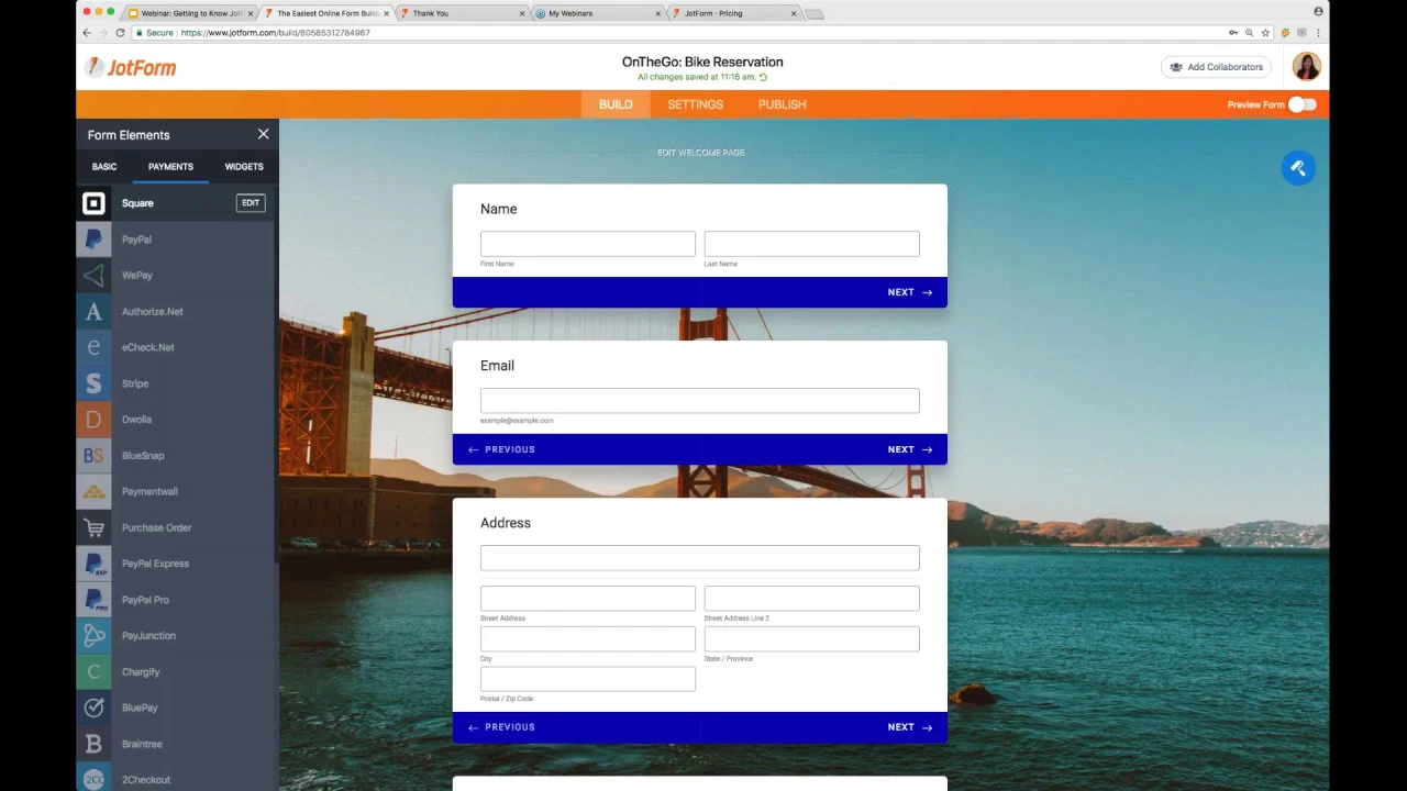
Jotform Cards, launched Feb. 6, is a brand new format option for online forms. It comes with a collection of powerful new features to make your forms friendly and even easier to fill out, resulting in 36% higher conversions.
Watch our 30-minute webinar video that provides an overview of Jotform Cards, a live demo, and Q&A session. Enjoy!


Send Comment:
12 Comments:
March 22, 2018
Thank you, I learned a lot about this new feature. I believe that it will be the best approach for me. We are implementing a mentorship program and this will allow ease of use for people who vary in computer/smart phone skill. The card as oppose to the form seems as if it will be helpful.
March 20, 2018
I like what you are trying to achieve but it really needs more testing. I'm using jot form cards and experiencing a few issues which make the overall user experience clunky. It also looks awkward on iphone 7. I think once you have the finer details sorted you will have a great product. If you want to get in touch I'd be happy to explain the problems I'm having.
March 10, 2018
i am new guy and i will like to know moore about jotform
March 10, 2018
Formulário
March 10, 2018
I have never been in more contact with jot form help since i went to jotform cards. A great idea but just doesn't work. You released them too soon before testing them out. Now my form won't submit because I removed the google recapture. Just cannot waste anymore time on this stupid invention. I am going to Formstack.
March 10, 2018
When can we expect a save button. I had a client just complain that she lost all information after filling the form. People getting turned off by not being able to save. It is not encouraging to those of us that love using Jotform.
March 9, 2018
03/04/2019 --- March 4th or April 3rd? Why not use the good old-fashioned alphabet - you know - like letters one would use to write words with... They look something like ABCD...
March 9, 2018
JumanjiForms - that's more like it.
March 9, 2018
Jotform cards are a major pain. They don't fit into websites which use sticky navigation at the top. Form jumping is a constant issue especially with mobile devices. Conditions are very limited. You can't hide the submit button. Address fields are displaying multiple choices & easily confused by customer with similar street address or business names in another state or city displayed by Google maps. (which becomes a major misunderstanding issue, causing multiple calls or email just to verify that the input info was correct) Also, instead of displaying several most default fields like name, email, phone, address which can be auto-filled - customer now have to do it in 13+ steps. After 4 or so steps people get annoyed, lost and leave the forms incomplete.
In theory it all sound good, but it's more of a headache to deal with than anyone needs to. (And it's all for that sliding effect appreciated by only one - website owner) I also love the way Jotform crew would edit or delete legit reviews, grievances and suggestions, but keep junk posts like these below:"
carmie55 March 08, 2018 at 09:44 AM
I am retired and don't need any forms
MOHAMMDKHAN March 08, 2018 at 09:14 AM
Need forms"
March 8, 2018
I am retired and don't need any forms
March 8, 2018
Need forms
March 8, 2018
does jot form provides an element or widget that allows a "client" or user to create an account whereby their basic info can be reused in future jet form responses and not have to manually input again?