Many websites these days have some form of welcome area on their homepage. Welcome pages generally act as an introduction for new visitors, explain the website and often prompt an action on the part of the user.
Website welcome pages are typically more prevalent at personal websites, portfolios, and traditional businesses. They are less popular on news websites (where the headline story acts as the introduction). Of course, welcome areas aren’t considered necessary on sites with a clear purpose and established audience – there would be no point having a welcome page at CNN.com, as their user base most likely already knows who they are.
Often a slogan can suffice to help establish what a site offers. If you are pushed for space, or consider a full welcome area to be obsolete then a brief tag-line explaining what your site does is a handy alternative.
Below is an outline of common traits that are seen throughout popular welcome pages:
- Large, bold typography. Welcome messages are easy to read and have more impact when the type is large, clear and legible. This means good contrast against it’s background, and often bold font choice.
- Plenty of color. In researching this article a definite trend of colorful welcome areas was noticeable. The reason behind this makes sense – the eye is drawn to color.
- Artistic/creative typography and graphics. Often the wider content will have more standard web-safe typography, but the welcome area will have elaborate fonts, complex graphics, lighting effects and imagery. This means that rather than just blend in as another area of content, the welcome area will act as a graphical composition in it’s own right.
- A simple and concise message. You can save the paragraphs of text for elsewhere on your website, a successful website should be summing up your website as concisely as possible, just a few sentences max.
- Informative photos. If a picture speaks a thousand words, then it makes sense to include photos in your welcome area. For a personal site a photo can add a nice human touch, or for a more corporate site a great product shot can speak wonders about the quality of the website/company.
Inspiring Welcome Areas:
To better illustrate these traits, here are some analyses of a range of successful website welcome pages below:
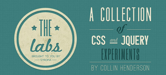
Syropia Labs
Syropia Labs use some really elegant typography in a retro style to create an engaging welcome area. The font choices are reminiscent of a 50s American diner, and the retro patterns and shapes used accentuate this theme. The text concisely and clearly summarizes the site’s content.
Olive and Twist
This welcome message uses bold typography to catch the users eye. The concise line ‘Creative design studio’ perfectly summarizes the site. The fact that this text is the lightest text on the page set against a predominantly dark background means that it really stands out.
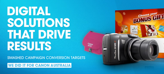
Adrenalin Media
The bright, colorful imagery of this welcome area immediately draws the eye. This welcome message is part of an interactive slideshow area, constructed using jquery. The capitalized text is bold, with a subtle drop shadow to contrast it further against the bright blue background.
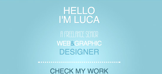
Luca Vercellio
Luca Vercellio uses a very minimal homepage design, where the welcome message comprises most of the page. The welcome area is relatively subtle, with a soft light effect, and white on light blue color palette. The typography varies quite a lot, but is all light and clear, fitting with the modern, clean website design. Nothing too elaborate here, just a nice simple message, with a personal touch ‘Hello I’m Luca’.
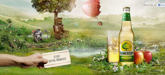
Somersby Cider
Much more a visual spectacle, than a typography welcome area. There is the basic welcome slogan ‘stay open-minded’ but the really impression is created by the beautiful photo manipulation, which features the product in an attractive way. The fantasy world presented creates a magical mood for new visitors, and a sense of intrigue and wonder that should encourage them to check out more of the site.
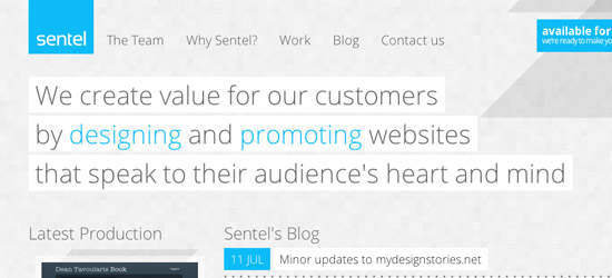
Sentel
A clean and minimal welcome area with a limited color palette. The key words ‘designing’ and ‘promoting’ which describe company’s key services are highlighted in blue in order to make them more prominent. The welcome message uses a light font, with a solid colored background to help contrast it against the main pixelated website background.
BeMobile
Be Mobile is a really bold website, combining black, yellow and white for a colorscheme with plenty of impact. This welcome message uses creative copy, starting each line with ‘Be’, leading up to their company name ‘Be Mobile’ at the bottom line. In addition to this is a bold, black call to action button, ensuring that the users eye is drawn first down the page, then into taking action.

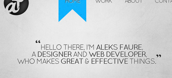
Aleks Faure
Another example of great copy. This copy introduces the designer, establishes what he does, and adds a sentiment about his quality and work ethic. The welcome area is simple but effective, and uses @font-face to integrate a creative font.
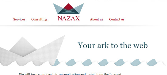
Narax
A really engaging welcome area, with a moving animation of an origami arc to fit with the slogan. The simple slogan ‘Your ark to the web’ is a little ambiguous, and doesn’t really describe what the site does. However, it does create intrigue. It’s actually the under slogan which explains the services offered. The pastel colors and cross-hatched paper area give a feeling of creativity, which fits well with the design theme of the company.
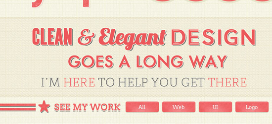
Syropia
This welcome area uses a retro look to help draw in users. The typography is varied, but comes together well as part of a great piece of imagery to headline the site. The copy has a nice personal touch as the webmaster states ‘I’m here to help you get there’. Color is uses sparingly, but red is used to emphasize key words.
Giebe Graphics
Another great example of copy defining the welcome area. The welcome message is very personal, and the grayscale color palette is broken by splashes of blue on key words. The opening line in speech marks (“nice to meet you!”) puts across a lot of energy and really helps connect with the visitor. The font is large and bold, with a subtle indented design to help it stand out against the page background.
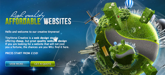
Tiny Verse
In my opinion this welcome area has too much text after the initial headline, and it’s not all that legible against the background. However, what really makes this welcome area successful is the exciting photo manipulation in the right. The welcome area background is also really eye catching, and the space age cloud theme is sure to entice people.
Noutes
A bold and bright welcome area that acts as a header to the rest of the website. This welcome area utilizes a large icon for imagery, which provides a shiny, professional touch. The typography is fairly basic, yet instantly and concisely sums up the aims of the website. There is also a large, prominent Facebook Connect call to action.
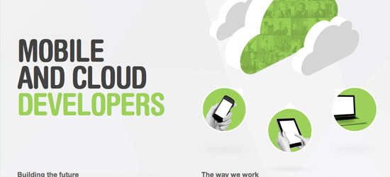
Touch Tech
Touch Tech uses a great memorable illustration, with relevant imagery of clouds and mobile devices. The typography is large, professional, yet with a friendly aspect to it, using rounded lettering. The copy is very basic, yet instantly establishes who the company are and what they do (‘mobile and cloud developers’).
Gabriel Aloysius
A wonderfully simple welcome area, with some hugely creative typography. Rather than use plain type, the letters act as a mask, letting imagery show through them. This imagery is constantly changing as part of a montage to showcase the photographers work, creating a welcome area with a double function. The way that the letter shapes contain her work acts almost like a window, where you’re wanting to see in.
Bear Grylls Live on Stage
A totally immersive welcome area experience. The jungle backdrop creates an enormous sense of depth, as does the huge 3D typography and foreground photographs. This welcome area perfectly captures the feeling intended by his live shows – that you as viewer are part of the action.
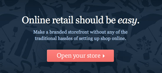
Goodsie
A simple but effective welcome area. The welcome beings with their mission station ‘Online retail should be easy’, which is effective as rather than trying to directly sell themselves, their selling point becomes their integrity and company values. The large, elegant white typography contrasts well against the dark blue background, and the bright call to action button attracts plenty of attention. Notice how the blue background also integrates silhouettes of retail products, creating a subtle but relevant backdrop for the welcome message.
Epic Fleet
A bold, striking welcome area with some nice copy. The emboldened text ‘you can afford’ underlines the central message of this company, which is value. The concise message also instantly states what they provide (‘web design’). Underneath this some examples of their work are attractively displayed in a fan pattern, in order to create additional visual intrigue.

We Are Pandr
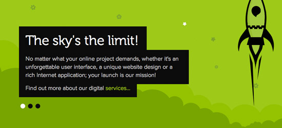
A stylish welcome area in an illustrative style. The welcome copy is highlighted by using a simple black backdrop featuring white typography. The main green background uses simplistic illustrations and patterns so as not to detract from the central message. The colors are bright, clean but limited, so the eye cannot help be drawn to the welcome headline.
Bear Hat Studios
A classic example of a welcome area using HUGE typography. The simple textured background ensures that the large text is the central focus, particularly as it takes up 80% of the homepage. There are no fancy words here, just simple copy that clearly states what this company provides. The typography is made more interesting through subtle gradient overlays and faint drop shadows. All of these design features serve to emphasize the welcome text.
Made by Vadim
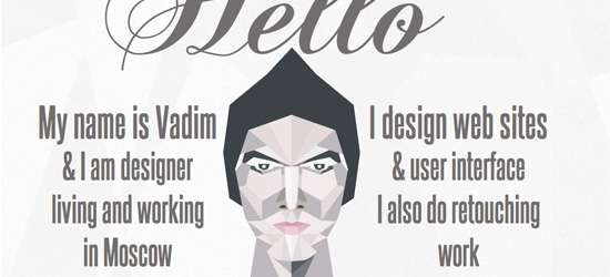
A creative welcome area with a stylized, abstract illustration at it’s center. The welcome message itself serves to introduce the designer and clarify exactly what he does. The personal ‘Hello’ message is emphasized through the use of scripted typography and large text. The abstract illustration of the designer not only provides a personal insight into his world, but helps to show off his design skills.
Putra Roeung
Another welcome area that concisely states what the website owner does. The subtle background design of this welcome area really works well. If you look closely you’ll see examples of their work and design processes behind the main text. The logo badge is a nice grungy touch to add creativity to the design, and the two call to action buttons are accentuated by sketchy arrows pointing to click them.
Spout Creative
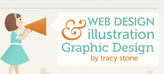
A quaint, easy-on-the-eyes welcome area, this site utilizes pastel colors and soft illustrations to provide a friendly welcome for people. The typography is well organized and uses reasonably informal fonts to add to the casual mood of the website. The illustration of the girl using the megaphone gives the text more of an auditory aspect, as she is clearly announcing the welcome message.
CMYK08
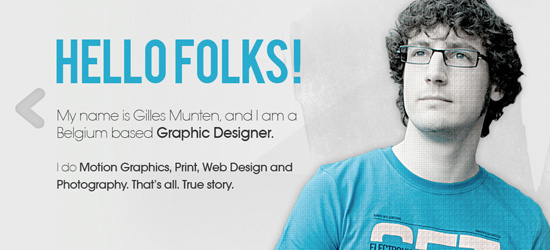
A great example of a highly personal welcome area. This designer combines a personal photo, an informal greeting (‘hello folks!’) and some nice grungy/sketchy touches to reflect his design style and personality. He has manipulated his own photo to fit with the limited color palette of the website, where blue, light gray and black combine to result in a stylish welcome page. The tagline by his photo ‘I think I need a haircut’ is another insight into his humor and presumably approach to design.
Chapter Three
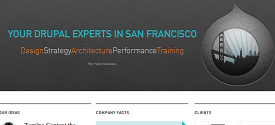
A reasonably formal welcome area, this design uses bright teal colored lettering for the main welcome headline, which contrasts effectively against the dark gray background. Key words are highlighted in orange, and their location (San Francisco) is integrated very creatively into the shape of the Drupal logo (which of course is relevant to the services they provide).
Masswerks
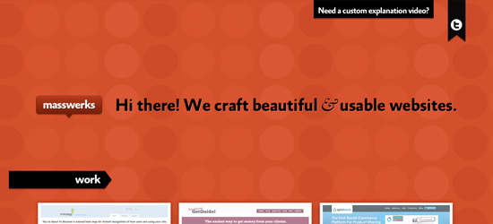
A very simple but attractive welcome area. The copy is a friendly greeting, followed by a description of the firm’s services. The bold black text contrasts well against the bright orange backdrop, and is emphasized further by use of a thin white drop shadow. The fact that the logo and welcome message are on a single line gives a unified sense to the design, and visually connects the company’s brand with the sentiments of their welcome message.
Alan Power
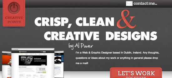
This welcome area avoids being overly busy, but creating a great visual hierarchy, drawing the eye diagonally down the header. The bold, large typography of the welcome area is really eye catching and the splashes of red work nicely. The simple gray background helps foreground the welcome message, which is emphasized by the examples of the company’s work to the left. Ultimately the eye is drawn down the header to the nicely textured call to action button, encouraging client contact.
New Concept
This welcome area uses photography to enhance the message within the copy. ‘Beautiful & Elegant’ describes their designs, but is also depicted by the beautiful, elegant butterfly to the right of the welcome text. When you hover over the butterfly image a magnified circle pops up, providing an interactive element to the welcome area, which helps maintain people’s interest.
Uproar PR
A great example of effective typography in a welcome area. Not only is the welcome type large and eye catching, but it impacts upon the surrounding environment. In this case we see the word ‘NOISE’ actually cracking the surface that it rests on, which creates a much more real environment for visitors. The lens flare effect and metallic sheen also draw the eye. The imperative nature of the copy ‘make some noise!’ is a much more aggressive message than other examples in this post, yet fits with the cut-throat nature of the PR industry.

Joe Guarino
Another designer who uses an informal welcome approach for potential clients. Rather than hide behind a false corporate mask, Joe presents himself honestly and openly, through a fun self portrait illustration and some funky typography. The informal copy ‘Hi, man!’ establishes a friendly vibe for potential clients and helps draw them further into his site.
Kendra Schaefer
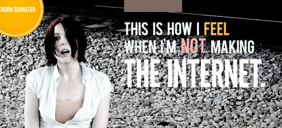
This site uses photography as the principle feature of the welcome area. The typography is reasonably large, but isn’t all that legible, and doesn’t provide a huge amount of information. It’s more there for a humorous, abstract message. The photography is the real gem of this welcome area, as it’s dark, moody and emotion, and captures a lot of attention. As a visitor we want to know more about the figure depicted, and as a result browse around the rest of the page for clues.
Shout Digital
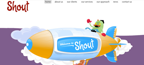
A bright, colorful welcome area with a crazy Flash animation. The actual text of the welcome area comes below this animated area, but the quality of illustration and animation is so superb that the site has already won you over.
Convax
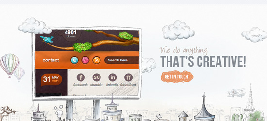
This welcome area integrates examples of the company’s work really creatively, by positioning them as a billboard in amongst a sketched out cityscape. The call to action button ‘get in touch’ is creatively integrated into the background, sitting within a sketched cloud shape.
Amit Tishler
A welcome area that’s highly appropriate for an animated, showcasing an awesome vector backdrop for the page. The welcome area includes a Youtube video, which showcasing the animator’s work better than a static image could.
Jeremy Man
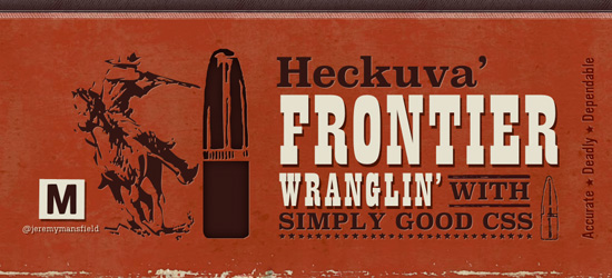
This welcome area has an awesome western theme that fits well with the overall site. The welcome text actually isn’t an image, and uses @font-face and some cool css effects to style it. The indented illustrations and background textures create an authentic cowboy aesthetic, as does the copy (‘Heckuva’ Frontier Wranglin’).
NorthEast Creative
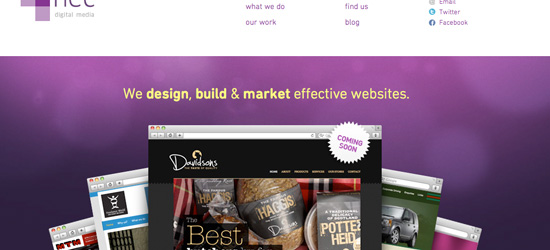
North East Creative use some great background lighting effects to foreground their concise welcome message. The colors of this area compliment each other well, and the bright yellow text stands out against the deep purple background. There is a central fan design displaying examples of their work, which works to create depth and a visual attraction for visitors.
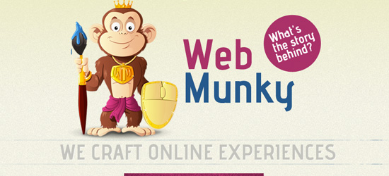
Web Munky
Web Munky use their cheeky mascot and colorful logo at the centerpiece for their welcome area. However, the tagline ‘we craft online experiences’ provides an informative sub text for the area. The bright, vibrant colors draw the users eye, and the visual hierarchy effectively prompts you to scroll down the page and find out more about their services.
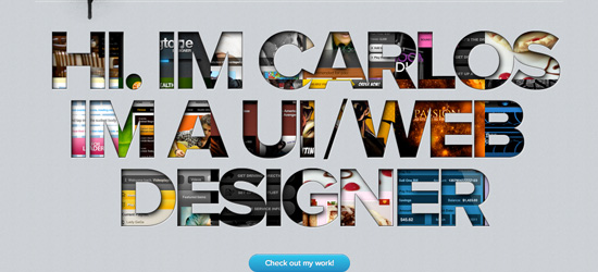
Media Germ
Another great example of text masking. This media company lets their work show through the shape of the welcome area lettering. The typography is really bright and eye catching, although the legibility is slightly hindered by the busy fill. The length of each line of text means that the eye is naturally drawn down the block of text to the smaller call to action button.
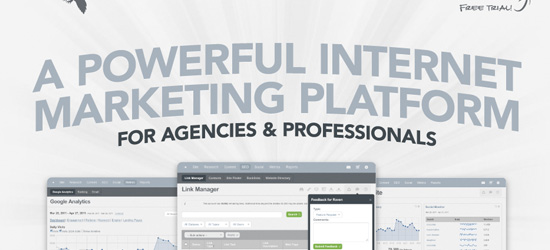
Raven Tools
Raven Tools use a relatively reserved color palette for their welcome area. However, the great background lighting and creative typography adds a lot of impact. The copy is concise and immediately lets users know what the company does: ‘A powerful internet marketing platform for agencies and professionals’. The screenshots beneath this help showcase how the platform works, followed by a bright call-to-action button.
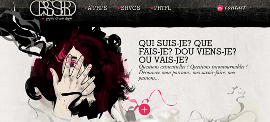
Crssrd
A really artistic welcome area that shows off the artist’s talents. The grungy illustration fits in perfectly with the surrounding textured website and typography. Even without analyzing the copy of this welcome page it had to be included as an example of how a great central design can make a welcome area memorable. Remember – a picture can often be worth 1000 words, and in this example no text is required to showcase the designers skill.
(rb)
Image by Robert Fotograf from Pixabay























Send Comment:
21 Comments:
More than a year ago
Wow! Great stuff, Thanks for sharing, very creative stuff
More than a year ago
very very good examples of landing pages. thanks :)
More than a year ago
Thanks for featuring our website :)
More than a year ago
Great article! I have been considering revamping our corporate page for some time and your links have given me food for thought.
More than a year ago
Nice roundup, that kendraschaefer site's quite funny.
More than a year ago
Brilliant article. Ideas are so simple. White space sells!
Thanks for sharing.
More than a year ago
Wow! Great stuff, thanks for sharing!
More than a year ago
Thanks for all the great comments guys! I'm really glad you enjoyed this article and hope you got some inspiration from the examples.
More than a year ago
Yeah I agree that most welcome areas could be more unique. The copy has a lot of impact, as personally if I do see some welcome copy that's different, funny or intriguing it really stands out against the crowd and engages me. That being said, it can be difficult to strike a balance between unique and informative. Some welcome areas may have quirky unique text, but if they're not telling you anything about the site it may be a turn off for visitors.
More than a year ago
Nice collection! Thanks for featuring both my website and labs page! ( & )
More than a year ago
Awesome article with some lovely websites.
Proud to be showcased with fellow designers. Thanks for showcasing WebMunky.com :)
More than a year ago
I agree with you. Also saying "welcome, howdy etc. is wasted space IMHO. Especially if your name is in your logo. Chances are they will know your name already. I think the examples that explain the "what" rather than the "who" are much more successful.
More than a year ago
Great article, love the examples too. Thanks for sharing.
More than a year ago
Great collection of sites, thanks for sharing
More than a year ago
Nice collection.
More than a year ago
Great collection! Thanks for the share, I've never been to this site before but I love the natural theme!
More than a year ago
Good article and some good examples. One thing I think is missing from the list is "designing for your target demographic". For example, if your most important audience is people over the age of 50, using a grunge style would be a bad idea.
More than a year ago
Great collection. It would have been nice to mention do's and don'ts in welcome pages.
More than a year ago
I like the posted sites man. A lot of good ideas start floating. lol
Tried to incorporate the same idea for BuyHookah.com (a site i improved lately)
More than a year ago
Thanks for the great article! I love the mediagerm landing page, very creative. Also, love the new design guys at Noupe!!
More than a year ago
Great collections!