Forms.
I know, your pulse doesn’t start racing with excitement.
Forms get a bad rep.
Love or hate them, from registration to collecting payments, forms are here to stay. Forms equal input, they mean collecting data from anyone who interacts with your business.
A form is successful when it engages rather than frustrates your user, and if it provides you with the data you need.
A form consists of different parts. And building a form that does what it needs to do relies on rules, principles, logic — and a bit of play.
Here are some ways to structure online forms that actually convert.
Deceptive simplicity
Forms look simple. A few fields, a bit of text, a couple of buttons. Is there really much more to it than that?
Well, yes.
A successful form feels simple for the user. But behind the apparent simplicity lies a spectrum of decision-making, tweaking, careful wording and thoughtful strategy.
All these are necessary to create a form that garners the useful data you need. Without them, forms won’t yield what you need.
Like a Lego construction, a good form relies on architecture. That means strong foundations, the right kind of structure and attention to detail.
There are five essential rules to keep in mind when you build a form.
1. Start with questions, bottom up
As in a Lego game, the organization of your form needs to be informed by questions. It’s questions that build a form from the ground up.
That makes listing questions a good place to start.
I always encourage our users to start by writing down all the questions that come to mind when thinking about what a form needs to achieve.
Make them proper questions, with a question mark at the end. Give yourself time to do this. You may want to ask colleagues to join you and add their questions.
2. Remove any questions you don’t need
Removing the unnecessary questions is essential because you need the cooperation of your users — the people who will be taking the time to fill out the form.
What are the chances of these people having a long time to spare on something they don’t see the point of? None.
So don’t offend your users by wasting their time. Cut with an eye for what you really need to know. Then rephrase each of these questions as succinctly as possible, without losing an inch of clarity.
Every time your user gets confused, doesn’t understand a question or doesn’t know what’s expected of them, the risk of them giving up increases dramatically.
Every additional question will affect a form’s conversion rate, and a user’s likelihood to complete it. If you don’t need it, don’t ask for it.
3. Organize questions into groups
Once you have trimmed and streamlined your list of questions, divide them into groups and subgroups where necessary.
Organizing questions in groups will help create logic and flow, which will support your user in progressing through the form. It will also make questions more digestible, and lower the overall cognitive load.
Some other affordances of grouping questions:
- A large form can be divided into multiple sections.
- Grouped questions can be skipped by setting a single Skip logic condition
- A set of questions can be repeated for every unit, such as members of a household
- A set of questions can be displayed together on the same screen during data entry
You can mark the ‘theme’ of each group (i.e. what holds the questions together) with a short, informative header at the top of each section (e.g. contact details — personal details — work experience). This lets the user quickly scan the form to see what type of information they will need to provide.
All this will lead to groups of succinct, thought-through, clear questions. Some of these groups will be bigger, some small. You may have some orphan questions. All good.
4. Sequence your questions skilfully
Even if you have more than one question per page, your user will have to answer them one at the time.
Every section in the form should nudge users to the next one. That means you need to order groups, and questions within groups, in a sequence that is logical and makes sense.
So ‘Who are you?’ will come before ‘ Where do you live?’ which will, in turn, come before ‘What’s your work experience?’
On a payment form, you would start by taking details, follow with shipping information, and finish by asking for payment. If you asked users to pay first, they would be far less likely to do so.
Sometimes, questions will need to be asked in a specific sequence because they don’t make sense out of context.
As a general rule of thumb, try and stagger questions from easy to hard. This helps users move through questions more quickly and motivates them to continue.
Remember to be ruthless when it comes to eliminating unnecessary questions. You can always ask optional questions after a form is completed — chances of getting a higher response rate this way is always likely to be better.
For example, questions like “How did you first hear about us?” or “Would you like additional information about our services?” feel less invasive when presented as an optional follow-up question.
Each of your questions is half of a whole. The other half is provided by your users. You can see the way you build your form as the blueprint for a conversation, or a dance.
The key thing to keep in mind is that there’s someone else you need to engage with, and who needs to engage with you. That’s what’s going to drive your decisions on how to order the questions on your form.
5. Create movement in your form
Your next, and final, rule follows from this: there needs to be movement in your form.
Each bit needs to prepare your user for the next one. In essence, it needs to become a story that you co-write with your users.
The way you construct and order your form needs to have some kind of narration woven within it — and that narration will be an important part of what makes your reader hanging.
Who is going to be your conversant who will co-create the form with you? That’s the question to keep in mind as you build the form. Forms are not just about mindless data — they are about people with minds.
Key components of a form
A form has one overarching goal — to get the recipient to completion. Part of guiding them down this path is explaining
a) what type of form they are filling out and
b) what they can accomplish by filling it.
Realistically, few people will take the time to read a detailed description of a form’s purpose, so you need to capture it concisely. That’s why the title is so important.
Make your form title is absorbing, informative and apt. Don’t waste words; get to the point. You want your reader to remember the purpose of the form as they continue to fill it out.
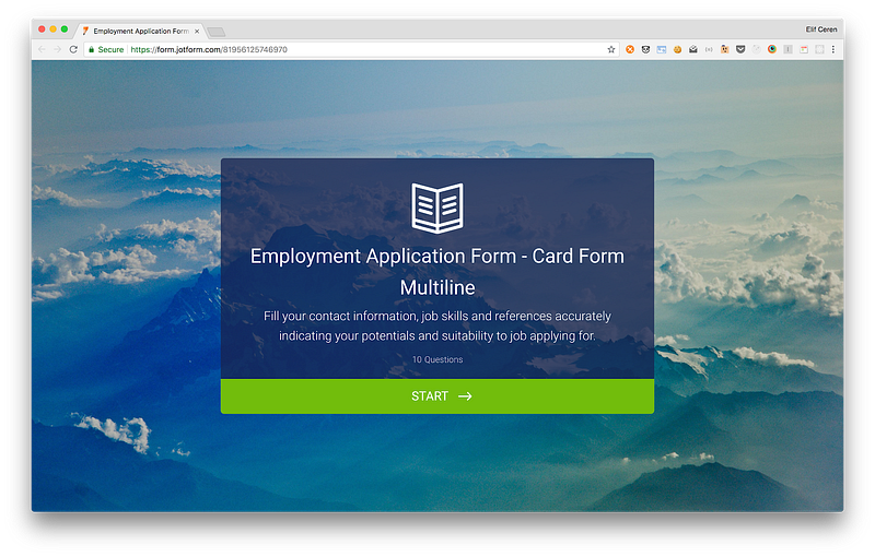
A good form doesn’t start abruptly: it will have a welcome page. It won’t end abruptly either: it will finish with an expression of thanks. Make sure you don’t skip these two parts.
Some forms require more effort than others. For instance, some will ask the user to check external bits of paperwork (e.g. passports). Some will take a substantial amount of time to complete.
Don’t spring this upon your user halfway — this will annoy and demotivate them. In the case of a more elaborate or more demanding form, give a brief, upfront description of what they can expect right at the start.
Some more technical stuff
Types of Input Fields
Selecting the right divider
Choosing the right type of divider for your form is essential. Depending on a form’s length, this could be very minimal.
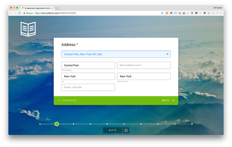
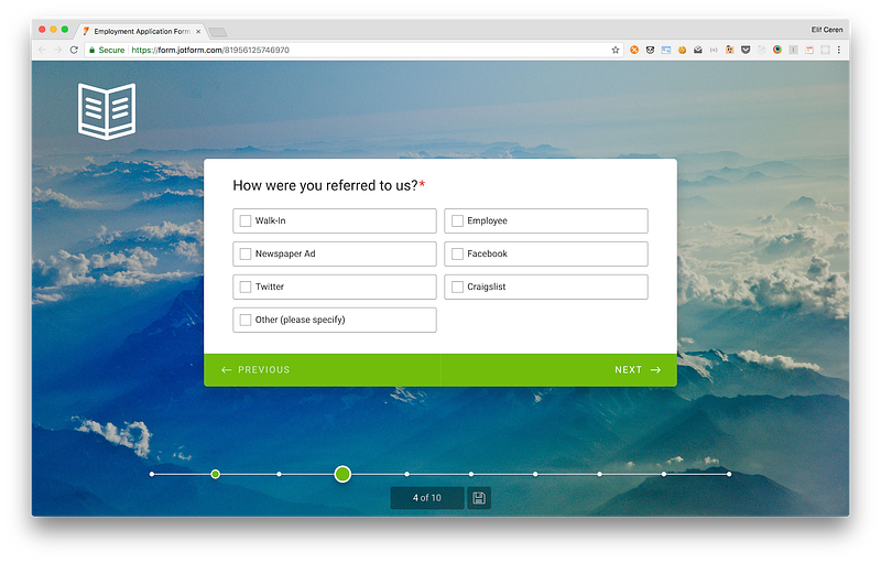
Our new product, Jotform Cards, presents each question separately. But in the case of traditional forms, placing dividers in (to visually break sections up) reduces overwhelm.
Communicating distinctions between groups don’t require much visual difference. In fact, too much contrast can distract people and stop them from being able to scan the form. The focus should always be on a form’s content rather than its presentation.
As information design expert Edward Tufte points out:
“Information consists of differences that make a difference.”
Basically, any visual element that isn’t actively signifying something makes it worse.
Multi-page or single page?
Is it better to group each topic on a single page or divide them across a series of pages? How many pages should there be? The answer is… it depends.
Some types of forms work better with multiple sections on one page and others work better with various pages, depending on length and content, and the users’ mental model.
When distinct topics are short enough to fit into a few sections, a single page will probably work best. When each section begins to run long, multiple pages may be required to break up the conversation.
When we released Card Forms, the Jotform Data Team conducted research about conversion rate (Form View/ Successful submission rate) of our new cards. The study showed that even in short forms (up to 7–8 fields), asking questions in a single page provided a better conversion rate.
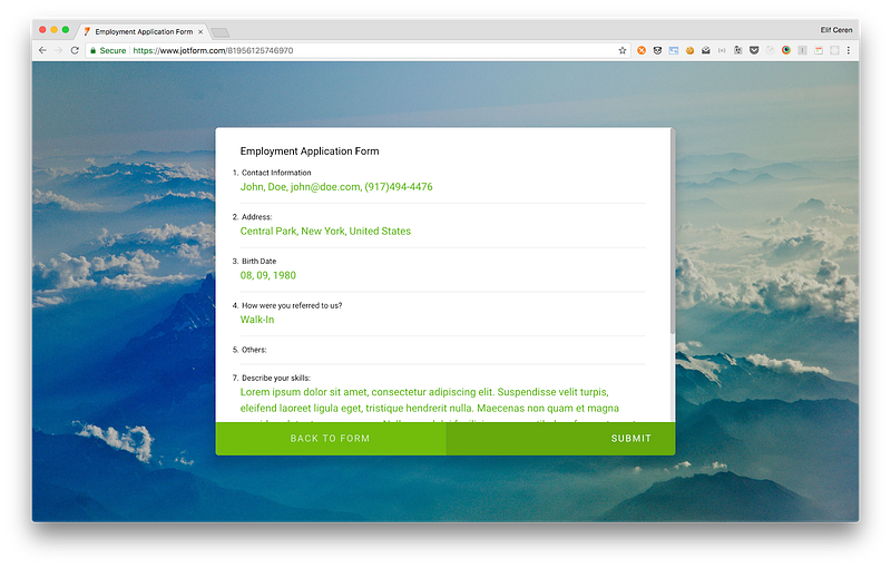
Because of this set-up, we also added a summary page and a progress bar. This displays how many questions there are remaining and how many have been completed, motivating users and encouraging them to finish the form with the endowed progress effect.
Distinguish between primary and secondary actions
Grouping questions also have the advantage of distinguishing between primary and secondary actions. Primary and secondary actions let users complete forms without any issues.
A primary example encourages you to complete the form. A secondary action takes you back when necessary. The most common example of primary and secondary actions is moving forward or backward.
But there are also use cases for secondary actions such as Save for later, preview, export and reset.
Advantages of using input groups and flexible inputs
Finally, there is the question of flexible input vs. form validation.
Form validation = required field, for example, someone’s name.
These should always be visible. However, when an input is flexible, it can be useful to offer the option of collapsing the field to minimize overwhelm.
Carefully consider the right input field for the type of answer you’re looking for. Could it be yes or no? A predefined selection?
Whenever possible, give affordances to help people answer questions quickly. Having predefined answers or yes/no questions will also help you collect and analyze data more easily.
You can always add an ‘other’ section if necessary.
Equally, remember to indicate which fields are optional and which aren’t. The (*) symbol is well-understood to mean ‘required’.
Associate required or optional indicators with input labels to demonstrate which questions need to be answered. The (*) symbol is well-understood to mean ‘required’.
Final thoughts
Yes, forms exist to gather data — but they do so through a collaborative process between you and your users. Skillful form building is not a mechanical process: it involves reflecting on what you are trying to achieve, and what’s the best way to achieve it.
That means, amongst other things, thinking about which data type will be most useful to answer the questions at hand. Focused forms are most likely to yield actionable results.
Designing an effective form is a creative process, but forms are no place to get fancy. Keep it as simple, short and focused as possible. Good luck.












Send Comment:
1 Comments:
More than a year ago
Great article! You mention having optional questions after submission. Do you have a sample of this? Would it be an entirely separate form?