How to improve the signup process
- Be up front
- Make the process quick and painless
- Offer incentives
- Give them options
Generating signups is key to creating and retaining a customer base. Online signup forms allow you to quickly collect contact information to stay in touch with people, update them about special events, or send discounts for products and services. As rudimentary as the signup process may seem, it remains one of the most effective ways to build and maintain relationships with your customers.
The challenge, then, is getting people to cross that signup threshold. Most modern consumers are being inundated with emails, which can make them hesitant to sign up to receive more. It’s why designing the best signup experience possible is critical if you want to stand out from the crowd as an organization people actually want to connect with.
Be up front
For any site visitor, choosing to sign up for an e-newsletter or other service is a split-second decision. In its 2021 Digital Experience Benchmark report, the digital analytics company Contentsquare found that users spend an average of just 54 seconds on a web page.
Time is precious for your consumers, so make sure you provide ample website real estate for your signup form to at least give yourself the opportunity to keep the conversation going.
In addition to making your form visually appealing, you want to design it so that the call to action (CTA) is front and center. Forget being bashful — be up front about what you’re asking from potential customers. Well-placed “Sign Up Today” or “Join Our Mailing List” copy attracts attention and will improve your chances of attracting a signup.
Make the process quick and painless
The signup process asks a lot of new users, even when it seems to ask very little. Think of it this way: Just by offering their contact information, someone is giving you permission to directly communicate with them and consider them a potential or returning customer. The best way to assuage any anxiety they might have about moving forward is to make the process smooth.
Omnisend, an email and e-commerce marketing platform, notes you can increase your conversion rate for email signups up to 10 percent if you ask for no more than three pieces of information — a name, email address, and one other data point (birth date, gender, metropolitan area, etc.) are all you need to get the connection started. Save the deep dive for when they’re an established customer, when you can conduct more in-depth surveys and research.
Offer incentives
Who doesn’t love a freebie? Adding a free incentive for an email signup can increase your cost per acquisition, but, done tactfully, it can draw an even greater number of leads. These giveaway items, also referred to as lead magnets, bolster your email lead generation and energize your signup process.
Depending on your business, you can explore a variety of incentives. Clothing and retail stores often provide a one-time 10 percent coupon for those who sign up to their email list. Companies that want to show expertise and thought leadership in a B2B space can offer free e-books, guides, or even webinars to nudge users down the signup funnel. No matter how they fit your business, incentives are a great, eye-catching way to increase conversions.
Give them options
In the spirit of keeping your signup process simple, consider providing signup options outside of routine manual entry. Automated prefilling of data makes it even easier for people to provide contact info through their social media or email.
For example, many sites now offer ways to sign up using their Facebook or Gmail accounts. With a simple click, users can provide you with the information you’d normally get out of a signup in even less time. It’s one of the most straightforward ways to cut excess steps in the signup process.
The signup process with Jotform
However you plan to improve your signup numbers, a great signup form builder is essential to making your goal a reality. Jotform gives you the power to generate top-notch forms that increase your chances of becoming a mainstay of people’s inboxes.
With a broad selection of signup form templates to get you started, you can customize forms with your own branding, add as many entry fields as you desire, and even incorporate widgets like dynamic textboxes and CAPTCHA tools. You can also embed forms in your website or landing page to get a visitor’s attention right away.
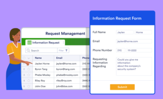
You’ll also need a way to organize all the information you’ll collect through these signup forms. You can connect your forms to Jotform Tables to easily track and manage data. Organize responses by submission date, personal information, and lead potential, all from one central hub that’s accessible to your whole sales or marketing team.
To master the signup process, you need a solid understanding of user behavior. With careful attention to detail, appreciation of your customers’ interests and attention spans, and the right forms, you can improve your signup rate and start building up an engaged and informed customer base.
















Send Comment: