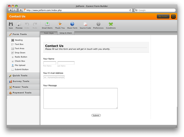
When I show Jotform to someone one of the most surprising things they find about Jotform is that there is no marketing homepage. Jotform’s homepage is, well, Jotform. It is the Form Builder. When you type Jotform.com you do not need to navigate to another page.
You can start using the app (i.e. creating form) right away.
Whenever we need to make a decision about our product, we always ask ourselves a single important questions:
Does it make things quicker for our users?
We always emphasize the importance of making things easier but I think “quickness” is probably a more useful term for practical purposes. If something can be learned quickly, it is probably easy. If you can create your form and set it up on your web site quickly, then it must be also easy to use.
You can’t have a slow web app that is also easy to use. If it is slow, it is not easy. It is painful.
That’s why when we need to make a decision, we always choose the “quick” option. Some of the decisions we made can be explained because we chose the quickness path:
– We have the form builder right on our homepage, we have no marketing homepage.
– There are 40 types of form field types you can drag and drop to your form.
– We do not require registrations to create live forms.
– Heavy use of javascript on our tool. e.g. AJAX to save and retrieve forms and wizard, drag and drop support, right click options.
– You can create a form, copy it to your web site right from Jotform.com homepage and never visit any other web page on our web site ever.
– If you have previously entered your email address on another form or your account, any new form you create will also send emails to that email address by default. You do not need to go through the same steps again.
– We use load balanced servers, CDN, gzipping, sprites, minifiers, cachers and 100 other things that improves the load time another couple of milliseconds.
– You can right click a question to clone it, or right click a form to make an exact copy.
– We have many ways to do the same things. You can accomplish something by right clicking on it, clicking on it on the toolbar or dragging it with your mouse. So that whichever is the quickest way to do it for you, you have the option.
– We even have a full screen mode. Haven’t you already tried that button at the top right corner of form builder?
Of course, it is easy to mess up and make things confusing instead of quicker. We have to be very careful. One of my favorites ways to find out if a change we make is working out is to do user testing. We find people who have never seen our product before and let them use it for half an hour.
We do not help them or suggest things, we simply record the screen and ask them to think out loud to the microphone. We then gather around, get pop-corn (not really) and watch the test. It is sometimes very hard but it is always useful.
One of these tests we watched a user create a form for more than half an hour without ever clicking on the save button once and then accidentally close the page.
You can’t imagine how much painful it was for us.
The next day, we implemented the auto-save functionality!









Send Comment: