Creating a waitlist landing page
- Start with the page design
- Include key elements for your waitlist landing page
- Perfect your CTA
- Create a signup form
- Add a thank you page
A landing page is a key element of email marketing. Designed to convert leads, landing pages can help you build your email list, sell products and services, and even boost your newsletter subscribers.
While it’s common to offer your leads instant access to gated content — like downloads or webinar recordings in exchange for their signup and contact information — there are some instances when you might want to gather lead contact information only.
For instance, when a product or service is in the prelaunch phase, creating a waitlist landing page lets you drive excitement and anticipation around the offer while collecting contact information for interested leads. Then, when your product or service is ready for launch, you can follow up with those leads.
How to create a waitlist landing page
Whether you’re preparing for an e-commerce product launch or gauging the interest of potential customers before launching a special event or service, it’s important to create a waitlist landing page that’s designed with your target audience in mind.
Start with the page design
As you create your landing page, focus on a clean, appealing page design that will help convert leads. There are many landing page builders that offer landing page templates to help you get started.
When designing your page, focus on colors that reflect your branding, and incorporate your logo so the page clearly reflects your business. Avoid making the page too overwhelming. Use design elements to draw visitors down the page, guiding them to the email signup and opt-in form.
Take a look at some landing page examples to see what works. Most successful landing pages have a relatively clean design, and they use bright pops of color to pull your attention to the essential sections and the information you need to know.
Include key elements for your waitlist landing page
Your landing page needs to clearly showcase your offer, whether that’s a new product, early access to a limited-time offer, or the option to be one of the first to access a special tutorial that’s not yet released. Photos, videos, and clear copy will all help drive excitement around the offer.
Make sure that you also use headers to keep the page organized. It can be tempting to put lots of information on the page, but you don’t want to risk readers skimming and missing key elements. Headers, bullet points, bolded statements, and quotes in different colors will draw readers’ eyes down the page.
You can also include a popup that’s triggered when site visitors are about to leave the page. This popup gives your visitors a second chance to consider signing up for the offer, and it’s one last opportunity for you to drive home the offer’s value and the importance of signing up.
Adding a countdown timer to the page can also help to create a sense of urgency, potentially driving conversions (and excitement).
Perfect your CTA
Your call to action, or CTA, is essential to the success of your waitlist landing page. You need to have a clear call to action that makes it easy for visitors to understand exactly what type of action they should take. An eye-catching CTA button will help prompt visitors to complete your signup or opt-in form.
Create a signup form
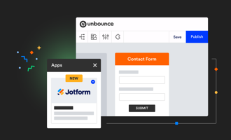
You can use Jotform to create an opt-in or signup form, and then you can embed that form within your landing page. Jotform features thousands of templates you can use and customize to your needs, or you can build your own form from scratch with the easy drag-and-drop form builder.
When you design your form, include only the form fields you absolutely need. In many cases, these fields will include an email address and a first name. The shorter your form, the greater your conversions tend to be. Longer forms that require excess information can contribute to page abandonment and lost leads.
When your site visitors fill out your form, Jotform will automatically capture that information and input it into a Jotform Tables spreadsheet. From there, you can access and review the information, and you can add it to the appropriate email marketing lists or groups.
Add a thank you page
In the case of a waitlist or coming soon landing page, it’s particularly important that you have a thank you page that includes additional details. The content can be brief, but it should highlight the fact that you’ll reach out to respondents by email once the offer is ready. You can use this thank you page to prepare your audience for what will happen next, and that can help reduce confusion and follow-up inquiries.
Don’t forget to take the time to A/B test the waitlist landing page to determine which elements, like your copy or your CTA, are most effective. When you take the time to create a waitlist landing page, you can increase your conversions and ensure that your upcoming launch will be a success before you even release the product or service.
Photo by lynying Ju on Unsplash


Send Comment: