Few people put much thought into their prelaunch “coming soon” landing page. Some don’t even have a page at all.
When done well, these landing pages can contribute a great deal to the success of your launch. Putting some effort into that “coming soon” landing page is how you get a head start building your email list, gathering feedback from potential customers, and generally getting some marketing momentum before your product is available.
In this post, we detail the six elements of great “coming soon” landing pages, including examples.
6 elements of a successful coming soon landing page
Sometimes referred to as a prelaunch page, a coming soon landing page is the perfect place to direct traffic before an official launch. Since a prelaunch page only sticks around until your product or service goes live, you’re free to make the page as succinct, or as detailed, as you want.
Whatever the length, your prelaunch page needs to include these six key elements:
- Describe what’s coming. Customers want to know about your product or service and when it will be available.
- Give a clear value proposition. Don’t expect customers to wait for a product unless they know how it will solve a problem they have. What benefits can they expect that no competitor offers?
- Offer incentives to join a prelaunch email list. When a customer gives you their email, they have knowingly entered your sales funnel. Offer incentives, such as discounts, limited-time offers, or social proof (i.e., “50 preorders so far”) to persuade them to join your email list.
- Encourage customer feedback. Customer feedback is as valuable prelaunch as it is when your business is up and running. Whether you use a simple contact form, a chatbot, or a live chat, have some way to collect customer feedback so you can fine-tune your messaging before going live.
- Encourage visitors to share the page. Generating buzz about your coming soon page is a big step toward a successful launch. Make it shareable to all of the social networks your audience frequents.
- Provide a compelling call to action. A prelaunch call to action (CTA) is how you encourage potential customers to continue through your sales funnel. Invite them to join your email list, download a white paper, or like your page on social media.
To better understand how these elements come into play, we’re including a half dozen prelaunch landing page examples that incorporate clean design with purposeful messaging.
Keep it simple
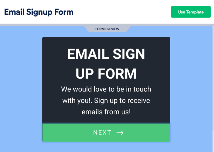
Don’t complicate a prelaunch list. The purpose of your prelaunch is simply to collect email addresses of would-be buyers. Just embed an email signup form on the landing page.
Pro tip: Check out some of our email opt-in form templates.
Create intrigue
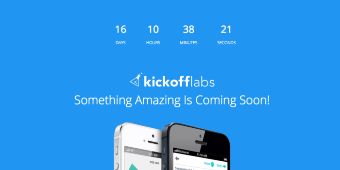
A bold headline, paired with product-specific imagery, gives a clear value proposition and an incentive for people to sign up early. There’s no need, at this stage, for a lot more copy on the page. A countdown timer provides another reason for people to sign up ahead of the launch.
Get people excited
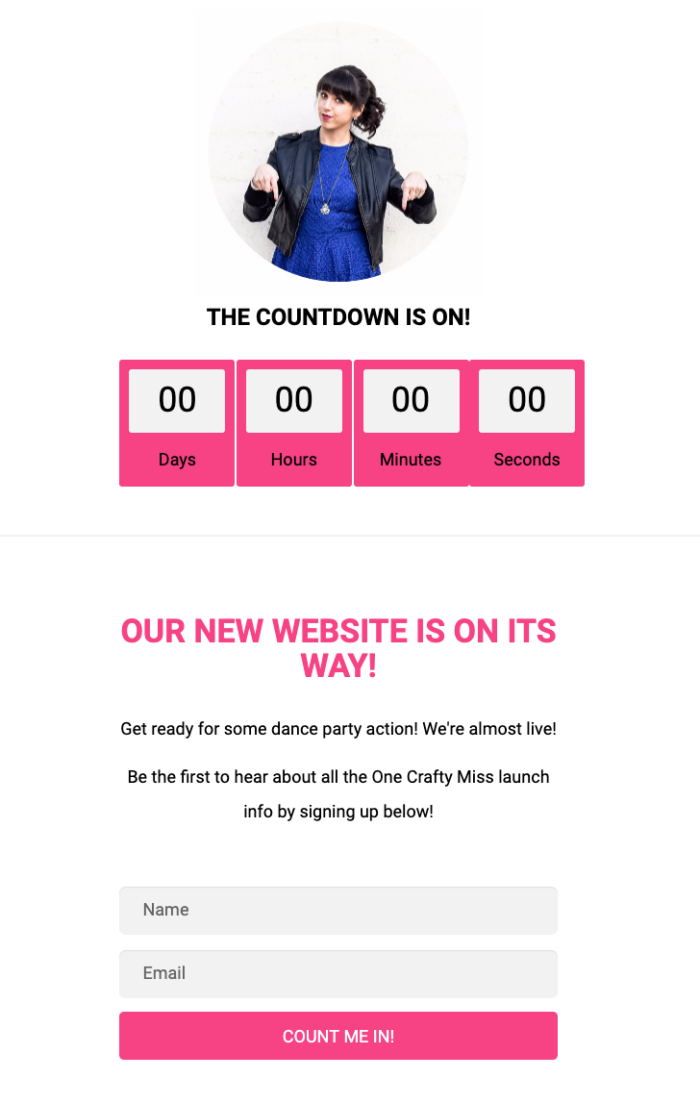
Website redesigns can be seen as boring and technical. Some clever copy on a coming soon page is a proven way to spice up the launch (or relaunch). The example above doesn’t have a ton of copy either, but “get ready for some dance party action” is enough to get people’s attention.
Use video
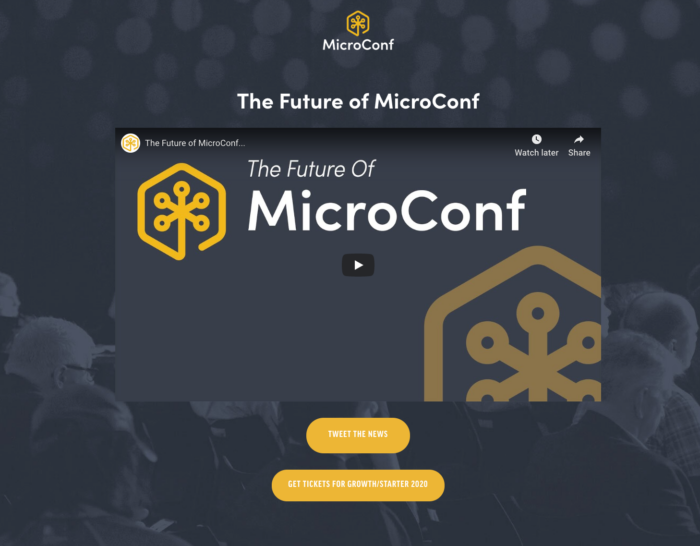
Video has become the king of online marketing, including during the prelaunch phase. If you or someone on your team is charismatic on camera, this is a golden opportunity to talk about the launch and what’s ahead.
In this example above, MicroConf does a good job of building excitement by sharing what’s ahead with all of their events in 2020.
Be whimsical
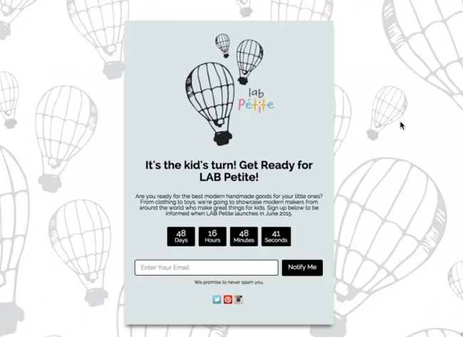
With its whimsical design, LAB Petite effortlessly includes many elements of a successful coming soon landing page. The page opens with a direct headline that tells a visitor the target audience is children and their parents. The copy succinctly explains precisely what is coming soon. A bold countdown shows visitors when, right down to the second.
The bottom half of the page offers both a signup form and social links to share the page with friends. The hand-drawn balloons are whimsical and subtle; they don’t distract people with loud colors or prints.
Add exclusivity
Exclusivity is the most effective tactic to get people excited ahead of the launch. This sounds counterintuitive, because you want to sell to whoever is willing to buy, right? But if you describe who your product or service is for, basically telling everyone else that it isn’t for them, you’ll create a higher perceived value.
Most people make their prelaunch marketing generic in an attempt to appeal to everyone. But when you try to appeal to everyone, you offer a watered down message that appeals to no one. Even a prelaunch marketing landing page has to keep in mind the customer persona your product is intended for.
Your prelaunch page is a valuable opportunity to get your business off to a strong start, even before the product is available for customers to buy. Putting in the effort to create a catchy call to action, encouraging customers to join your email list, and inviting feedback will give you a big head start on success.






Send Comment: