If you’ve ever created or completed a survey or signup form, there’s a good chance you’ve encountered both checkboxes and radio buttons, as they’re both ways to make selections. And though they’re similar in some ways, they’re different in others — including their appearance and their uses.
Checkboxes are, well, square boxes you can check (or “X”), while radio buttons are circles you can select. And though you may prefer to use the one you consider more aesthetically pleasing for your survey, it’s important not to make your decision based on appearance alone.
When to use checkboxes vs radio buttons
Let’s imagine you’re a restaurant owner looking to collect feedback about a place you recently opened so you can find out which comfort dishes are most popular. To decide whether to use checkboxes vs radio buttons for your restaurant survey, first establish what type of answers you’d like to receive — a simple yes or no or as many options as desired?
You can, of course, ask questions that provide a mix of both types of answers on your survey, but bear in mind that scrambling them may confuse your respondents and ultimately warp your survey’s results. If you’re going to include both, group similar questions together or use subheadings.
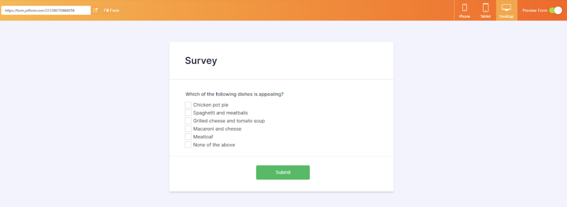
Because checkboxes are mutually inclusive — enabling respondents to choose multiple answers — they’re best for questions with a list of possible answers, as below.
Which of the following dishes is appealing? Select all that apply.
- Chicken pot pie
- Spaghetti and meatballs
- Grilled cheese and tomato soup
- Macaroni and cheese
- Meatloaf
- None of the above
Since the checkboxes are independent of one another, choosing “chicken pot pie” won’t deselect “spaghetti and meatballs.” (In fact, users can choose all five dishes if they can’t make a decision, but hopefully, for the purposes of your survey, one or two will suffice.)
On the other hand, radio buttons are mutually exclusive — i.e., it’s only possible to make one selection — making them most suitable for yes-or-no questions. So, unlike checkboxes, clicking an unselected radio button will deselect your previous choice.
When to use checkboxes vs radio buttons: Best practices
When it comes to best practices for using checkboxes vs radio buttons, there are a few guidelines to consider:
- Use standard, common visual representations for both — like square boxes for checkboxes and small circles for radio buttons. They’re easy to recognize and use.
- Lay out your options vertically (not horizontally) for easier navigation and readability and less likelihood of confusion among and errors from your respondents.
- Avoid negations for checkbox labels. For example, if your restaurant survey asks, “How would you like to be notified of future promotions and specials?” don’t list one of the checkbox options as “Don’t email me.” Instead, offer “Email” as one of the options and let your respondent decide whether or not to select it.
How to implement checkboxes and radio buttons with Jotform
Now that you have a better understanding of checkboxes vs radio buttons — and when to use them — here’s how to implement them using online form builder Jotform.
Jotform is a user-friendly, powerful, fully customizable, and completely code-free tool. And whether you need to build a form (like a survey or signup sheet), table, PDF, or app template, you can do so easily from one centralized, streamlined platform — by starting from scratch or using one of thousands of premade templates.
Here’s how to add checkboxes to your next Jotform survey:
- First, go to Jotform’s Form Builder and select the form you’d like to add checkboxes to.
- Once you’re happy with your form’s overall style, theme, and layout, click the Add Form Elements button in the left corner of your screen.
- Click the Widgets tab.
- Search for the word “checkbox.”
- You should see a list of different checkbox styles — including Flat, Polaris, Button, and Line. Cycle through a few to see which one you like best. (The Square Checkbox is one of the most recognizable types for surveys, so let’s use that version in this example.)
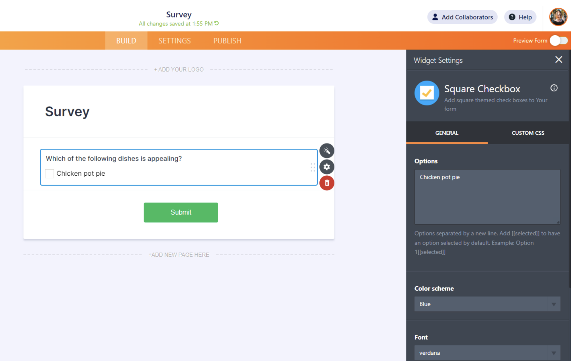
- In the Square Checkbox field, type in a question (e.g., “Which of the following dishes is appealing?”)
- Type in your answer choices (e.g., “chicken pot pie,” etc.) in the Options field under the Widget Settings tab on the right side of the Form Builder.
- In the Widget Settings box, feel free to change the font and font color of your question and answers.
- When you’re done, click the green Update Widget button.
- Toggle the Preview Form button in the top right corner to see what it looks like on a phone, tablet, or desktop.
- Toggle the Preview Form button again to get back to your editing screen.
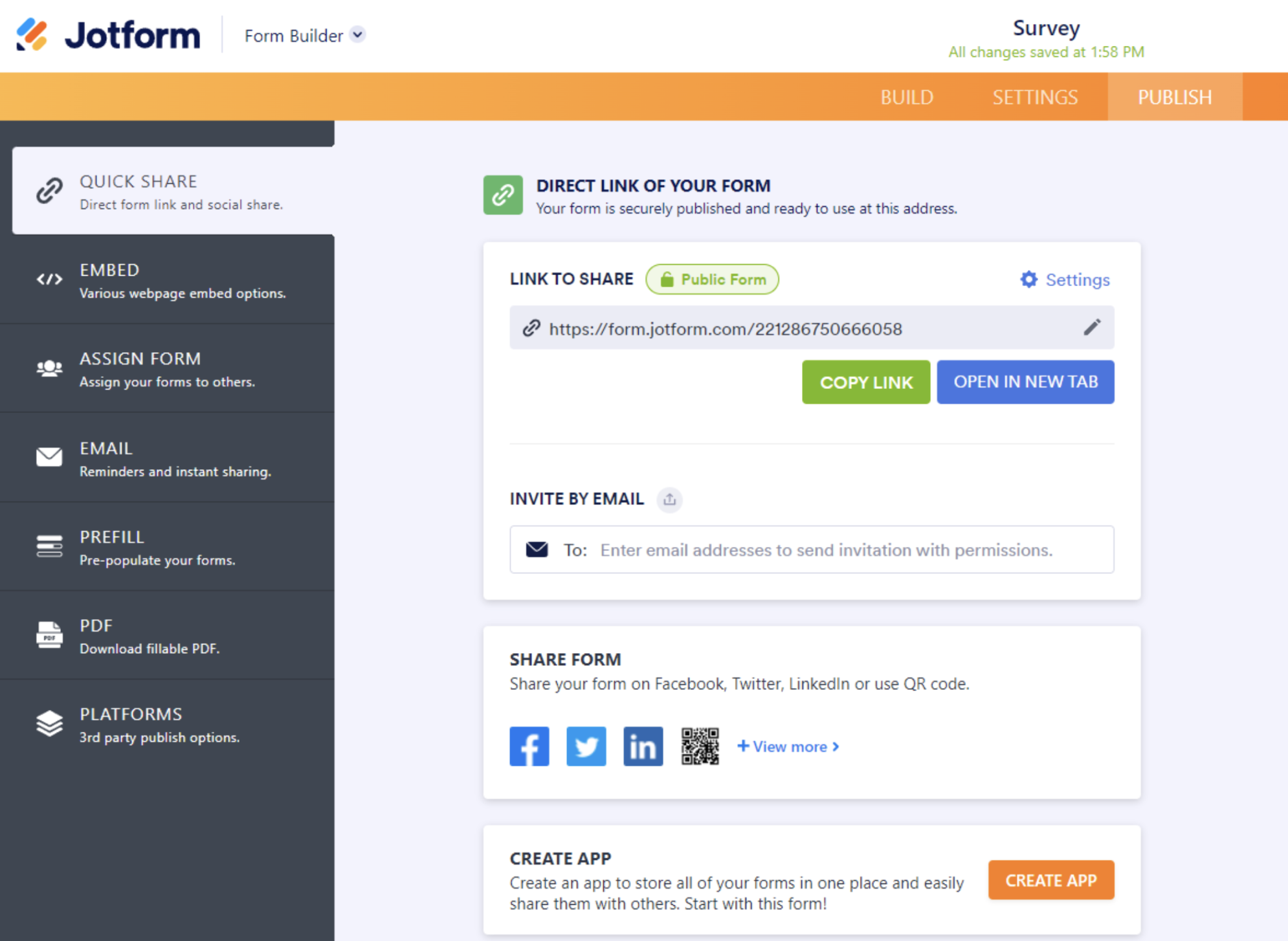
- Finally, add the rest of your checkbox questions and answers, then click Publish in the center of the Form Builder’s upper menu to share, embed, or print your form.
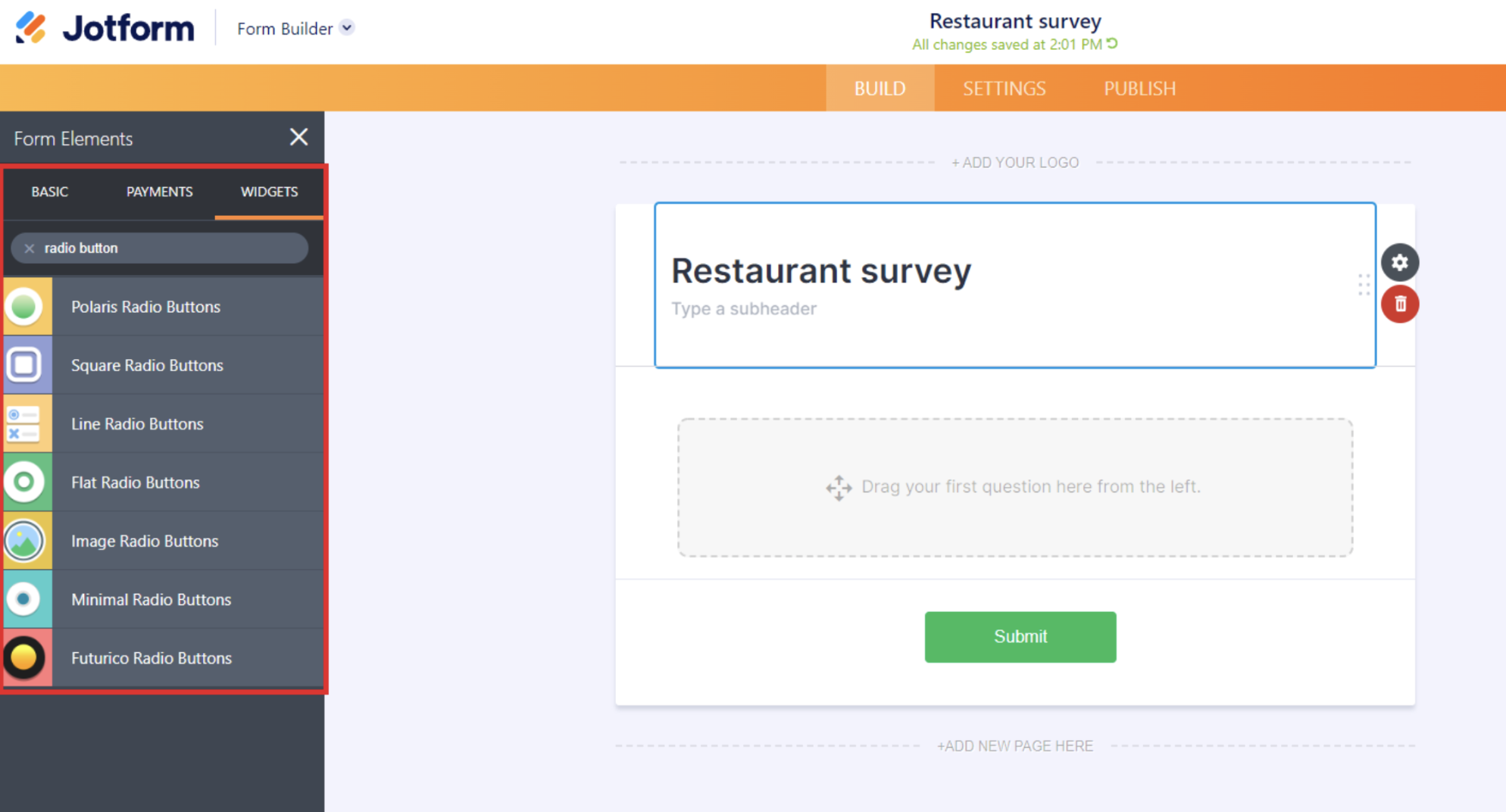
And for radio buttons, follow the first three steps from the checkbox how-to, but then complete the steps below:
- Search for the phrase “radio button.”
- You should see a list of different radio button styles — including Polaris, Square, and Line. Choose the style you like the best (for our purposes, we’re going to select Flat Radio Buttons, one of the most recognizable types).
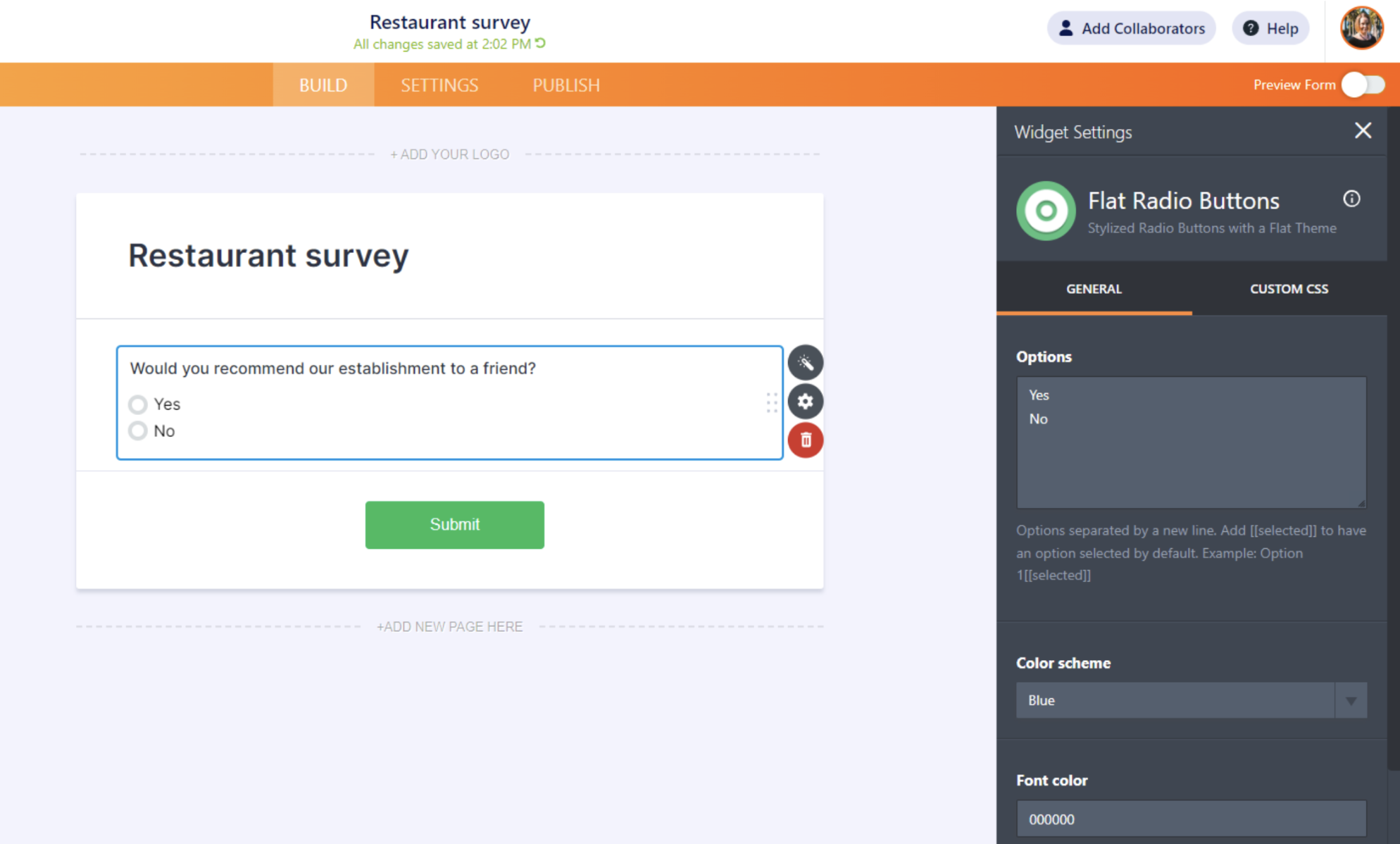
- In the Flat Radio Buttons field, type in “Would you recommend our establishment to a friend?”
- On the right side of the Form Builder, you should see an Options field under the Widget Settings tab, which is where you’ll type “Yes” and “No” vertically, one per line.
Again, follow steps eight and nine from the checkbox how-to to finalize your radio buttons survey.
While checkboxes and radio buttons offer similar benefits in online forms and surveys, they function quite differently. Now that you know the differences between the two — as well as best practices for both — you’re better equipped to use them correctly in your forms and surveys and collect valuable, actionable feedback for your business.

















Send Comment:
1 Comment:
More than a year ago
How to get these via API?
When i trigger multiple checkbox values, with comma separated, it does't get assigned as tags, its just comes as a text field with combined values.