How many times have you noticed something while you were shopping at the grocery store that made you leave your full cart in the middle of the store and run out the exit? If the answer to this question is “never,” you’ve just identified a key difference between shopping at a brick-and-mortar retailer and shopping online.
Shopping cart abandonment has long been a problem for online businesses. It’s difficult to fully resolve the issue because of the many variables that cause people to abandon their online shopping carts before they finish a transaction.
However, it is possible to improve e-commerce shopping experiences and reduce cart abandonment. This article looks at what an abandonment rate is and gives several ways to reduce it.
Calculating the abandonment rate
Shopping cart abandonment is the percentage of your customers who leave an abandoned cart before completing transactions. You can calculate the abandonment rate by dividing the total number of completed purchases by the number of shopping carts that shoppers created during a given period.
You then subtract the resulting number from 1 and multiply that by 100 for the abandonment rate. For example, if you have 50 completed purchase transactions and 250 shopping carts created, your shopping cart abandonment rate is 80 percent.
50/250 = .2
1 − .2 = .8
.8 x 100 = 80 percent abandonment rate
A typical abandonment rate fluctuates between 60 and 80 percent. According to the Baymard Institute, a web usability research organization, the average shopping cart abandonment rate globally in 2019 was 69.57 percent. While it’s sobering to visualize roughly seven out of every 10 of your potential customers bailing on a transaction, there are measures you can take to curb this. Here are six of them.
6 ways to reduce shopping cart abondenment
1. Visual aids
Customers often find it frustrating when they click a submit button and another screen appears instead of a message telling them the item they purchased is on its way.
This issue for people isn’t the new screen exactly — it’s that they didn’t expect the new screen. Create a less complicated checkout process by giving customers a visual road map to follow. This will let them know the process for completing a transaction in advance and reduce their hesitation to move forward. LandsEnd.com provides a great example.
2. Store vs checkout
On the back end, an e-commerce store and the checkout are sometimes segregated for security reasons — but this doesn’t mean the user experience can’t be seamless.
While you certainly want measures in place to ensure you’re protecting customer data, it’s jarring when your system takes customers away from the store and to a checkout page that looks different. Even with appropriate notifications throughout the process, this may create the opposite effect than you intended. Imagine shopping at Target — where red is the dominant color scheme — but arriving at the checkout line and suddenly finding everything blue.
You can solve this problem by simply coordinating the look and feel of the shopping experience with the checkout page experience. This includes carefully selecting colors, fonts, background, etc. — even if you use a different platform, such as Shopify, to handle checkout.
3. Make it more like real shopping
As a user shops at a brick-and-mortar store, they fill their cart as they go. It’s easy for them to see what they’re considering purchasing by simply looking into the cart. While this may seem insignificant, anything that you can do to make the e-commerce site experience similar to the in-store experience for your website visitors can help minimize the number of shoppers abandoning carts.
Online retailers can accomplish this by providing thumbnails along with a list of shopping cart items. Lowes.com uses a slide in/slide out format that keeps the user on a product page while giving them a view of their cart and showing them suggested items just below what they most recently placed in their cart.
4. Options, options, options
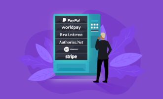
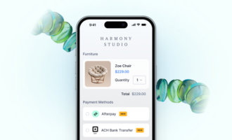
At a physical store, customers get the opportunity to pay with either cash or credit card. The more payment methods you can offer, the more customers you can acquire. Offering payment options like PayPal or Venmo gives customers the option of using cash-like equivalents.
Another feature that people like is the guest checkout option. A significant number of users want the ability to make purchases without having to create an account. Not having a guest checkout option accounts for 14 percent of abandoned shopping carts, according to researchers.
5. Easy return policies
A good return policy has two parts. First, make sure your policy minimizes the hassle for the customer if they want to return something.
Second, inform the customer of your return policy early in the shopping experience. This helps minimize the biggest obstacle to making a purchase: uncertainty. Minimizing uncertainty is essential when online shoppers want to buy things they can’t touch or see in person.
6. Free shipping
It’s so easy for people to switch to another site in the middle of a purchase. All they have to do is open another browser tab.
Capturing a customer could come down to the difference of just a few dollars. Offering free shipping — although it increases your shipping costs — can make your option more appealing and boost your customer conversion rate. This helps you make more profit in the long term, and it can even increase customer satisfaction.


















Send Comment: