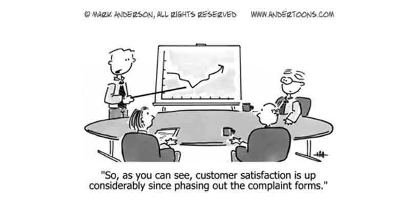
What is the biggest difference between an online store and a brick-and-mortar store? Other than on one you can shop with your underpants? I’d say the biggest difference is that on a brick-and-mortar store you can get feedback much easier. Shoppers will tell you when you are missing an item they are looking for, or you will know how they feel about things by just looking at their faces or how they behave. Maybe they will just look at the price tags and will leave. Maybe they will smile when they see a particular product. These things are very valuable feedback and you don’t get them on an online store.
Your website does not have to be an online store. Whatever kind of website you have, there is no “too much feedback”. You should find more ways to engage your users and get feedback from them. So, how can you get more feedback from users? It turns out the best way to get feedback is to place a feedback button on your site.
Pro Tip
The easiest way to collect customer feedback? Use Jotform to embed a feedback button in your website — for free.
Here are the reasons why you should add a feedback button to your website today:
1. It Shows You Care About Users
Having a feedback button on your site tells the world that you care about what people think. When I see a feedback button on a site, I know that if I send an email to the owner, I will probably get a quick response. If they care about user input, I will not waste my time by letting them know about a problem I see or an idea I have for them.
2. You will get more feedback
Users can be very fragile. Many will simply see a problem and leave your site without ever letting you know what happened. This is why we continuously do user testing. But you cannot catch every problem with user tests.
Let’s say your sign-up button does not work on Internet Explorer 9. What would you prefer to happen?
Parallel Universe No 1: Every day several users click on the sign-up button on your website and since it does not work, they do not bother to sign up. They simply leave your site for greener pastures. They think if signup button does not work, the contact form may also not work. So, why should they bother?
Parallel Universe No 2: Sign-up button does not work. They see a feedback button. They click on it and they type with big letters “YOU SUCK”, and they leave. When you receive 1-2 of these a day from your feedback button you start asking yourself what the hell is going on? You check your logs and find out what browser they used and the page from which these messages came. Then, you see that the button is broken on IE9. You fix it and stop bleeding several users a day to your competitors.
Pro Tip
Collect real-time customer feedback with Jotform AI Agents to gain valuable insights, automate workflows, personalize interactions, and streamline customer service operations.
3. You will be Notified About Minor Problems
A quick feedback button allows users to send you a message without leaving what they have been doing. This is very important. Because many people do not use tabs and afraid to leave what they are doing to go to your contact form. So, having a feedback button allows them to quickly contact you without leaving the page.
4. It’s a Backup for your Contact Form
What if your contact form is broken, or the link to it is not visible enough. Having a second way to contact you is always good.
5. It looks Professional
A feedback button will make your site look more professional. Jotform feedback buttons are completely customizable. You can customize the button colors, pop-up window colors and the form itself. Jotform also does not show a logo or a “powered by” message anywhere. So, it will look like a completely custom solution.
6. You can add a small survey
Feedback buttons are a great way to survey your users. In addition to asking for letting them know what they think about your site. You can add a few additional survey questions. You can ask things like “Would you pay if we had such and such service?” or “Do you like this new addition we made recently”.
Be careful! Do not ask too many questions. Make sure to let them know survey questions are optional. Otherwise, you will get less feedback.
7. It is easy, quick and free
You can use Jotform Form Builder to create a feedback button in minutes. All you have to do is to create a new form, add some questions to it, get a short HTML code, and place it in your website footer.
Jotform is totally free until 100 submissions/month. If you have a small website that should be more than enough for your needs. Hey, if you are getting more than 100 feedbacks a month, $34 is probably a very good investment anyways.
8. You won’t lose anything by doing it 🙂
A feedback button does not take too much space on your site. It does not take your users away from the task. We designed our code so that if you place it in the footer of your site, it does not slow it down. You will not lose anything by adding a feedback button to your site. It is a no-brainer decision.
Don’t wait! Add a feedback button to your site right now. It will only take you a few minutes.
Update: Albert from Jotform Support Team has just made this nice video tutorial. Watch it to see how to create a completely custom feedback button and use it on your site in 3 minutes.


Send Comment:
3 Comments:
More than a year ago
Its very beneficial to get customer feedbacks, it helps in understanding the strength and weakness of business. BugRam is also a nice tool for feedback
More than a year ago
Website real estate is limited and everything you add to your site has to justify its existence in some way. I think that a feedback form definitely does justify its existence in an important way because it ensures potential customers that you're there for them. I think that its sometimes a hard sell to add anything else to your website because in the rush to add Facebook and Twitter buttons and all kinds of sharing buttons to websites a lot of important real estate has been covered in useless buttons. I think that its really only about Facebook for businesses and this is illustrated by the number of companies listed at that have emerged that help businesses advertise on Facebook. The only downside to adding a feedback form is that the number of repetitive questions you get will definitely skyrocket and will take up more of your time. But this is counterbalanced by the increased sales potential and the likelyhood that you will figure out what problem areas you have and improve your site for your customers.
More than a year ago
great idea going to mention it to my Ed