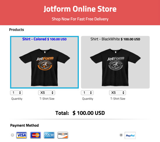
Online forms serve important functions whether they’re used internally or for customer use. A well-designed form can not only increase conversions, but they can contribute to the overall brand strategy. If a form is intuitive and easy to use, people may sign up for newsletters, contact the company, make a purchase, and submit data at a higher rate than if the form was poorly implemented. It hardly takes a second for a potential customer to hit the “x” and leave your form, website, or app. The key is to make your form effective with thoughtful design so you can get the information that you need without frustrating people to the point where they give up.
Having an effective payment is especially important, because it is the necessary point of contact that lets a business continue running. A shocking 70% of online shopping carts are abandoned, which means that something went wrong. Although we can’t control consumers’ change of mind, we can help the payment form be more effective.
1) Appealing Design
Forms shouldn’t look shoddy, bootleg, or amatuer. Especially since many forms require users to enter sensitive information like their credit card information, forms need to convey trust. They should be clear and easy to understand, and should have a logical information path. Especially important on mobile devices, it is easier for users to fill forms where the drop-down menus are grouped together to enhance ease of use and “flow.” At a minimum, the layout should be instinctual and unambiguous.
2) Easy repeat purchases
Repeat customers love to be rewarded. Upon consent, an e-commerce form should feature the option to save a customer’s payment information so that the process is faster and more streamlined after the first purchase. This is an appreciated feature, especially on mobile where it can be a hassle to type out all of the billing and shipping information. Adding the capability to save the data for the next use is a win-win for the company and the customer.
3) Create Visual Path of Interest
Utilize placement of white space, colors, visuals, and text guide the eye in the direction that you want. You can use abstract techniques that guide attention subtly (suggestive directional cues) like making use of whitespace and text. Larger, more prominent text indicates greater importance than visually smaller and slighter text. Simple spatial positioning of visuals, text, and whitespace can draw the eye in the direction that you want. Leave the space around your call to action and form uncluttered so it can stand out. You can also make use of explicit directional cues like numbers, bullets, arrows, and real-world indicators.
4) Commitment:
Once you get your customers to commit to something (for example, sign up to receive newsletters), they are much more likely to make a purchase. Give them an incentive to make that commitment. Offer a discount on their first purchase upon signup, have them be automatically entered in a giveaway, offer them something compelling. Make that clear and enticing with a visually appealing form.
5) Present information efficiently:
10% of carts that are abandoned due to having a lengthy checkout process. Make sure your forms do not ask for the same information twice (a staggering 50% of sites do this), and maintain clarity and ease of use to maintain customers’ attention spans.
6) Prevent Action paralysis:
Show your customers how easy it is to buy something from your e-commerce site. In the form, remind them that there is free shipping, etc. Add bullet points, sectioned areas, or numbers as appropriate to visually show that they are making progress and are on their way to checkout. Do not make users fill out information then spring on them the fact that they must register or make some additional action. Make the action path straightforward and take as little time as possible.


Send Comment:
3 Comments:
More than a year ago
Very well said. Thanks for the tips!
More than a year ago
$100 for the t-shirt? I mean, I want one and all but...
More than a year ago
you can use payment forms with Jotform? I didn't know that!