At Jotform, our users matter to us. A lot.
After all, we have 3.2 million of them. They create forms and receive responses through us every day.
We want to make our users’ experience with us as easy and enjoyable as possible. How do we do this? By listening to them and learning from them whenever we can.
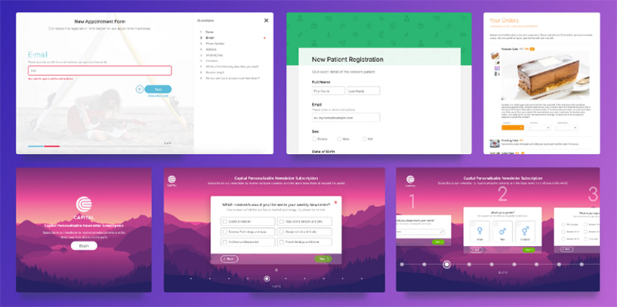
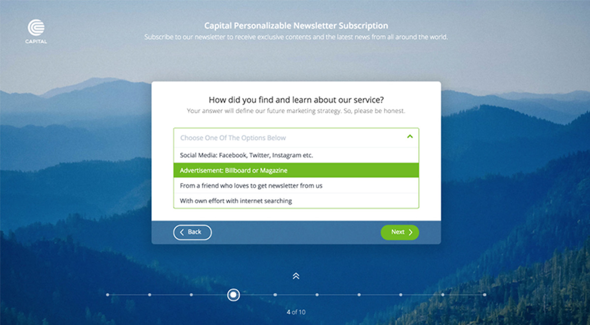
And that’s why we created Jotform Cards, our most user-driven project ever.
While we built Cards, our users guided us every step of the way; from research and design through to development.
Our founder wrote about how focusing on the customer (not the competition) brought us over 1 million new signups in a year.
From concept to launch, this process took us 326 days to complete.
How did we go about it?
Here’s what happened…
Day 1 — Idea
Looking at things like user feedback, bug reports and applied solutions over a large timeframe, we realized our forms needed an update.
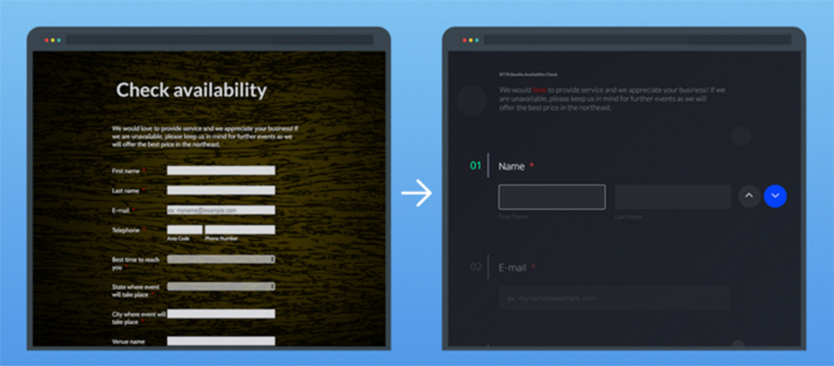
We could make as many minor tweaks as we wanted, but the fact remained: the design of our forms, and the experience of filling them out, was behind the times.
Our forms needed to be more aesthetically-pleasing, user-friendly and smart.
Thus, we began our journey with a single aim: re-invent our online forms.
Day 18 — Hack week 1: Fundamentals
Here’s how it works at Jotform: whenever we’re looking for answers, alternative solutions or ways of pushing the boundaries, we organize a hack week.
This requires all teams to drop their daily responsibilities and work on a single task for five days straight. And so, the idea for Jotform Cards was born.
Now we’d specified our goal — to reinvent online forms — we had to ask ourselves:
“How on earth can we reinvent online forms?”
This question immediately gave rise to other questions, too.
What would define this new generation of forms? How could we create solid ground for the rest of the project?
At the time, trying to find answers felt like staring at a blank page. We knew what we were working towards, but we didn’t know how to get there.
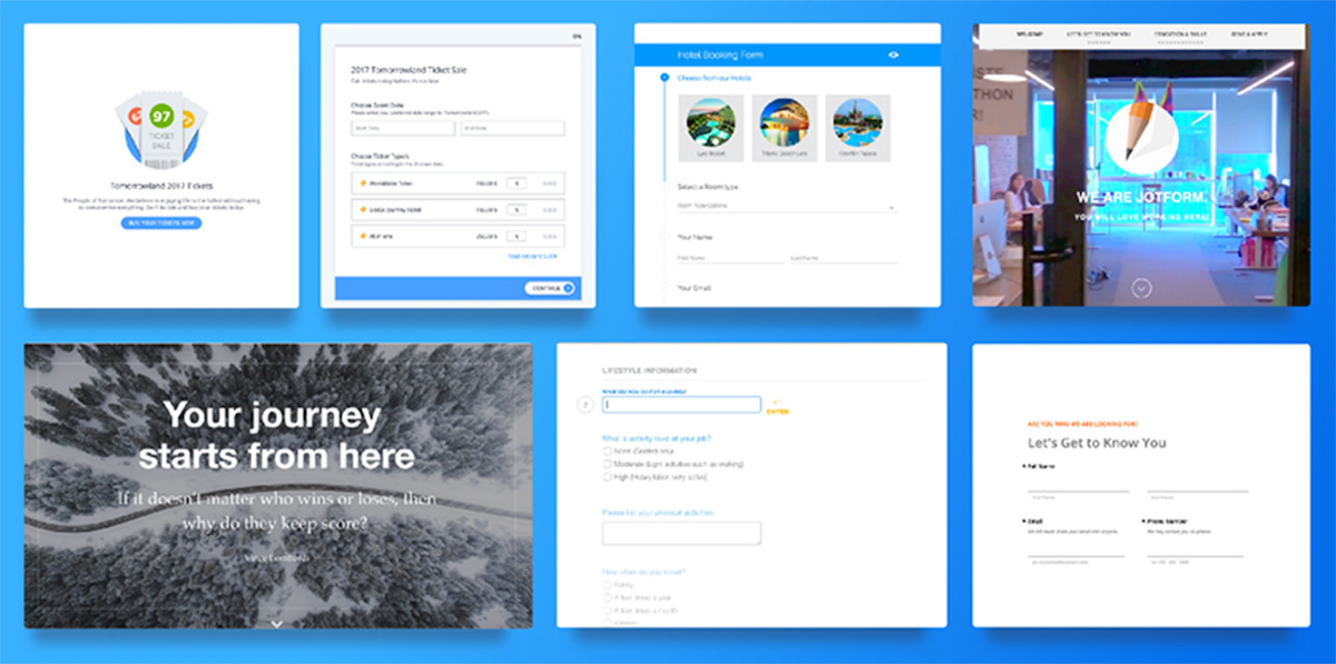
So, we started to analyze as many forms as possible, in as much detail as possible, zooming in on different aspects such as label alignment, colors, animations and so on.
We also started to analyze our own users’ forms in more depth. To create a product — no matter what your role in the team is — the most common strategy is to do online searches, read academic articles and review what your competitors have done.
But, in our experience, these tactics don’t always point the best way forward. Indeed, our founder wrote about how focusing on the customer (not the competition) brought us over 1 million new signups.
Long story short, we prefer to take our users’ choices as our starting point.
So, when we’re at a turning point, our users’ forms provide us with input and guidance.
On the basis of our analyses, we began to create prototypes. At the end of the week, each team shared and explained their decisions, setting out their ideas using the form prototype they had developed.
We saw that all teams struggled with similar problems and arrived at similar evaluations — but often their solutions were different.
Day 39 — Hack week 2: What might forms look like in 2027?
By the end of the first hack week, we’d put the fundamentals for the project in place.
Now it was time to push the limits. The subject of hack week 2 was:
“what might forms look like in 2027?”
We didn’t know what the design trends would be in ten years time, or which technologies would be available to us.
So we let our imagination run wild.
How could we push what we already had, break the rules and create a free-thinking mindset?
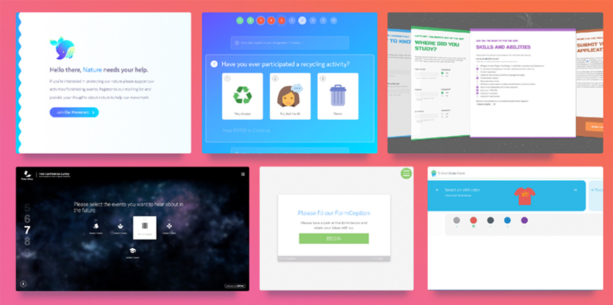
During hack week 2, we experimented with voice-overs, AR, and creating designs from a space age. It was a lot of fun.
Day 60 — Hack week 3: Pimp my form
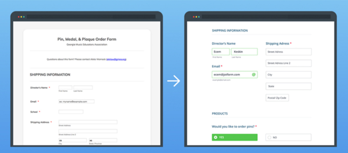
Hack week 3: time to try something totally different. Instead of working on one idea for a whole week, each team randomly picked a form and spent the day improving its visuals and functionality.
We used real-life instances picked from our users’ forms. And at the end of each day, the new version of the form was sent to its original owner for feedback.
With only one day to analyze problems and find solutions, we were forced to move quickly. This was a good thing. There was no time to obsess over tiny details or try different ideas.
This hack week helped us develop a mindset of dividing large problems into smaller pieces and addressing them one by one.
(ps. I know I keep talking about hack weeks. In case you are interested, here is how hack weeks can encourage innovation and creativity)
Day 81 — Hackweek 4: Invent Form 2.0
During hack week 4, all teams tried (almost) all possible form layouts. We needed to create something amazing on the basis of the prototypes we’d developed, the analyses we’d done and the knowledge we’d gained over the previous weeks.
So, all teams started to create final prototypes to show what, in their opinion, the new generation of online forms should look like.
It was time to start making serious decisions. So we asked for our users’ opinions once again. We prioritized user-friendliness, fun, and ease.
Day 88 — First Prototype
On the 88th day of the project, the first prototype of Jotform Cards was ready for action (at this point, it didn’t even have a name yet).
With our first prototype done and dusted, it was time to move on to the next phase: development.
Initially, we tried to remain as independent as possible from Jotform’s original infrastructure and focus on creating something new. But equally, we needed to figure out a way to support Jotform’s traditional form layout as well.
We reviewed our legacy code to see whether it should be renewed or reused for Jotform Cards. We eventually decided that reusing the current code base would be a lifesaver; and, that it would be best to design the new software architecture according to our current infrastructure instead of updating it.
Now, it was time to do some heavy lifting and convert the prototype into a feature-complete product. All form fields were redesigned and redeveloped, all micro-animations were rewritten, and all our original decisions were re-evaluated again.
Day 138 — A/B tests start
After months of hard work, we were ready to share our secret project with the world. It was super-exciting for us to see user reactions.
We immediately started to pay close attention to the statistics that were rolling in. The Data Team analyzed answers to questions like:
Did users like Jotform Cards? Did they want to switch back to classic form layout? How many users stayed active when using Jotform Cards? How many fields were added?
Day 195 — New user group
After nearly two months, the numbers from the A/B test didn’t reflect what we’d hoped: we needed to go back to the drawing board.
We began brainstorming to look into the root of the problems, experimenting with changing the default colors and looking for a correlation between user categories and the form layouts they preferred.
In the meantime, we were still receiving feedbacks from real users. And since they’re the ones who will be using the product, we always give their thoughts priority.
What were they saying?
It was something along the lines of:
Yes, you did something new — which is super cool — but there is still a need for the classic form layout.
And that was it! Once again, our users showed us the way.
They were happy to try something new like Jotform Cards, but they didn’t want to lose the classic form either.
Why couldn’t they have both?
So, we started working on a new test group who could create forms of both types and add them to ongoing A/B tests.
By the time the A/B test was updated, Jotform Cards had nearly every major feature of our classic forms.
Time for more hack weeks!
Day 214 — Hack week 5: New features
So, we’d managed to get Jotform Cards to the same level as our classic forms and updated our A/B tests.
Usage statistics were increasing every day. It was time to take Jotform Cards to the next level.
For the 5th Hack week — and for the first time in the Jotform history— all teams worked on different ideas for a week.
And we made great progress.
One of our product teams developed a ‘Smart Embed’ feature, which automatically adapts Jotform Cards to mimic the page it’s embedded in.
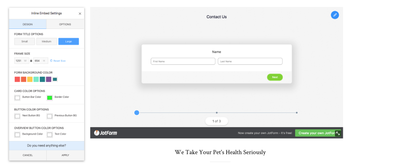
Another team developed the ‘Inline Embed Editor’, which lets users adjust their form’s embedded style on their pages.
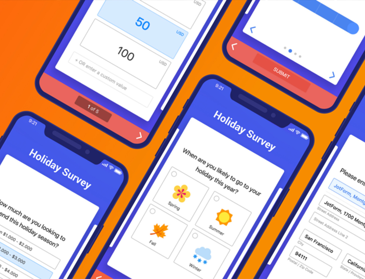
We also updated the mobile version of the Jotform Cards from top to bottom, adapting all layout elements, animations, and gestures to provide the best user experience on a mobile device.
Day 242 — Hackweek 6: Fields
During the 6th hack week, it was time to improve form fields and add cool features to them.
All teams worked on different form fields to make prototypes as parallel processes. We selected the target fields according to usage rates of fields and user feedback.
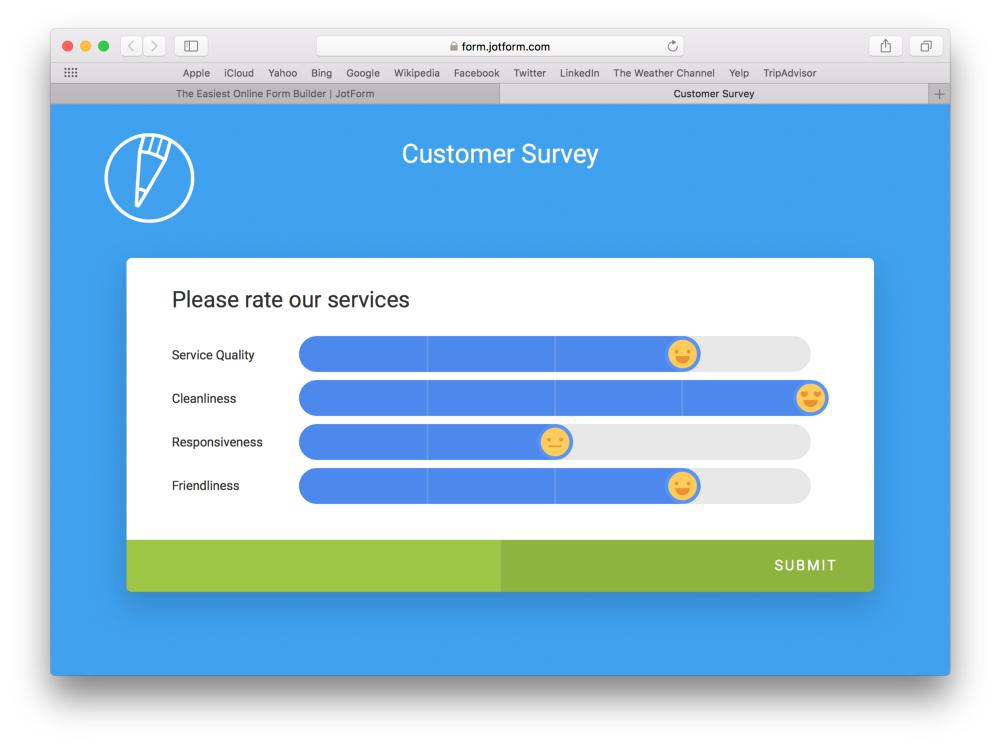
One problematic field was the Input Table. We managed to improve this field by updating its design and adding new features such as an emoji slider, thus making one of the most boring fields fun to fill.
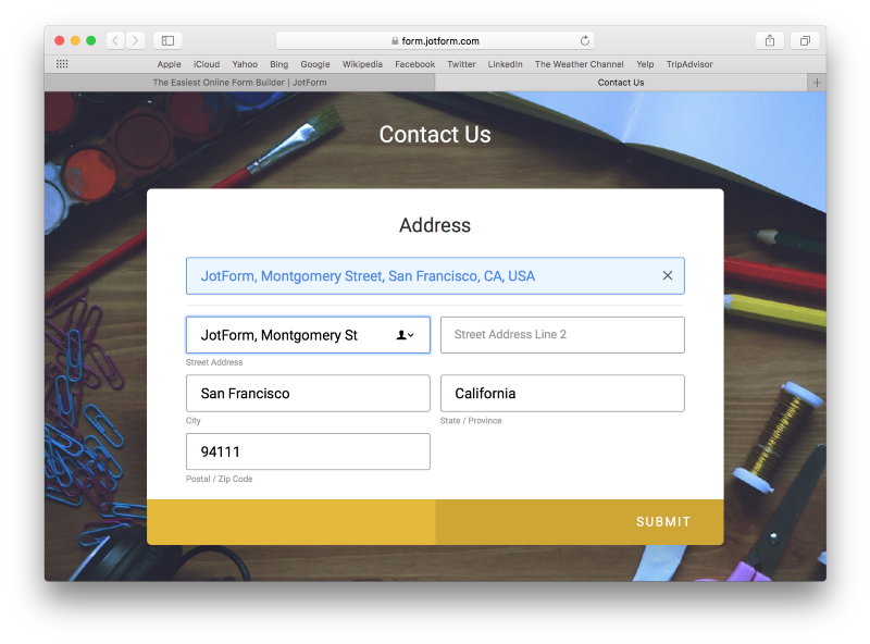
We worked on the address field too, adding an autocomplete feature to make it easier to fill out.
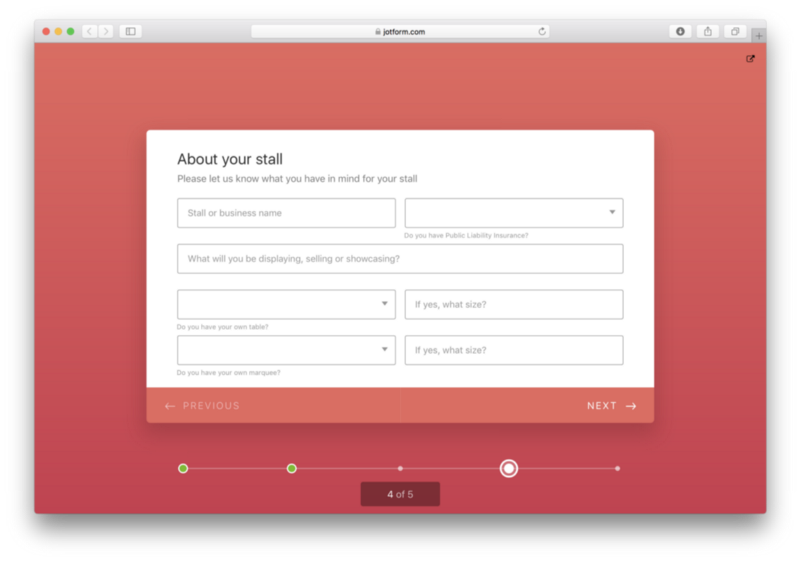
We also developed the Multi-line Question, which lets users add more than one field to a single card.
Day 262 — Hack week 7: More fields
Improvements during hack week 6 had a great impact on user feedback. So, we decided to look back into improving the most-used form fields.
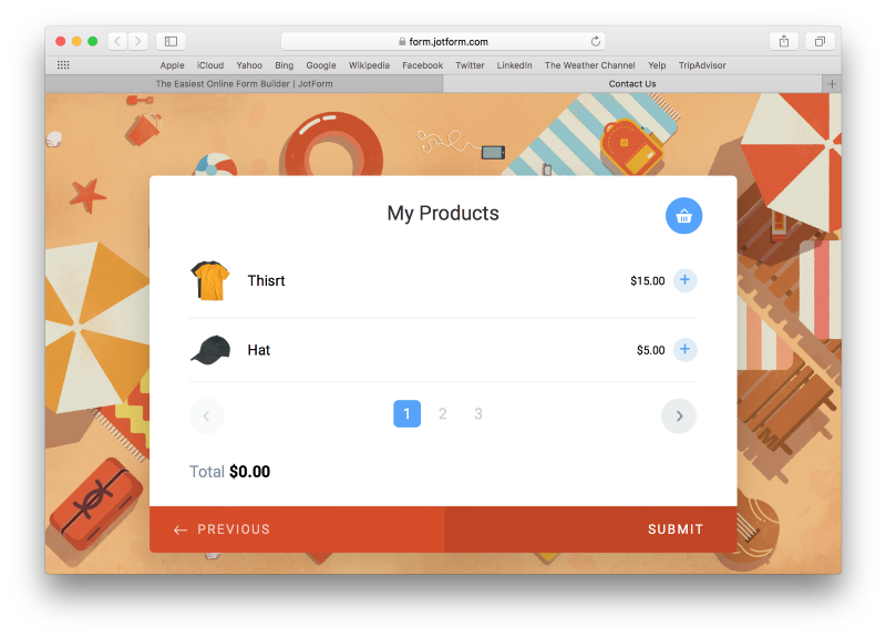
One team worked on the payment field and integrated a shopping bag feature, which lets form submitters see the products they want to buy listed.
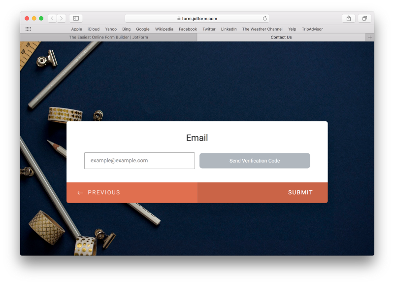
Another team made updates to the email field and added verification features to it.
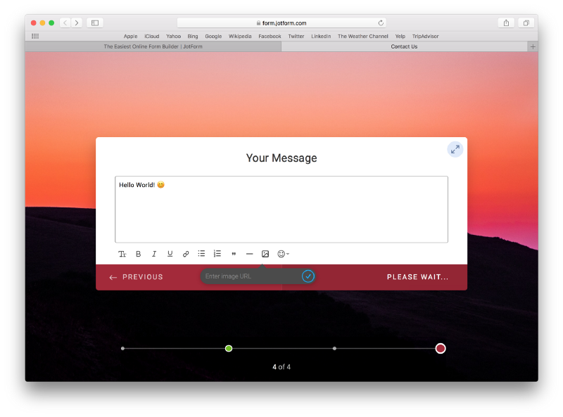
Finally, we updated the Long Text Entry field to add emojis, files or styles.
Day 274 — New group for the test
Our testing continued, and when we analyzed the numbers, we saw the third test group was a great success.
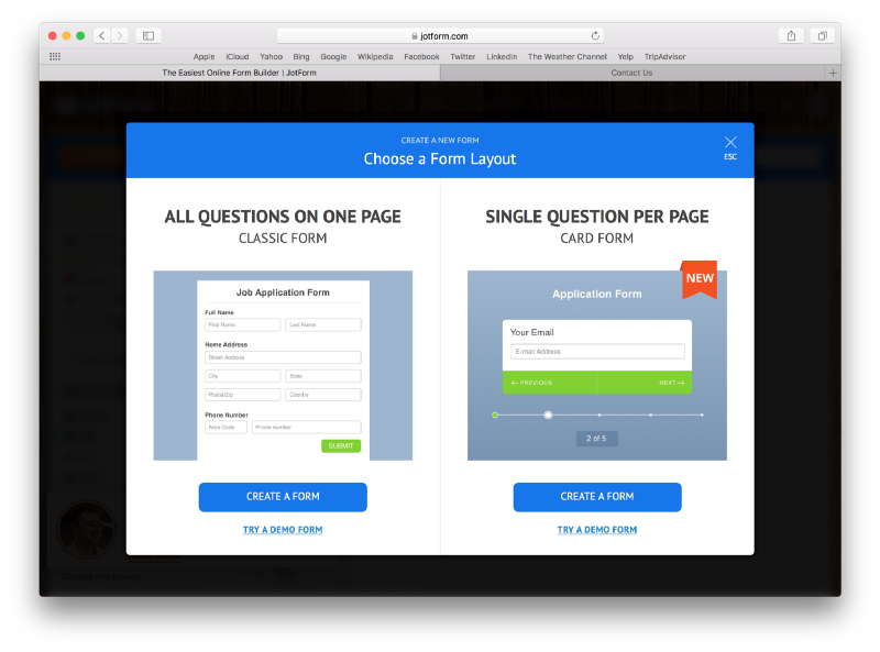
The decision was made: our users should be able to create both types of forms, new and classic.
Now, we wondered, what was the best way to present these options to users? Another A/B test it was!
We prepared three different form layout selection models for each group and put them to test with a control group.
Day 298 — Hack week 8: Wrap it up
The 8th and final hack week was our last opportunity to make big, brave changes to the product. It was time to give the ideas we never had time to try out a chance.
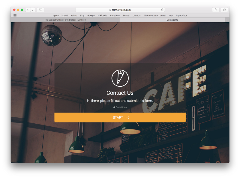
We worked on colors, fonts, spacing, the welcome page and all general elements.
We also worked on an import tool, improved the feedback button embeds and created mini cards.
Day 313 — Sharing our product with the world
Following eight hack weeks in 10 months, we were ready to pack up Jotform Cards and share it with the world.
We decided to give users both of the form layout options and wait for the test results to decide which design we’d use. But, none of the test groups could determine a winner.
We updated the test again, but this time, all of our new users were able to see both options.
Day 327–Release!
Finally! On February 6th, we announced Jotform Cards as our newest product.
For 326 days, we’d worked on this project full-time, day and night: poring over details big and small, fixing more than 280 bugs and implementing 102 feature requests. Phew.
Best of all, we succeeded in making a product that our users love.
We hope you love Jotform Cards as much as we do, and we can’t wait to hear your thoughts!











Send Comment:
4 Comments:
July 16, 2018
Great Content.
Thanks for sharing.
Law Enforcement Supplies - legear
March 20, 2018
love it good work
March 20, 2018
I love your correct usage of "poring" used in "poring over" on the third to last paragraph. Well done. Can't wait to try out the new Cards. I believe from what little I know about them that they may just be the fix I just discovered I need! Perfect timing.
March 13, 2018
Great Content.
You guys going great in this way.