-
JHobbs1958Asked on October 30, 2016 at 6:05 PM
The first two input fields are not visible on the screen when using form on mobile.

-
omerorkun JotForm Data ScientistReplied on October 31, 2016 at 1:43 AM
Hi,
I have cloned your form and reproduced the issue. Width of the first two fields are far too much to fit in a mobile screen and they slide far right because of that.
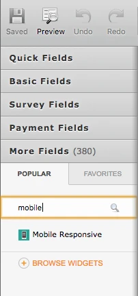
In the cloned version of your form I added our Mobile Responsive widget. Please see how it looks like on mobile after that:
Text boxes are now aligned to their respective headlines and their width are now fit to the mobile screen. Please try this widget:
Do let us know if the issue still persists. Thank you for contacting us.
-
JHobbs1958Replied on November 5, 2016 at 10:03 PM
I created a new page at segregationholding.con/guru-index-new.html and added the widget. It didn't fix the problem. I inserted some CSS that also did not help:
@media only screen and (min-width: 320px) and (max-width: 480px) and (orientation: portrait) {
li#input_5 {width: 100px !important;} li#input_4 {width: 100px !important;}
form-all { width: 100%; color: black; background-color: #d2232a;
}
}
-
Mike_G JotForm SupportReplied on November 6, 2016 at 11:42 AM
Can you try to add the CSS codes below to your form and check the result, please?
@media (min-width : 304px) and (max-width: 717px){
#label_5, #label_6, #label_4 {
width : 23% !important;
}
#id_6 {
width : 100%;
}
#cid_5, #cid_6, #cid_4 {
width : 75% !important;
}
.form-all .form-submit-button {
height : initial !important;
}
}
You might need to remove the Mobile Responsive widget to avoid conflict.
Or, you can also try to add the codes above to the codes on your website instead within <style></style>.
Thank you.