
-
supplyshieldAsked on October 19, 2016 at 9:01 PM
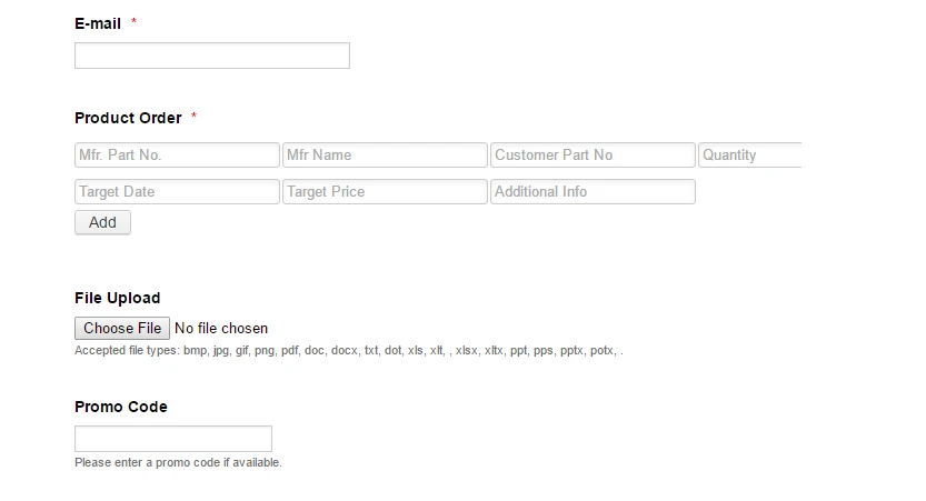
I have used the Infinite List Widget to generate a 7-column list item on this page, under "Product Order" section on the link below. I am looking to be able to make this layout more responsive for smaller-than-desktop screens. I can use CSS to shrink all the column widths for screen sizes under 980, but it will make the columns super duper narrow and difficult to use on a phone.
http://supplyshield.com/request-a-quote-2/
Appreciate the ongoing support
-
BorisReplied on October 20, 2016 at 5:50 AM
I have checked your form, and I see you are currently using this as the custom CSS inside the widget:
#list .col1 {
width: 140px !important;
}
#list .col2 {
width: 140px !important;
}
#list .col3 {
width: 140px !important;
}
#list .col4 {
width: 140px !important;
}
#list .col5 {
width: 140px !important;
}
#list .col6 {
width: 140px !important;
}
#list .col7 {
width: 140px !important;
}
#list .col8 {
width: 140px !important;
}I also see you have injected similar custom CSS inside the form as well:

Please remove all custom CSS from the widget, and also from the form, because the code was added with errors and doesn't work correctly.
You should really avoid using !important declarations in custom CSS, unless you know the style wouldn't work in any other way. You should normally use your CSS declarations without the "!important" part.
Additionally to the above, the Infinite List widget does not have an element with the ID #list, so the currently used code isn't actually doing anything with that widget.
With that being said, here is the exact code to use to have your Infinite List made fully mobile responsive.
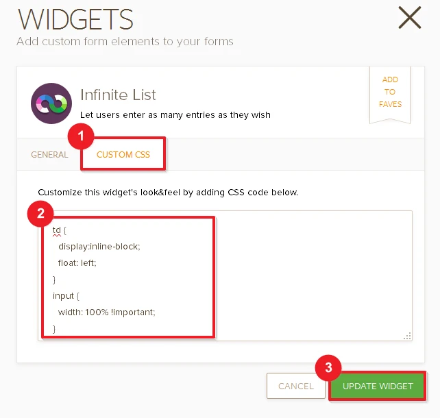
Step 1: Inject this code into the Infinite List widget, as its Custom CSS:
td {
display:inline-block;
float: left;
}
input {
width: 100% !important;
}That is all that was needed, but we can further customize the code to specify how wide each field should be, or how many fields to have per line. Please take a look at the following images for visual guidance:
Step 2: Inject this code into your form, to make the container of the Infinite List widget itself mobile responsive:
iframe[src*="//widgets.jotform.io/list/"] { width: 100% !important; }
You can inject it into the form by following this guide, but please make sure you first remove all your earlier custom CSS as it contains errors:
https://www.jotform.com/help/117-How-to-Inject-Custom-CSS-Codes
That should be it. Please try your form on a mobile device after that, and let us know should you need any further assistance. Cheers!
-
supplyshieldReplied on October 20, 2016 at 11:08 AM
Hi Thank you - the bad code that you had me remove (starting with #list etc) was actually given to me from Jotform on another support topic I had contacted about - https://www.jotform.com/answers/964475-Adding-labels-to-infinite-list-widget-#9
I did what you instructed above, and I am going to ignore the labeling issue for now to work on the responsiveness. The columns are responsive within the bounds of the iframe, but the iframe width is set to 600px at the moment, so my next question would be how to make that iframe width 100%? I did inject the iframe code you also sent me.
Thanks for the support
-
David JotForm Support ManagerReplied on October 20, 2016 at 1:14 PM
Please try injecting the following code:
@media only screen and (max-width: 480px) {
#customFieldFrame_17{
width: 100%;
height: 300px;
}
}
Result:
Let us know if you need more help.
-
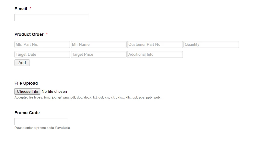
supplyshieldReplied on October 20, 2016 at 1:44 PM
Hi thank you - that did not address my actual question, but I went ahead applied it to the CSS , but it did not affect anything on screen size under 480px
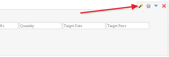
Please see my inserted screenshots to see how wide the columns are on various screen widths. This is on Chrome, and it cuts off in the same manner on Chrome on my Android device.
-
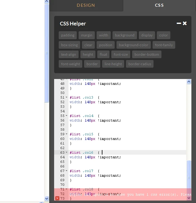
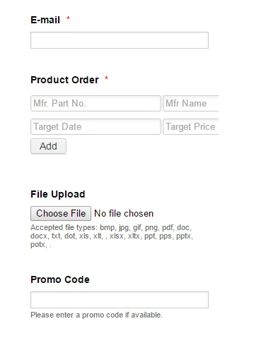
Kiran Support Team LeadReplied on October 20, 2016 at 4:14 PM
The issue is happening due to a brace missing from the CSS code injected in your form. Please add the closing brace as mentioned in the screenshot below and also inject the CSS code provided by our colleague in the last response.
It should be working fine and the list is displayed as shown below:
Hope this information helps!
-
supplyshieldReplied on October 20, 2016 at 7:16 PM
Yes thank you!
- Templates
- Integrations
- Products
- PRODUCTS
- Form Builder
- Jotform Enterprise
- Jotform Apps
- Store Builder
- Jotform Tables
- Jotform Inbox
- Jotform Mobile App
- Jotform Approvals
- Report Builder
- Smart PDF Forms
- PDF Editor
- Jotform Sign
- Jotform for Salesforce Discover Now
- Support
- GET HELP
- Contact Support
- Help Center
- FAQ
- Dedicated Support
Get a dedicated support team with Jotform Enterprise.
Contact Sales - Professional ServicesExplore