
-
cbbleAsked on May 18, 2016 at 2:07 PM
ı am using mobile responsive template
form layout okey
responsive form yes
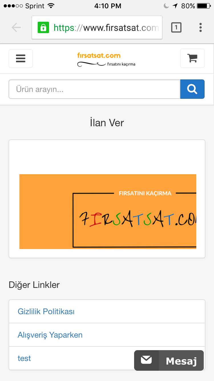
but not working, please help me friends https://www.firsatsat.com/ilan-ver-pml6 -
HubersonReplied on May 18, 2016 at 4:15 PM
The only issue I have noticed is with the form header, you can fix it by adding the following CSS to the form from Designer.
@media screen and (max-width: 480px), screen and (max-device-width: 768px) and (orientation: portrait), screen and (max-device-width: 415px) and (orientation: landscape){
div.form-header-group {
margin-left:0!important;
margin-right:0!important;
font-size : 1.2em;
}
h2.form-header {
font-size : 1.8em;
line-height : 1.1;
padding-right: 10px;
}
}
The Mobile Responsive Widget can be removed.
You can preview the clone here: https://form.jotform.com/61386332428962.
-
cbbleReplied on May 30, 2016 at 3:26 PM
i can not : Would you please check the phone. my website link

-
KadeJMReplied on May 30, 2016 at 4:27 PM
Are you trying to view this on iPhone and Android?
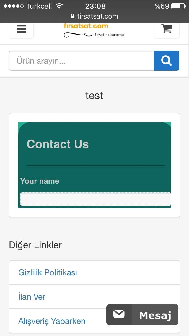
I checked this on my end on my iPhone 6 and it seems that it's not working properly at all.
All I see is the header of your form as shown in the screenshot below and nothing else on mobile.
If your website has a mobile method then try enabling it as it appears its only partial even though the mobile browser will try to make it work for mobile anyhow.
This problem isn't the form though. It's something else because if you look at the form by itself with its direct link you'll see it shows up fine by itself on desktop and fine by itself on mobile.
I would suggest trying to re-embed it with our iFrame Code to see if that helps.
Otherwise, if there's still a problem then please let us know.
-
cbbleReplied on May 31, 2016 at 3:40 PM
Thank you guys. ok problem solved.
"If your website has a mobile method then try enabling it as it appears its only partial even though the mobile browser will try to make it work for mobile anyhow"
- Templates
- Integrations
- Products
- PRODUCTS
- Form Builder
- Jotform Enterprise
- Jotform Apps
- Store Builder
- Jotform Tables
- Jotform Inbox
- Jotform Mobile App
- Jotform Approvals
- Report Builder
- Smart PDF Forms
- PDF Editor
- Jotform Sign
- Jotform for Salesforce Discover Now
- Support
- GET HELP
- Contact Support
- Help Center
- FAQ
- Dedicated Support
Get a dedicated support team with Jotform Enterprise.
Contact Sales - Professional ServicesExplore