-
sugardreamAsked on September 10, 2015 at 10:08 PM
My main problem is with my mobile version for tables and smartphones. When the boxes expand the customer can't see the end of the form anymore and they can't submit.
Page URL: http://sugardreaminc.com/orders.htm -
CharlieReplied on September 11, 2015 at 4:37 AM
Hi,
I believe this is because the form was embedded using the iFrame code, unfortunately, the iFrame has a fixed height and it doesn't seem to dynamically change when the form changes.
Have you tried embedding using the default embed script code? Although if your website is loading a lot of JS there's a possible that a code conflict might happen, but please do try.

Also, after that, please do follow this guide on how to make the form mobile responsive: http://www.jotform.com/help/311-How-to-make-Forms-Mobile-Responsive
Do let us know if that helps.
-
sugardreamReplied on September 11, 2015 at 1:29 PM
It didn't work. Any other suggestions?
Is there a code I can add to alway show all the options, instead of collapsing them?
Thanks.
-
CharlieReplied on September 11, 2015 at 2:58 PM
Hi,
That's odd, using the default embed script should work as resizing of the height happens there.
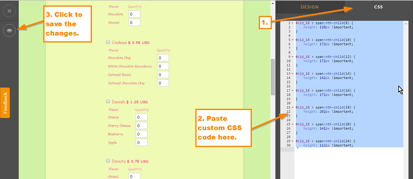
To open the closed options in your products, you can use this custom CSS code:
#cid_18 > span:nth-child(8) {
height: 120px !important;
}
#cid_18 > span:nth-child(10) {
height: 172px !important;
}
#cid_18 > span:nth-child(12) {
height: 172px !important;
}
#cid_18 > span:nth-child(14) {
height: 142px !important;
}
#cid_18 > span:nth-child(16) {
height: 172px !important;
}
#cid_18 > span:nth-child(18) {
height: 202px !important;
}
#cid_18 > span:nth-child(20) {
height: 142px !important;
}
#cid_18 > span:nth-child(24) {
height: 112px !important;
}
Open your form designer and paste the custom CSS code under the CSS tab.
After applying that code, this is how it should look like: http://form.jotformpro.com/form/52536209135957?
Do let us know if that works.