-
corinapengAsked on August 19, 2015 at 5:26 PM
I try to get a visualization report but it comes out funky and I can only see 2 questions. Please let me know how I can create beautiful visualizations of data as I am debating if I should move to Survey Monkey.
Thanks!
-
BorisReplied on August 19, 2015 at 10:27 PM
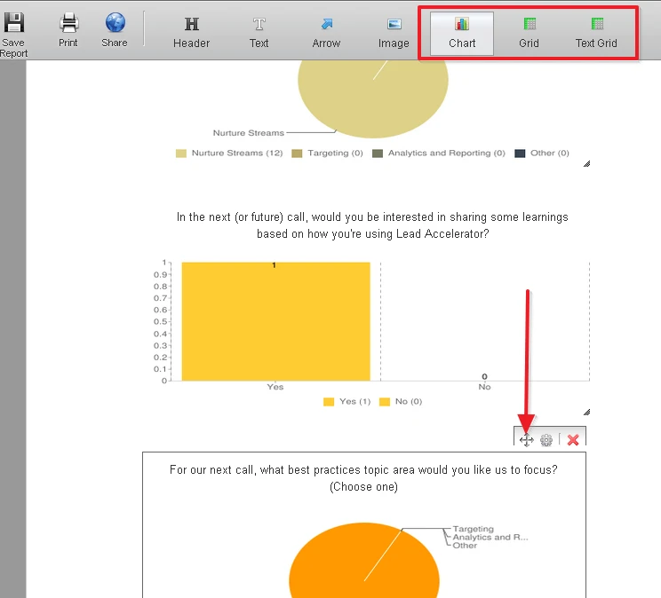
You can have as many or as little of your questions shown in your Visual Reports. By default, only two of your questions are shown in charts, to get you started. I believe that this is what you saw when seeing only two questions.
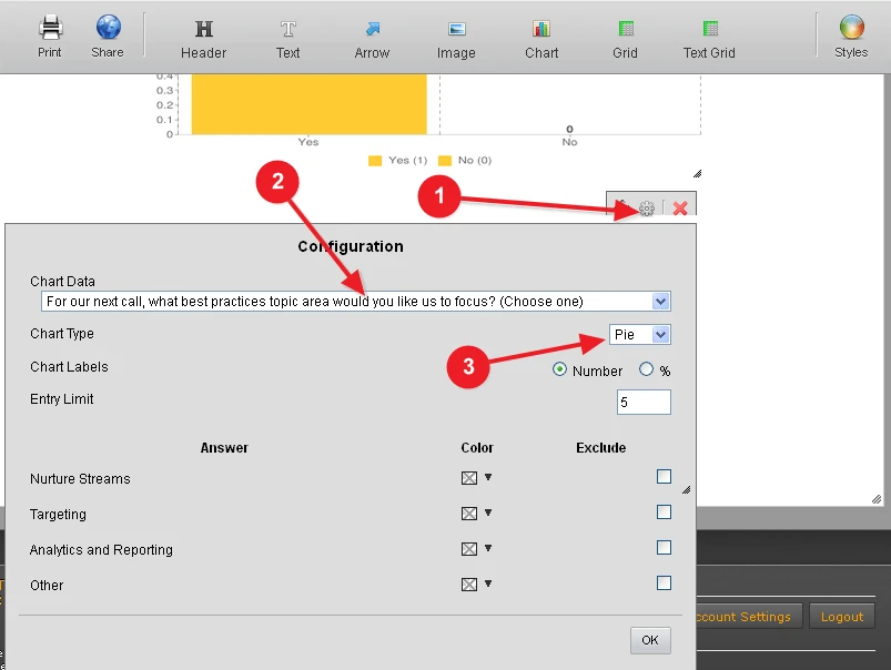
You can add more charts / questions to your report by clicking on one of the Chart | Grid | Text Grid buttons at the top of your Visual Report Builder. Then move it to where you want it to be with the moving icon, and you can also resize it with the little gripper in its bottom right corner.

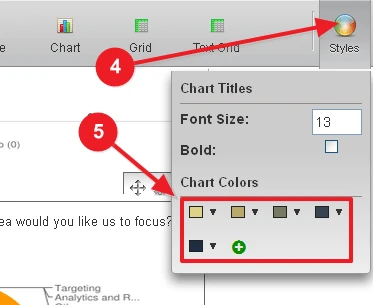
You can choose which of your questions this chart will present, as well as which colors it should have.
You can take a look at our guide on How to Create a Visual Report with your Form Submissions for more details, and you can also limit the presented entries based on dates by using Visual Report Filters.
I have created a very simple Visual Report for you as a demo, here: http://www.jotform.com/report/51973620078055
Please let us know if you need any further assistance, and we will be happy to help.
- Templates
- Integrations
- Products
- PRODUCTS
- Form Builder
- Jotform Enterprise
- Jotform Apps
- Store Builder
- Jotform Tables
- Jotform Inbox
- Jotform Mobile App
- Jotform Approvals
- Report Builder
- Smart PDF Forms
- PDF Editor
- Jotform Sign
- Jotform for Salesforce Discover Now
- Support
- GET HELP
- Contact Support
- Help Center
- FAQ
- Dedicated Support
Get a dedicated support team with Jotform Enterprise.
Contact Sales - Professional ServicesExplore