-
dvminfoAsked on July 28, 2015 at 2:34 PMAnother question I have is about the run-over text in the check-box options
you can see at the top of the screen shot in the 2nd attached image (under
the Enrollment Intent Statement header). If I shrink it the option text, it
will look the way I want it to, but the question text gets cut off (see
image 3).
I look forward to hearing from you about how to fix these issues. -
Welvin Support Team LeadReplied on July 28, 2015 at 2:42 PM
Unfortunately, I'm not sure if you are referring to the field label and options alignment. Please post the screenshot in this thread so I can check it.
Here's how you can post it here: https://www.jotform.com/answers/277033.
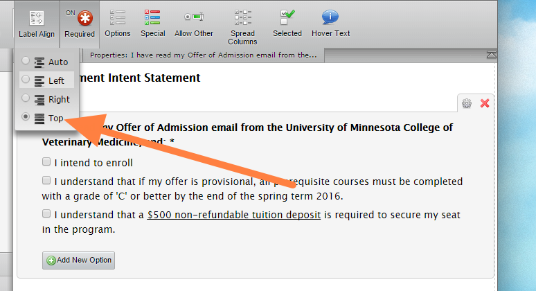
But try setting up the label to top:

I think that works for you. Let us know.
Thanks


