
-
shuishAsked on February 26, 2015 at 8:22 AM
Hello, i have created a form and added to my website, which all works fine on my pc however when viewed on ipad the options fields move under the titles and cuts off the rest of form. I have tried resizing the form width to see if that helps but it hasn't done anything. Any help would be great.
Also i have noticed that there is a large white gap above the first form entry even though i have 0 padding and margin around the form.
-
CarinaReplied on February 26, 2015 at 12:36 PM
I tested and could replicate the same situation:

The standalone version of the form worked fine:
I recommend that you try to embed the form again using the embed method:
To remove the gap before the first question please add the css code :
.jotform-form {padding: 0;}Let us know if the problem persists.
-
shuishReplied on February 26, 2015 at 1:36 PM
Hello, i reinserted the code but using the Embed option but i am afraid the layout is still the same.
On the plus side the Padding code worked lol
Any other ideas regarding the form layout?
All the best
-
CarinaReplied on February 26, 2015 at 3:32 PM
Good to hear that the padding situation is solved.
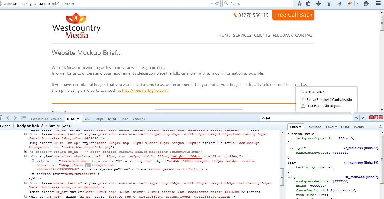
Regarding the layout situation it seems to me that this is connected with the div's height. Please try editing the div's height to "auto" or increasing the pixel number:
Let us know if the problem persists.
- Templates
- Integrations
- Products
- PRODUCTS
- Form Builder
- Jotform Enterprise
- Jotform Apps
- Store Builder
- Jotform Tables
- Jotform Inbox
- Jotform Mobile App
- Jotform Approvals
- Report Builder
- Smart PDF Forms
- PDF Editor
- Jotform Sign
- Jotform for Salesforce Discover Now
- Support
- GET HELP
- Contact Support
- Help Center
- FAQ
- Dedicated Support
Get a dedicated support team with Jotform Enterprise.
Contact Sales - Professional ServicesExplore