
-
EpicStudioAsked on January 16, 2015 at 4:59 PM
Hi there, thanks for your help.
I just visited my sie after a while and it seems that the fields changed width. Is there any kind of conflict I can avoid? Since it changed automatically.
Thanks again..!
 Page URL: http://www.woox.com.mx
 -
MikeReplied on January 16, 2015 at 6:28 PM
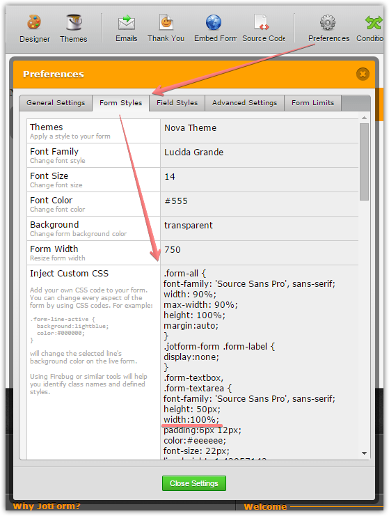
Unfortunately, there is no way to find out how the fields were changed, but the issue seems to be specific to your form. There are custom styles on your form, you might consider changing them from:
.form-textbox,
.form-textarea {
width:35%;
}to
.form-textbox,
.form-textarea {
width:100%;
}and from
.form-input,
.form-input-wide {
width:20%;
}to
.form-input,
.form-input-wide {
width:100%;
}Result:
Please give it a try and let us know if you need any further assistance.
-
EpicStudioReplied on January 16, 2015 at 6:59 PM
Thanks. I did it. Much better. Problem solved.
I'm still looking for a way to make it 2 lines when it becomes mobile-width narrow. Do you have any idea mhow could I make it?
Thanks again.
-
abajanReplied on January 17, 2015 at 2:37 AM
Try this:
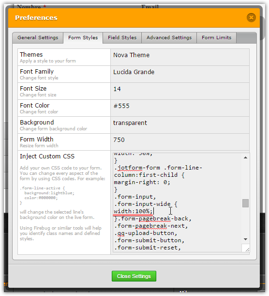
1. In the form's injected CSS, change the following rule:
.form-line {
padding:0;
margin: 0 0 15px;
}to
.form-line {
padding:0;
margin: 10px 0 15px;
}and change the following rules (the last ones in the injected CSS)
#id_1, #id_3 {width:41%;}
#id_2 {width:18%;}to
#id_1, #id_3 {min-width: 300px;}
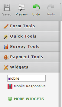
2. Close the Preferences popup and then insert the Mobile Responsive widget:(Please see this guide)
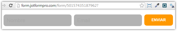
When I cloned your jotform and did the foregoing, I got this result. It it closer to what you wanted to achieve?
-
abajanReplied on January 17, 2015 at 2:42 AM
Make sure the widget is placed after the submit button.
- Templates
- Integrations
- Products
- PRODUCTS
- Form Builder
- Jotform Enterprise
- Jotform Apps
- Store Builder
- Jotform Tables
- Jotform Inbox
- Jotform Mobile App
- Jotform Approvals
- Report Builder
- Smart PDF Forms
- PDF Editor
- Jotform Sign
- Jotform for Salesforce Discover Now
- Support
- GET HELP
- Contact Support
- Help Center
- FAQ
- Dedicated Support
Get a dedicated support team with Jotform Enterprise.
Contact Sales - Professional ServicesExplore

