
-
LICACHAsked on December 11, 2019 at 10:18 AM
Hi!
This issue was solved with some custom css but it started to bug again.
In the builder it appears like that (good display):

And in live version it displays like that:
Here is the custom css that was implemented:
label#label_input_168_0 {
width : 500px !important;
}
label#label_input_169_0 {
width : 500px !important;
}Thanks for your help.
Page URL: https://form.jotform.com/193442803749364 -
Kiran Support Team LeadReplied on December 11, 2019 at 12:22 PM
Please try adding the following CSS code to the form to display the single/multiple choice fields on the form correctly.
.form-radio-item, .form-checkbox-item {
max-width: none !important;
}
Thanks!
-
LICACHReplied on December 11, 2019 at 12:59 PM
I tried but it does not work.
Here the full CSS I have:
"
.form-sub-label {
color : #9FA0A9 !important;
}
.form-required {
color : #EBC717 !important;
}
.form-checkbox-item label {
text-align : justify!important;
font-size : 12px;
color : #333333 !important;
}
.form-radio-item label {
font-size : 12px;
color : #333333 !important;
}
.qq-upload-button.undefined {
margin : 12px !important;
width : 200px !important;
}
.form-textbox {
box-shadow : none !important;
outline : none !important;
}
.form-submit-button {
width : 200px !important;
}
label#label_input_168_0 {
width : 500px !important;
}
label#label_input_169_0 {
width : 500px !important;
}
@media screen and (max-width: 480px){
.form-pagebreak-back-container {
float : left !important;
}
.form-pagebreak-back-container, .form-pagebreak-next-container {
width : 40% !important;
}
.form-checkbox-item:not(#foo), .form-radio-item:not(#foo) {
width : 50%;
}
}" -
KrisLei Jotform SupportReplied on December 11, 2019 at 5:27 PM
Hi,
I'm currently working on your form. I will get back to you shortly with the necessary codes to resolve the issue.
Thank you.
-
LICACHReplied on December 15, 2019 at 5:33 AM
Hi! Any news on this issue? I wonder why it appeared fine for a few days and then it messed up...
-
Vanessa_TReplied on December 15, 2019 at 6:36 AM
I have added the custom CSS below:
#cid_168, #cid_169,
#id_168 .form-checkbox-item,
#id_169 .form-checkbox-item {
max-width: none !important;
}
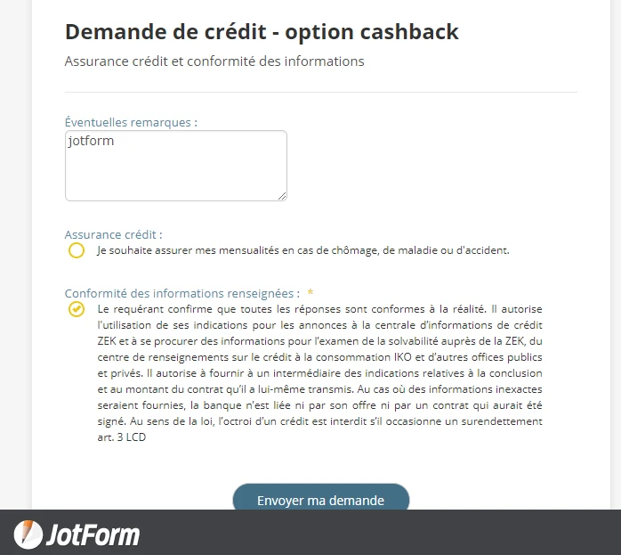
and your form now looks like this:
-
LICACHReplied on December 15, 2019 at 7:17 AM
On desktop and tablet it looks fine but not on mobile...
-
roneetReplied on December 15, 2019 at 8:20 AM
Could you please test it now. I have added the mobile responsive code in your Form.
Let us know if you have further questions.
Thanks.
-
LICACHReplied on December 15, 2019 at 10:00 AM
It seems to be all good thanks! I hope it will remain the same after few days and won't mess up again.
Thank you all for your help.
- Templates
- Integrations
- Products
- PRODUCTS
- Form Builder
- Jotform Enterprise
- Jotform Apps
- Store Builder
- Jotform Tables
- Jotform Inbox
- Jotform Mobile App
- Jotform Approvals
- Report Builder
- Smart PDF Forms
- PDF Editor
- Jotform Sign
- Jotform for Salesforce Discover Now
- Support
- GET HELP
- Contact Support
- Help Center
- FAQ
- Dedicated Support
Get a dedicated support team with Jotform Enterprise.
Contact Sales - Professional ServicesExplore