-
AlicatPurrfectionsAsked on August 28, 2019 at 6:35 AM
-
Victoria_KReplied on August 28, 2019 at 6:45 AM
Yes, this can be also adjusted with custom CSS code, but this time, please add codes to form directly. Here is the guide: How-to-Inject-Custom-CSS-Codes
@media screen and (max-width: 480px), screen and (max-device-width: 768px) and (orientation: portrait), screen and (max-device-width: 415px) and (orientation: landscape) {
.form-spinner-input, .form-spinner {
height: 2em;
}
}
Hope this helps! But, please get back to us if you need further assistance.
-
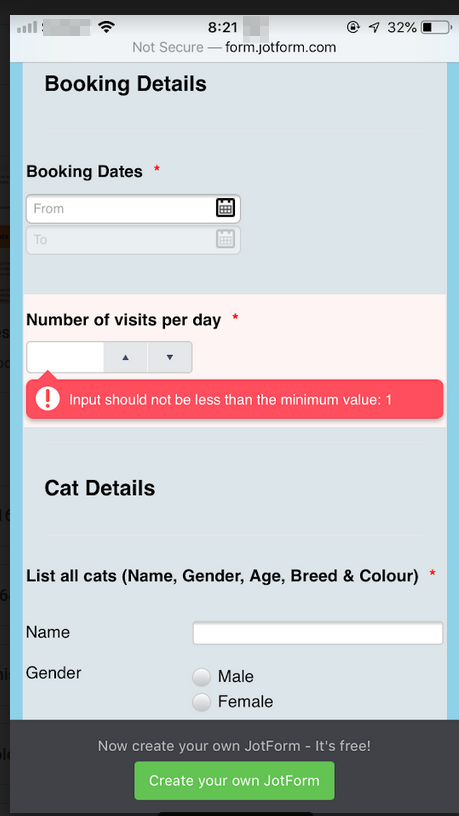
AlicatPurrfectionsReplied on August 28, 2019 at 9:43 AMHi
I’ve added the code given where I think it goes but nothing has changed.
The number of Visit box is still full width when it just needs to be a
short box.
The booking date box is still the full width, looks stupid being that
length.
No change to the cat details. The colour option is still hidden off the
mobile screen.
Please help!
... -
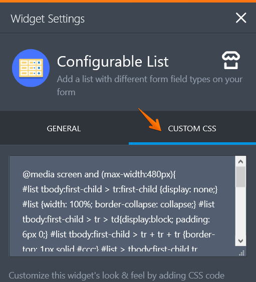
Richie JotForm SupportReplied on August 28, 2019 at 11:04 AM
You may try this custom CSS code and place it in your Booking date's widget custom CSS.
#date-container{
width: 180px;
}No change to the cat details. The colour option is still hidden off the
mobile screen.For your Cat Details configurbale list, you may use this custom CSS:
@media screen and (max-width:480px){
#list tbody:first-child > tr:first-child {display: none;} #list {width: 100%; border-collapse: collapse;} #list tbody:first-child > tr > td{display:block; padding: 6px 0;} #list tbody:first-child > tr + tr + tr {border-top: 1px solid #ccc;} #list > tbody:first-child tr td.col1 {padding-top: 20px;} .mobileColumnName {display: inline-block; padding-bottom: 4px; width: 40%; box-sizing: border-box;} .mobileColumnName + input, .mobileColumnName + textarea, .mobileColumnName + select, .mobileColumnName + .radio-container, .mobileColumnName + .checkbox-container, .mobileColumnName + .dateContainer {width: 60%; display: inline-block; box-sizing: border-box; vertical-align:top; box-shadow:none;} .buttonsColumn {text-align: right;}
}
Please give it a try and let us know if you need further assistance.
-
AlicatPurrfectionsReplied on August 28, 2019 at 5:43 PMThanks.
That’s sorted.
However, I can’t get the question ‘number of visits’ section to be smaller.
It seems a very long box for only 1/2/3 to be selected. Can it be made
smaller? I’ve reduced the width to 30 pixel but made no difference.
Thanks
A
... -
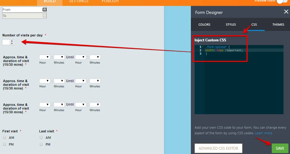
Girish JotForm SupportReplied on August 28, 2019 at 7:31 PM
Please insert the CSS code below:
.form-spinner {
width: 50px !important;
}
Would this suit you?
-
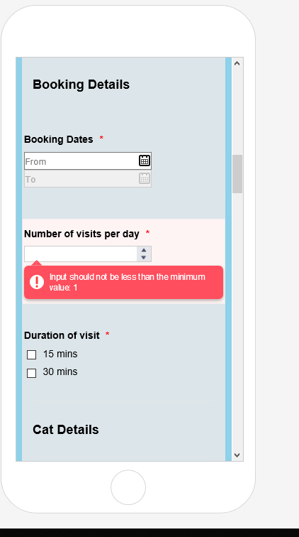
AlicatPurrfectionsReplied on August 29, 2019 at 3:07 AMNow you can’t see the number selected?!!
Didn’t work, why? Please fix
Thanks
A
... -
Victoria_KReplied on August 29, 2019 at 3:30 AM
Hello,
I have adjusted the code in your form, so now the field looks like this:
@media screen and (max-width: 480px), screen and (max-device-width: 768px) and (orientation: portrait), screen and (max-device-width: 415px) and (orientation: landscape) {
.form-spinner {
width: 40% !important;
zoom: 0.7;
}
}
Let us know if you need more help.
-
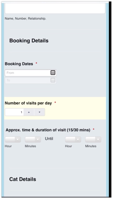
AlicatPurrfectionsReplied on August 29, 2019 at 4:43 AMHi
Thanks but why have you made the media screen have no margin? All the
options are now squeezes right up against the left margin. Looks really
odd. I was happy with everything else just wanted the number of visits box
to be smaller like how it was shown in the picture by whom had given the
CSS code previously.
Very frustrating!
... -
Nik_CReplied on August 29, 2019 at 5:04 AM
That's not affected by the CSS code you inserted.
The CSS code just adjusts the width of the field when viewed on mobile, it doesn't adjust the margin.
How would you like to have the field showing?
Centered? If that's the case, you can use this CSS:
@media screen and (max-width: 480px), screen and (max-device-width: 768px) and (orientation: portrait), screen and (max-device-width: 415px) and (orientation: landscape) {
.form-spinner {
width: 40% !important;
zoom: 0.7;
position: relative!important;
left: 25%;
}
label#label_93 {
text-align: center;
}
}
If you want it adjusted further, please let us know.
Thank you!
-
AlicatPurrfectionsReplied on August 29, 2019 at 5:43 AMThe form was fine before the last CSS was entered! So it has affected the
form. You haven’t sorted what I asked! I was the form to have a left margin
and be as it was previously!!!
This should not be this hard! Very annoyed my form has been altered when I
did not ask for the questions and options to all be moved!!!
I want the form sorted please ASAP, I can’t start using it till it’s
fixed!!!
A
... -
Victoria_KReplied on August 29, 2019 at 6:07 AM
Hello,
My apologies, but I am not sure if I can understand the exact requirements. Can you share some more information on how you would like form to look like on mobiles?
The code that is currently in your form only affects the Number of Visits field and only for mobile layout.
-
AlicatPurrfectionsReplied on August 29, 2019 at 7:43 AMIt was fine before that amendment was made. I have no idea how to change it
back as I didn’t change it!
I want it to fit on the mobile screen as it was sitting normally before!
... -
AlicatPurrfectionsReplied on August 29, 2019 at 7:43 AMI can’t show you as it no longer looks like how it was!
... -
Richie JotForm SupportReplied on August 29, 2019 at 8:26 AM
Can you please share to us a screenshot on how you view the form and the changes that you would like to make?
Guide:-How-to-add-screenshots-images-to-questions-to-the-support-forum
I have a cloned version of the form with only the changes in the configurable list was added.
I have checked with your current form and the margins seems to be the same.
Here is a screenshot of the cloned form with only the configurable list CSS added.
Your current form when viewed in my iPhone.
Looking forward for your response.
-
AlicatPurrfectionsReplied on August 30, 2019 at 2:43 AMSomeone has made a change as it was not that close to the left margin. I
want a left margin, it’s quite simple. There is no need for it all to be
right up against the side of the form. It looks awful and very
unprofessional!
... -
AlicatPurrfectionsReplied on August 30, 2019 at 2:43 AMI’m on holiday and wanted this live on my business website by now!
I only have my mobile with me so can’t do screen shot. It is not like that
when you are in edit mode.
... -
Nik_CReplied on August 30, 2019 at 3:54 AM
We didn't insert any code that would affect left margin.
You asked for changing the width of the "Number of visits per day" field, and the code we provided is doing only that.
I mean, you can remove the code from Custom CSS, and you can see that the margin is not affected.
What would you like to have, some left margin for all fields or only for that field, and how big the margin should be?
Thank you!