-
AlicatPurrfectionsAsked on August 28, 2019 at 6:10 AM
Hi
Re: Alicat Purrfections Booking Form
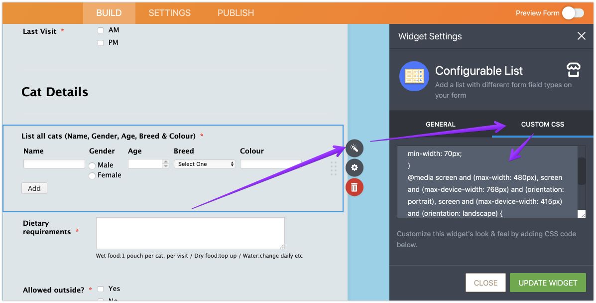
I can’t shrink the cat details question so it’s all seen on a mobile screen. The colour option is falling off the screen. Can the Age box be smaller to allow a bit more space? Or how can it fit?
Also, can the number of visits question and booking date boxes be a bit smaller? I’ve tried to amend the width but nothing changes on screen.thanks
Allison
-
Victoria_KReplied on August 28, 2019 at 6:38 AM
Hello Allison,
I have moved one of questions to separate thread: https://www.jotform.com/answers/1943022
To fix the Configurable List layout for mobile screens, please inject the following CSS code into Configurable List:
@media screen and (max-width: 480px), screen and (max-device-width: 768px) and (orientation: portrait), screen and (max-device-width: 415px) and (orientation: landscape) {
th {display: none; } .mobileColumnName {font-weight: bold; display: block; padding-bottom: 6px; zoom: 0.95;} td{float:left;padding-right: 0;}
td.col4 {display: block; clear: left; }
}
Guide: How-to-Inject-CSS-Codes-to-Widgets

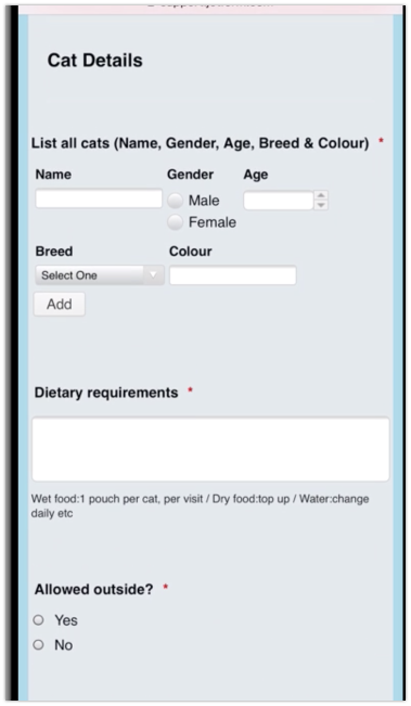
Then it should look like this: