-
mikelnewmanAsked on August 19, 2019 at 1:35 PM
Hello,
I've tried to code below to make the 1-10 scale fit better on a mobile device but it didn't help solve the issue. Is there anything thing else. I guess I could just tell the user to turn phone sideways if they need to report a higher rating.
@media screen and (max-width: 480px) {
.form-scale-table th, .form-scale-table td {
padding: 2px .1px;
}}
-
John_BensonReplied on August 19, 2019 at 2:29 PM
I was able to replicate the issue you're describing to. Please try to insert this custom CSS:
@media screen and (max-width: 480px) {
.form-scale-table .form-radio {
margin-right: 2px !important;
}.form-scale-table {
font-size: 10px !important;
}}
Here's a guide on How-to-Inject-Custom-CSS-Codes. Here's the result:

If you're still having issues, then please let us know what specific phone are you using for testing.
-
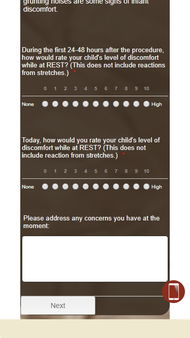
mikelnewmanReplied on August 19, 2019 at 3:43 PMHere’s two screen shots from my iPhone 8 iOS 12.3.1
... -
John_BensonReplied on August 19, 2019 at 3:59 PM
Unfortunately, we cannot see the screenshot that you're trying to share via email attachment.
You need to go directly to this thread (https://www.jotform.com/answers/1931900) and use the Insert/edit image button in the Reply Editor.
-
Elton Support Team LeadReplied on August 19, 2019 at 6:12 PM
Try this:
@media screen and (max-width: 500px){
[data-type="control_scale"] .form-radio {
margin: 0 !important;
}
[data-type="control_scale"] .form-scale-table th,
[data-type="control_scale"] .form-scale-table td {
padding: 9px 0;
}
}
Result:
-
mikelnewmanReplied on August 19, 2019 at 8:43 PMYay! That fixed it! Thanks!
...