


-
cigarsurveysAsked on July 24, 2024 at 7:56 PM
Hi,
Please help scale down the Input table's width and remove the wrap text on the sublabel of the table on mobile view.
mobile view.

-
Sonnyfer JotForm SupportReplied on July 24, 2024 at 10:55 PM
Hi Dan,
Thanks for reaching out to JotForm Support. You can inject the below CSS Code to your form to scale down your Input Table's width on mobile:
/* Scale down input table width on mobile -#17245491 */

@media only screen and (max-width:480px) {

table.form-matrix-table {

  min-width: 350px ! important;

}

th.form-matrix-headers.form-matrix-column-headers.form-matrix-column_0, th.form-matrix-headers.form-matrix-column-headers.form-matrix-column_1, th.form-matrix-headers.form-matrix-column-headers.form-matrix-column_2 {

  width: 10px ! important;

}

}

/* Code ends here */
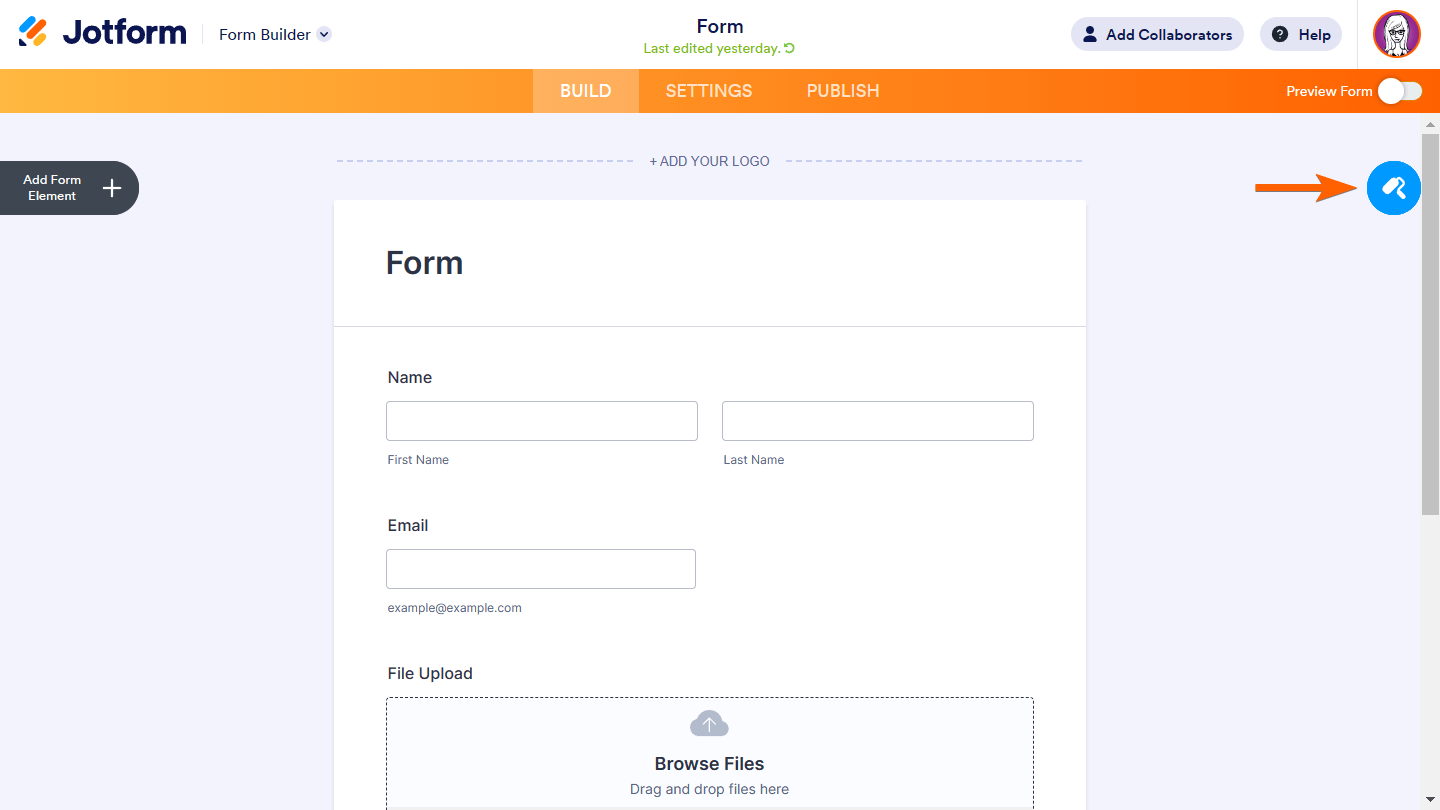
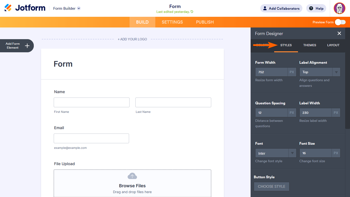
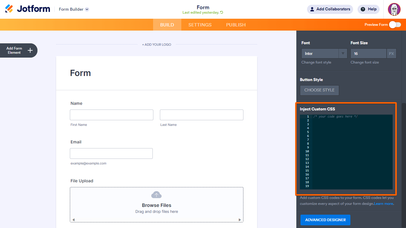
It's really easy to do, let me show you how:
- In Form Builder, click on the paint roller icon.
- Select the Styles tab.
- Scroll down through Inject Custom CSS and enter your CSS code.
That's it. Here's a link to my demo form that you can clone, and below is what it looks like afterward on an actual device:
Let us know if you need any more help.
- In Form Builder, click on the paint roller icon.
-
cigarsurveysReplied on July 25, 2024 at 5:57 AM
Hi Sonnyfer,
I used the CSS code but it didn't fix the issue.
-
cigarsurveysReplied on July 25, 2024 at 6:50 AM
Hi Sonnyfer,
Could you please adjust the table to automatically resize and fit the screen when viewed on mobile devices? It should be fully visible within the form without requiring a scroll bar.
-
Richie JotForm SupportReplied on July 25, 2024 at 7:02 AM
Hi Dan,
You can try this CSS instead to reduce the font size of the text.
@media screen and (max-width: 480px){

#id_204 table.form-matrix-table label{

   font-size: 10px !important;

}

}
Check out this screenshot of my sample output:
Give it a try and let us know if this works for you.
-
cigarsurveysReplied on July 25, 2024 at 7:22 AM
Hi Sonnyfer,
The issue persists. It should be fully visible within the form without requiring a scroll bar.
-
cigarsurveysReplied on July 25, 2024 at 7:25 AM
Hi Richie,
Could you please adjust the input table to appear the same on mobile view as it does on tablet view? It should fit the screen without needing to scroll.
-
Sidharth JotForm SupportReplied on July 25, 2024 at 8:41 AM
Hi Dan,
I understand the issue, but I’ll need a bit of time to work out a solution. I’ll get back to you shortly.
We really appreciate your patience and understanding.
-
Sidharth JotForm SupportReplied on July 25, 2024 at 9:17 AM
Hi Dan,
You can add the CSS code given below in your form:
@media screen and (max-width: 480px){

li[data-type=control_matrix] {

    margin-left: -28px;

    width: 480px !important;

    padding-right: 0px !important;

    margin-right: -25px !important;

  }

th.form-matrix-headers.form-matrix-column-headers.form-matrix-column_0 {

  width: 60px !important;

  padding-left: 1px;

  padding-right: 1px;

}

th.form-matrix-headers.form-matrix-column-headers.form-matrix-column_1 {

  padding-left: 1px;

  padding-right: 1px;

  width: 55px !important;

}

th.form-matrix-headers.form-matrix-column-headers.form-matrix-column_2 {

  width: 90px !important;

  padding-left: 1px;

  padding-right: 1px;

}

th.form-matrix-headers.form-matrix-row-headers {

  padding-left: 5px;

  padding-right: 5px;

  width: 50px !important;

}

}
Check out the screenshot below to see the result:
You can clone and test a cloned version of the form.
Give it a try and let us know if you have any other questions.
-
cigarsurveysReplied on July 26, 2024 at 6:20 AM
Hi Sidharth,
Thank you so much for the assistance! The code works! However, can we set the vertical-alignment of the dollar sign to the middle?
-
Richie JotForm SupportReplied on July 26, 2024 at 6:49 AM
Hi Sidharth,
You can try adding this CSS code:
@media screen and (max-width: 480px){

.form-matrix-values:nth-child(4)::before {


 top: 41%;

}

}
Check out this screenshot of my sample output:
Give it a try and let us know if this works for you.
-
cigarsurveysReplied on July 26, 2024 at 6:59 AM
Hi Richie,
The code works! Can you also fix the sublabel below the table? Also, I have another issue with my form. The Review Widget button is not functioning well on mobile view, please see the second image below. Hope you can help me with as well.
-
Joeni JotForm SupportReplied on July 26, 2024 at 8:10 AM
Hi Sidharth,
I checked your form and can see that you have a duplicate CSS Code for the Input Table Sublabel which means when you try to edit the Code it won't reflect in the sublabel. I suggest deleting the second CSS Code for the sublabel. Take a look at the screenshot below:
First CSS Code:
Second CSS Code:After that, insert this code on the first CSS Code to adjust the width of the sublabel. width: 100px !important;
Also, the Review Before Submit seems to be working on my end. Take a look at the screencast below:
I've gone ahead and cleared your form caches to refresh the form. Can you please try again?
Give it a try and let us know how it goes.
- Templates
- Integrations
- FEATURED INTEGRATIONS
- PayPal
- Slack
- Google Sheets
- Mailchimp
- Zoom
- Dropbox
- Google Calendar
- Hubspot
- Salesforce
- See more Integrations
- See 100+ integrations
- Products
- PRODUCTS
- Form Builder
- Jotform Enterprise
- Jotform Apps
- Store Builder
- Jotform Tables
- Jotform Inbox
- Jotform Mobile App
- Jotform Approvals
- Report Builder
- Smart PDF Forms
- PDF Editor
- Jotform Sign
- Jotform for Salesforce Discover Now
- Support
- GET HELP
- Contact Support
- Help Center
- FAQ
- Dedicated Support
Get a dedicated support team with Jotform Enterprise.
Contact Sales - Professional ServicesExplore


 Second CSS Code:
 After that, insert this code on the first CSS Code to adjust the width of the sublabel.