
-
nealbryantAsked on March 28, 2018 at 1:21 PMIf I wanted to prevent the form from shrinking below a certain width and maintain both columns what would be the best way of doing that? I think that would be preferred at this stage than getting into reworking. Would the best way of doing that be for everything to scale together rather than reordering?
-
Kevin Support Team LeadReplied on March 28, 2018 at 1:37 PM
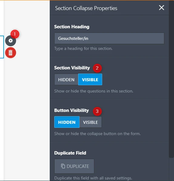
I think I found a workaround for this, you will need to do the following:
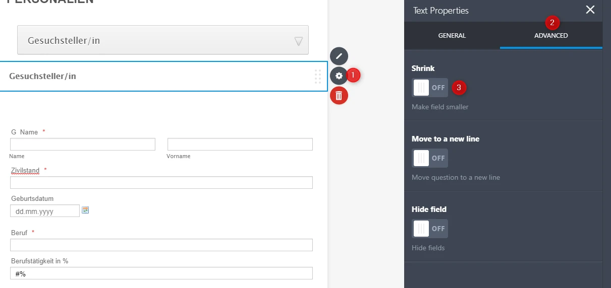
1. You will need to turn off the shrink option in all the fields.

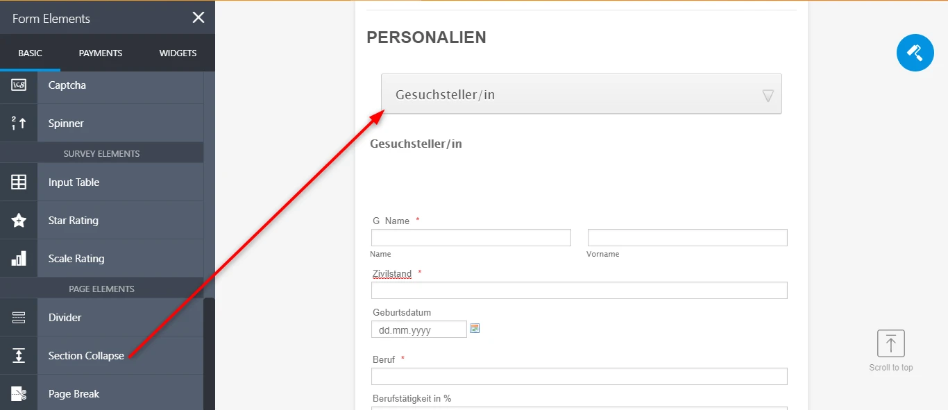
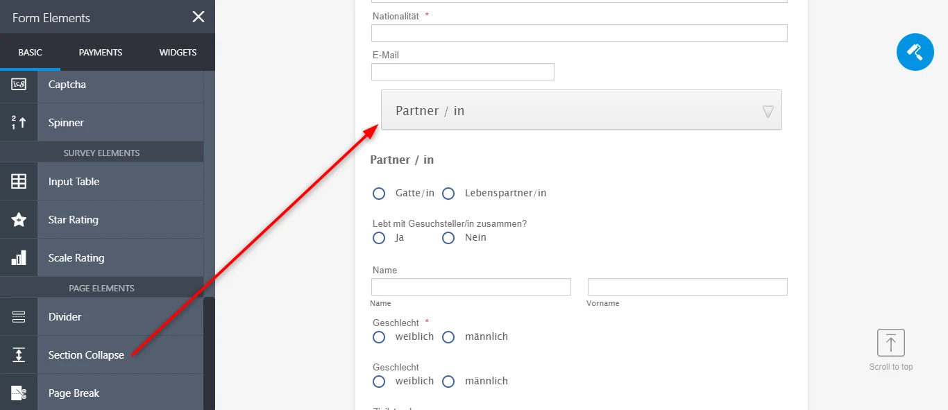
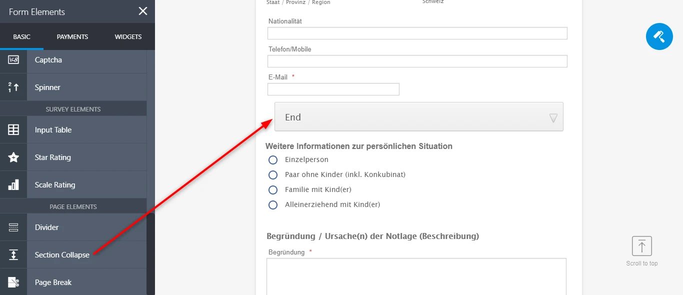
2. Add a section collapse for each section and a third one at the end of the last field of the second section, this way the fields are shown and not affected by the collapse tool on the second set of fields.
3. Configure the collapse tools to be hidden, but their sections visible.
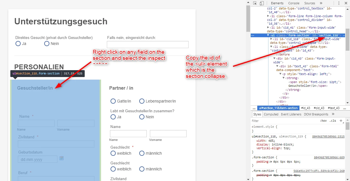
4. Get the id of the two section collapse that contain the fields you need to display in columns.
5. Once you have the ids of both section collapse tools, replace the ids on the code below with the ids you have copied:
ul#section_118, ul#section_119 {
width: 48%;
display: inline-block;
vertical-align: top;
}
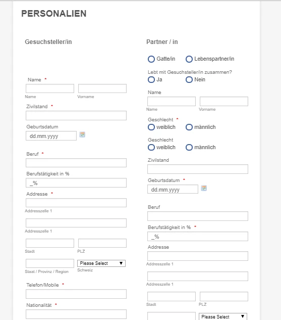
An example can be seen on this form: https://form.jotform.com/80496870530966
This is how the fields will be displayed on desktop:
And they will be displayed like this when there is not enough room to display both columns inline:
I hope this helps.
-
nealbryantReplied on March 29, 2018 at 6:38 AM
Hi Kevin,
Thank you very much for that, and the clear explanation. I've tried it out myself on a clone of the form and it definitely improves how things scale down.
There are a few instances where the input boxes are not quite sizing properly. Do I need to add the 48% to them after a certain display width?
Thanks,
Neal
-
Kevin Support Team LeadReplied on March 29, 2018 at 9:48 AM
I have checked the form and I can see there is some CSS code affecting the fields width, the properties are affecting on mobile as well.
I would recommend you to try removing all the CSS code from your form and inject the following:
@media screen and (min-width: 480px){
#input_92 {
width : 290px !important;
}
#input_98 {
width : 220px;
}
#input_77 {
margin : 0px 0px 2px 7px;
width : 290px;
}
#label_99 {
margin-left : -4px;
width : 300px;
}
#input_99 {
margin-left : -4px;
width : 290px !important;
}
#input_108 {
width : 650px;
}
#input_111 {
width : 280px;
}
.form-textarea {
width : 650px;
}
#input_103 {
width : 650px;
}
#id_72 {
width : 650px;
margin-top : 0px;
}
#input_84 {
width : 290px !important;
}
#input_75 {
width : 290px !important;
}
.form-input-wide {
}
#input_76 {
width : 290px !important;
}
#input_78 {
width : 290px !important;
}
#input_79 {
width : 290px !important;
}
#input_80 {
width : 290px !important;
}
#input_81 {
width : 290px !important;
}
#input_83 {
width : 290px !important;
}
#input_82 {
width : 290px !important;
}
#id_93 {
}
#input_93 {
width : 290px !important;
}
#input_94 {
width : 290px !important;
}
#input_95 {
width : 290px !important;
}
#input_96 {
width : 290px !important;
}
#input_98 {
width : 290px !important;
}
#input_101 {
width : 290px !important;
}
#input_102 {
width : 290px !important;
}
#input_105 {
width : 290px !important;
}
#input_106 {
width : 290px !important;
}
#input_110 {
width : 290px !important;
}
}
.form-line-column {
padding-left : 15px !important;
}
.form-radio-item label {
width : 300px;
}
.form-label.form-label-top {
margin : 0px 0px 4px 4px;
}
#label_71 {
font-weight : 700;
width : 600px;
font-size : 16px;
margin-left : -2px;
padding-bottom : 5px;
padding-top : 5px;
}
.form-html {
padding : 0px 0px 0px 0px;
}
.form-textbox {
margin : 0px 0px 0px 2px;
}
#label_77 {
margin : 0px 0px 2px 7px;
}
#id_91 {
margin : 0px 1px -10px 1px;
}
#cid_98 {
margin-left : -5px;
}
#label_98 {
margin-left : -4px;
}
#id_100 {
margin : 0px 1px -10px 1px;
}
#id_103 {
margin-left : -4px;
}
#id_104 {
margin : 0px 1px -10px 1px;
}
#id_107 {
margin-left : -4px;
}
#id_108 {
margin-left : -4px;
}
#label_108 {
width : 500px;
}
#id_109 {
margin-left : -2px;
margin-bottom : -10px;
}
#id_112 {
margin-left : -2px;
margin-bottom : -10px;
}
#text_73 p.hover {
margin-bottom : 500px;
}
#id_73 {
padding-bottom : 0px;
margin-bottom : -4px;
}
#id_85 {
margin-bottom : -15px;
font-size : 16px;
font-weight : 700;
}
#id_113 {
margin-left : -2px;
}
.form-section.page-section {
}
#label_82 {
width : 290px !important;
}
#label_79 {
width : 290px !important;
}
#label_84 {
width : 290px !important;
}
#label_78 {
width : 290px !important;
}
#label_39 {
width : 300px !important;
}
#label_45::first-letter {
font-size: 0px !important;
}
ul#section_118, ul#section_119 {
width: 48%;
display: inline-block;
vertical-align: top;
}
I hope this helps.
-
nealbryantReplied on April 3, 2018 at 6:44 AM
Hi Kevin,
Thanks for that, and all the help.
It appears that that code has stopped the collapse sections from working, is that to be expected?
Also it seems that the left alignment of some of the fields is slightly out now (screenshot below. I've also set the Total Vermogen field to shrink so that it's only half of the forms width (to match the above fields), should I just add this back in within the suggested code?Thanks,
Neal -
Kevin Support Team LeadReplied on April 3, 2018 at 9:07 AM
I have been checking the forms in your account, but I cannot find the one where the collapse tools were added, I tested my cloned form too and the collapse tools work after modifying the CSS code, may you please test this form and see if the same happens: https://form.jotform.com/80496870530966
Please note that you may also cloned the form into your account and work on it: https://www.jotform.com/help/42-How-to-Clone-an-Existing-Form-from-a-URL
-
nealbryantReplied on April 11, 2018 at 4:42 AM
Hi Kevin,
Thanks for that. I ended up making a copy of your clone, and used that as the base as I couldn't get the new CSS to play ball on my one.
That all seems to be working well, so thank you for your help.
How would you suggest that I handle the other 2 column areas on mobile i.e. at the very top of the form those columns overlap each other when you move down to mobile? Form ID: 80984211400347.Also, I know this is separate, but when embedding within squarespace the form is cut off on mobile even though I have set the height to 100%. Do you know a fix for that?
Thanks again,
Neal -
Victoria_KReplied on April 11, 2018 at 9:50 AM
Hello,
Here is the custom css for your form ID: 80984211400347
@media screen and (max-width: 480px){
ul#section_118, ul#section_119 {
width : 100% !important;
display : inline-block;
vertical-align : top;
}
.form-line {
width: 100% !important;
}
#label_input_114_0 {
width: 280px !important;
}
#input_103, #input_107, #input_108 {
margin-left: 5px !important;
}
#id_99, #id_98 {
margin-left: 5px !important;
}
#header_28 {
font-size: 1.85em !important;
}
#cid_77 {
margin-left: 0 !important;
}
}
#input_103, #input_107, #input_108, #input_101, #input_102, #input_105, #input_106, #input_96, #input_97, #input_98, #input_99, #input_92, #input_93, #input_94, #input_95, #input_96, #input_75, #input_76, #input_77, #input_78, #input_79, #input_80, #input_81, #input_82, #input_83, #input_84 {
width: 270px !important;
}
#cid_77 {
margin-left: 5px !important;
}
#cid_99 {
margin-left: -5px;
}
.form-textarea {
width : 650px;
}
.form-line-column {
padding-left : 15px !important;
}
.form-radio-item label {
width : 300px;
}
.form-label.form-label-top {
margin : 0px 0px 4px 4px;
}
#label_71 {
display : none;
}
.form-html {
padding : 0px 0px 0px 0px;
}
.form-textbox {
margin : 0px 0px 0px 2px;
}
#label_77 {
margin : 0px 0px 2px 7px;
}
#id_91 {
margin : 0px 1px -10px 1px;
}
#cid_98 {
margin-left : -5px;
}
#label_98 {
margin-left : -4px;
}
#id_100 {
margin : 0px 1px -10px 1px;
}
#id_103 {
margin-left : -4px;
}
#id_104 {
margin : 0px 1px -10px 1px;
}
#id_107 {
margin-left : -4px;
}
#id_108 {
margin-left : -4px;
}
#label_108, #label_102, #label_101 {
width : 500px;
}
#id_109 {
margin-left : -2px;
margin-bottom : -10px;
}
#id_112 {
margin-left : -2px;
margin-bottom : -10px;
}
#text_73 p.hover {
margin-bottom : 500px;
}
#id_73 {
padding-bottom : 0px;
margin-bottom : -4px;
}
#id_85 {
margin-bottom : -15px;
font-size : 16px;
font-weight : 700;
}
#id_113 {
margin-left : -2px;
}
#label_82 {
width : 290px !important;
}
#label_79 {
width : 290px !important;
}
#label_84 {
width : 290px !important;
}
#label_78 {
width : 290px !important;
}
#label_39 {
width : 300px !important;
}
ul#section_118, ul#section_119 {
width : 48%;
display : inline-block;
vertical-align : top;
}
#label_114 {
display : none;
}
#id_123 {
margin-bottom : 0px;
}
#label_122 {
display : none;
}
Please replace the current code with this one.
Let us know if you need further assistance.
-
nealbryantReplied on April 11, 2018 at 10:53 AM
Thank you very much Victoria that has fixed both points!
- Templates
- Integrations
- Products
- PRODUCTS
- Form Builder
- Jotform Enterprise
- Jotform Apps
- Store Builder
- Jotform Tables
- Jotform Inbox
- Jotform Mobile App
- Jotform Approvals
- Report Builder
- Smart PDF Forms
- PDF Editor
- Jotform Sign
- Jotform for Salesforce Discover Now
- Support
- GET HELP
- Contact Support
- Help Center
- FAQ
- Dedicated Support
Get a dedicated support team with Jotform Enterprise.
Contact Sales - Professional ServicesExplore


 Thanks,