
-
charonjamesAsked on September 19, 2017 at 7:54 PM
-
Kevin Support Team LeadReplied on September 19, 2017 at 7:57 PM
Please inject the following CSS code to your form in order to display the fields wider on mobile devices:
@media screen and (max-device-width: 480px){
#id_79 .form-matrix-row-headers {
width: 25px;
min-width: initial;
}
}
This guide will help you injecting the code: https://www.jotform.com/help/117-How-to-Inject-Custom-CSS-Codes
I hope this helps.
-
charonjamesReplied on September 19, 2017 at 8:04 PM
Thank you for your reply however I injected the code and it is still displaying the same way in mobile view.
-
Kevin Support Team LeadReplied on September 19, 2017 at 8:42 PM
I have just checked on a cloned form of yours and the code worked: https://form.jotformpro.com/72618094437967
I can see you have already deleted your form, may you please provide us a new form where you injected the code?
We will be glad o inspect it.
-
charonjamesReplied on September 19, 2017 at 8:52 PM
The web address to the form I'm using is https://form.jotform.com/62695200624150. The total that should be showing is $205 however the last number is cut off due to the column not being wide enough.

-
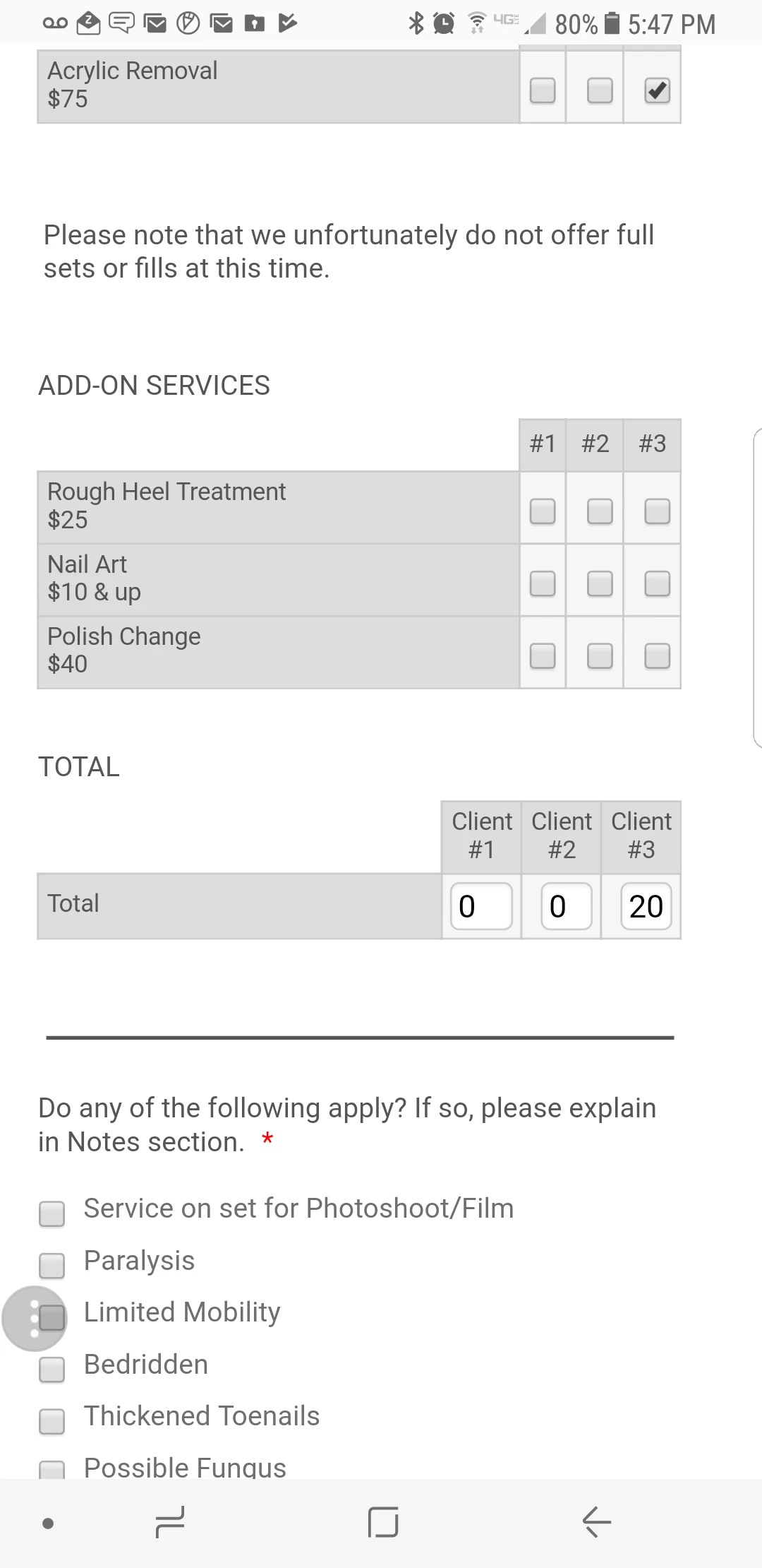
Kevin Support Team LeadReplied on September 19, 2017 at 10:09 PM
I have just cleared your forms cache and also removed the code and added it again to your form, it seems to be working now, may you please check now?
This is how the form should be showing up on your end:
I hope this helps.
-
charonjamesReplied on September 19, 2017 at 10:30 PM
It is displaying properly now. Thanks!
- Templates
- Integrations
- Products
- PRODUCTS
- Form Builder
- Jotform Enterprise
- Jotform Apps
- Store Builder
- Jotform Tables
- Jotform Inbox
- Jotform Mobile App
- Jotform Approvals
- Report Builder
- Smart PDF Forms
- PDF Editor
- Jotform Sign
- Jotform for Salesforce Discover Now
- Support
- GET HELP
- Contact Support
- Help Center
- FAQ
- Dedicated Support
Get a dedicated support team with Jotform Enterprise.
Contact Sales - Professional ServicesExplore