
-
TheMysticsAsked on August 23, 2017 at 3:39 AM
-
Chriistian Jotform SupportReplied on August 23, 2017 at 3:57 AM
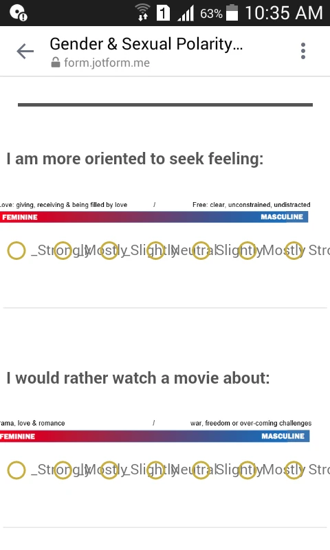
First, please take a look at the image below:

If this is okay for you, please inject the following CSS code on your form:
@media only screen and (max-width: 40em){
.form-multiple-column {
width: 100%;
font-size: 10px;
}
.form-radio-item:not(#foo) {
width: 70px;
}
}
Here's the guide on How to Inject Custom CSS Codes.
Let us know if you need further assistance.
-
TheMysticsReplied on August 23, 2017 at 6:19 AM
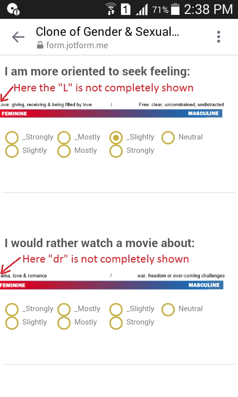
Some part of the image is out of the screen. How can I fix it?
-
Ashwin JotForm SupportReplied on August 23, 2017 at 7:42 AM
Hello presenceacademy,
Can you please let us know which image in displayed out of screen? I did check your form and it seems to display the image correctly. Please check the screenshot below:
I would suggest you to please share a screenshot of the issue and we will take a look. The following guide should help you how to upload image in forum post: https://www.jotform.com/help/438-How-to-Post-Screenshots-to-Our-Support-Forum
We will wait for your response.
Thank you!
-
TheMysticsReplied on August 23, 2017 at 8:20 AM
-
John_BensonReplied on August 23, 2017 at 9:12 AM
To fix the issue, please add this custom CSS code to your form:
img.form-image {
width : 100% !important;
margin : 0px 0px -30px 0px !important;
}
Here's a guide on how to add custom CSS code to your form: https://www.jotform.com/help/117-How-to-Inject-Custom-CSS-Codes
Result:
If you want to test it, here's the link of my clone form: https://form.jotform.com/72343219660959
I hope that helps. Let us know if you have questions.
-
TheMysticsReplied on September 1, 2017 at 10:53 AM
Hi, thanks for the support. I've one more.
Can we format the mobile version so the answer bubbles are smaller as the answer choices get smashed on my phone. So may be a little padding in between the bubbles, but bubbles of smaller size.
Help screenshot:
Thanks
-
David JotForm Support ManagerReplied on September 1, 2017 at 12:19 PM
Do you mean something like this?
You might try the following code: https://www.jotform.com/help/117-How-to-Inject-Custom-CSS-Codes
@media only screen and (max-width: 40em){
.form-radio-item:not(#foo) {
width: 57px !important;
}
.form-radio-item:not(#foo) label:before {
left: 12px !important;
width: 14px !important;
height: 14px !important;
}
.form-radio-item:not(#foo) label:after {
margin-left: 6px !important;
margin-top: -2px !important;
}
}
You may check my clone form: https://form.jotformpro.com/72434691580965
-
TheMysticsReplied on September 1, 2017 at 2:51 PM
Hi, thanks for your reply. But all I can see on my screen is this: http://whatismyscreenresolution.net/multi-screen-test?site-url=https://form.jotformpro.com/72434691580965&w=414&h=736
Is it possible that all the options appear in one row, like in your screenshot about. On my 5.5 inch mobile it's appearing in 2 rows, like the link I've attached above.
Also when I click on the option then the check mark is not marked at it's position, I think you can understand it better when click on any option.
Thanks
-
Nik_CReplied on September 1, 2017 at 3:40 PM
This is how it is showing for me by using the link above:
They are showing in one line on 5.5" phone. Also, checkmarks are showing fine:
I don't have 5.5" phone on me, I tested on 4.7" (not Android) and the checkboxes are showing in two rows, but considering the screen size that should be normal. Also, check marks are working fine there as well.
I assume you tested this on a real device, could you tell us which one?
- Templates
- Integrations
- Products
- PRODUCTS
- Form Builder
- Jotform Enterprise
- Jotform Apps
- Store Builder
- Jotform Tables
- Jotform Inbox
- Jotform Mobile App
- Jotform Approvals
- Report Builder
- Smart PDF Forms
- PDF Editor
- Jotform Sign
- Jotform for Salesforce Discover Now
- Support
- GET HELP
- Contact Support
- Help Center
- FAQ
- Dedicated Support
Get a dedicated support team with Jotform Enterprise.
Contact Sales - Professional ServicesExplore