
-
DYLAN WESTAsked on July 30, 2017 at 9:14 PM
Hello,
My Jotform, which looks great on desktop, does not resize to fit a mobile or tablet screen. Current, y it has to be zoomed way out on mobile in order to see the entire form.
Please advise as I would like the entire form to be responsive and fit the mobile & tablet screen.
Dylan

-
John_BensonReplied on July 31, 2017 at 1:38 AM
I checked the Page URL (https://www.pixelempire.com/pages/contact-us) that you have provided and I was able to replicate the issue.
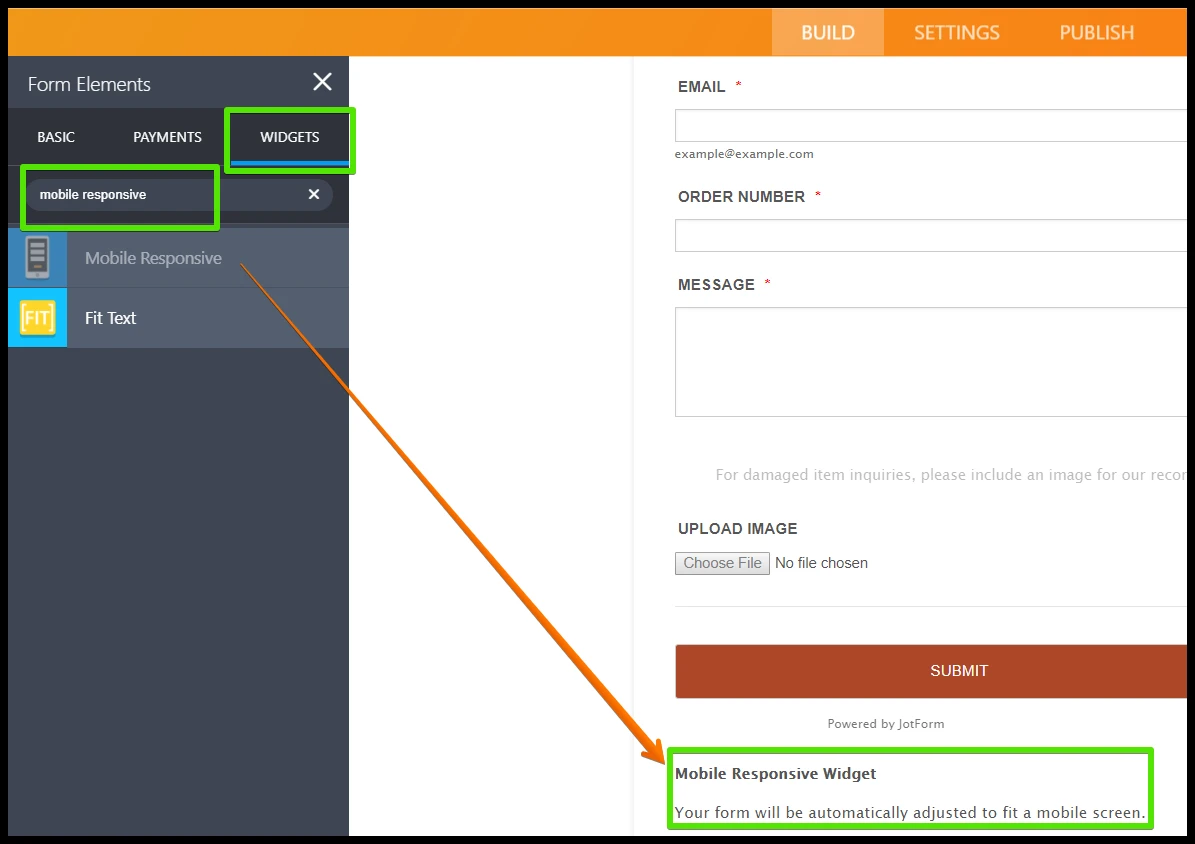
Please add the Mobile Responsive widget to your form. To do that, here's a guide:
1. Log in to your account and open the form.
2. Click the Add Form Elements button and go to the Widgets tab.
3. Search for the Mobile Responsive widget and add it to your form.After that, add this Custom CSS Code to your form:
.form-submit-button {
max-width : 100% !important;
width : 100% !important;
}
To add the Custom CSS Code, please follow this guide: https://www.jotform.com/help/117-How-to-Inject-Custom-CSS-Codes
I hope that helps. If you have questions, please contact us again.
- Templates
- Integrations
- FEATURED INTEGRATIONS
- PayPal
- Slack
- Google Sheets
- Mailchimp
- Zoom
- Dropbox
- Google Calendar
- Hubspot
- Salesforce
- See more Integrations
- See 100+ integrations
- Products
- PRODUCTS
- Form Builder
- Jotform Enterprise
- Jotform Apps
- Store Builder
- Jotform Tables
- Jotform Inbox
- Jotform Mobile App
- Jotform Approvals
- Report Builder
- Smart PDF Forms
- PDF Editor
- Jotform Sign
- Jotform for Salesforce Discover Now
- Support
- GET HELP
- Contact Support
- Help Center
- FAQ
- Dedicated Support
Get a dedicated support team with Jotform Enterprise.
Contact Sales - Professional ServicesExplore