
-
rudydareeventemediaitAsked on April 27, 2017 at 2:55 AM
Hello,
we are building a new forms for our e-commerce in 4 languages.
The template are the same for each language, you find below the link for example in italian.
https://eu.jotform.com/build/70153601264951
The form work correctly, but when I look in the mobile iphone, I see only one portion of form (I attach the screenshot)
How can see all form optimized for mobile?
Thanks for your information.
Best regards,
Rudy
-
jonathanReplied on April 27, 2017 at 4:10 AM
I also see the mobile browser issue when I checked on your website the embedded form.
For initial troubleshooting I suggest you try first the following modification.
#1 Add the Mobile Responsive widget on your form.
#2 Re-embed the form on your website using instead its iframe embed code.
User guide : https://www.jotform.com/help/148-Getting-the-form-iFrame-code
Test the form on your website using mobile browser after applying the suggested updated.
Let us know if this did not work.
-
jonathanReplied on April 27, 2017 at 6:45 AMLast post of this morning
Asked by rudydareeventemediait on April 27, 2017 at 05:48 AM
Hello,
about my last request, I make your change and I publish a new versione with Iframe, but there is again the same problem.
How do I do?
Thanks
Regards
Rudy
----
I checked again your embedded form on your website and I see it was still using the script embed code.
Please try first changing the embed code with the iframe publish code.
Also, add the Mobile Responsive widget on the form.
Let us know if you encounter any difficulty applying the suggested modification.
-
rudydareeventemediaitReplied on April 28, 2017 at 3:43 AM
Hi Jonathan,
I make your suggest, but I see again the mistake on mobile.
Can you help me?
Thnaks
Rudy
-
Chriistian Jotform SupportReplied on April 28, 2017 at 4:15 AM
Hi Rudy,
Can you please try injecting this custom CSS on your form and see if this helps to solve the mobile responsive issue?
@media screen and (max-width:600px) {
.form-all {
width: 100%;
}
}
Here's the guide on How to Inject Custom CSS Codes.
Hope this helps.
Regards. -
rudydareeventemediaitReplied on April 28, 2017 at 6:17 AM
Hi Chriistian,
thanks for your help but don't work..
I need copy and paste again the iframe codes afte CSS?
Thanks
Rudy
-
Nik_CReplied on April 28, 2017 at 6:59 AM
I tested your form on my phone (Samsung Note 3) and it showed like this:
So I assume that this issue happens only on iPhone, so I inserted this CSS in your form:
@media only screen
and (min-device-width : 375px)
and (max-device-width : 667px) {
.form-all {
width: 80%!important;
}
}
Could you please check now, it should show like this:
Let us know how that worked.
Thank you!
-
rudydareeventemediaitReplied on April 28, 2017 at 10:10 AM
Hi Nik,
thanks for you support.
I make your suggest, but dont' work again...
You can check?
With Iphone6 I see this:
I await you help.
Thanks
Rudy
-
amyReplied on April 28, 2017 at 11:08 AM
Hi Rudy,
Would you please try decreasing the width of the form-all class? For example you can try using this CSS code instead of the current one:
@media only screen
and (min-device-width : 375px)
and (max-device-width : 667px) {
.form-all {
width: 50%!important;
}
}
When I check the result on my iPhone, it should appear as in the screenshot:
I hope it helps.
If you need further assistance, please let us know.
Thank you.
Kindest Regards.
-
rudydareeventemediaitReplied on May 2, 2017 at 9:27 AM
Hello,
Unfortunately, I do not see the form properly on my iphone. It always comes out of the screen.
I tried Android and function well.
But what about the Iphone? 5, 6 or 7, it should look right on everyone.
Can you help me? This is making us lose time.
Also now in the Italian aversion of the site, I have a problem with "HI"
Thank youRudy
-
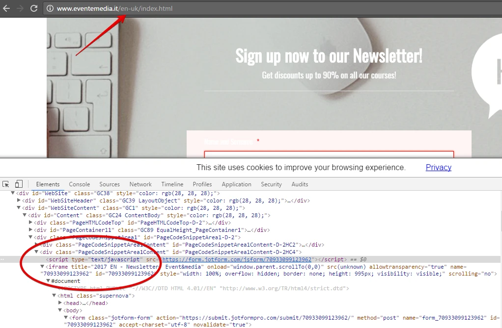
Mike_G JotForm SupportReplied on May 2, 2017 at 11:25 AM
We would like to apologize for any inconvenience this is causing you. Upon inspecting your website, I found out that the form is embedded using its embed script.
<script type="text/javascript" src="https://form.jotformpro.com/jsform/70933099123962"></script>
I have tried using the same script and embedded it to a simple sample web page and tested it on an iPhone and the form seems to be mobile responsive. This means that the form itself is mobile responsive but would still depend on the website where it is embedded.
Perhaps you could check the div that holds the form's embed script. Also, I believe it would really be best if you will use the form's iframe code. Since iframes would normally take up as much width as necessary.
- Templates
- Integrations
- Products
- PRODUCTS
- Form Builder
- Jotform Enterprise
- Jotform Apps
- Store Builder
- Jotform Tables
- Jotform Inbox
- Jotform Mobile App
- Jotform Approvals
- Report Builder
- Smart PDF Forms
- PDF Editor
- Jotform Sign
- Jotform for Salesforce Discover Now
- Support
- GET HELP
- Contact Support
- Help Center
- FAQ
- Dedicated Support
Get a dedicated support team with Jotform Enterprise.
Contact Sales - Professional ServicesExplore