
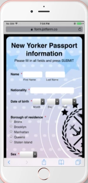
-
SamlateAsked on March 8, 2017 at 2:20 PM
One more question regarding the smartphone format for my form.
The first name and last name are not under each other (they are side by side).

How can I fix that?
Thank you
-
David JotForm Support ManagerReplied on March 8, 2017 at 2:56 PM
Please try injecting the following CSS code: https://www.jotform.com/help/117-How-to-Inject-Custom-CSS-Codes
@media only screen and (max-width: 480px) {
input#first_5 {
width: 100px !important;
}
input#last_5 {
width: 100px !important;
}
}
Result:
-
SamlateReplied on March 8, 2017 at 3:06 PM
Hi,
I injected the CSS code, but the first name and last name are still sticked together.
-
jonathanReplied on March 8, 2017 at 5:42 PM
I see it also working as intended on mobile browser on my latest test.
but indeed the first name and last name field is a bit closer. You can make adjustment on the margin between them so it is more separated.
Modify the CSS code provided by BDAVID previously to this...
@media only screen and (max-width: 480px){
input#first_5 {
width : 100px !important;
}
input#last_5 {
width : 100px !important;
margin-left : 10px !important;
}
}
---
In the new code, I only added this one
margin-left : 10px !important;
Save the form and test again. Let us know if this still did not fixed it.
-
SamlateReplied on March 8, 2017 at 6:30 PM
-
jonathanReplied on March 8, 2017 at 7:40 PM
Since the next question was about a different feature, we will resolve it separately here
https://www.jotform.com/answers/1085369
- Templates
- Integrations
- Products
- PRODUCTS
- Form Builder
- Jotform Enterprise
- Jotform Apps
- Store Builder
- Jotform Tables
- Jotform Inbox
- Jotform Mobile App
- Jotform Approvals
- Report Builder
- Smart PDF Forms
- PDF Editor
- Jotform Sign
- Jotform for Salesforce Discover Now
- Support
- GET HELP
- Contact Support
- Help Center
- FAQ
- Dedicated Support
Get a dedicated support team with Jotform Enterprise.
Contact Sales - Professional ServicesExplore