
-
yedidyaAsked on January 21, 2017 at 6:30 AM
Part 2: problems related to a mobile responsive:
First of all, I must say that the problems here are after checking in system design - “Make this form responsive”.
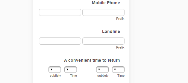
4. Field “Phone”:
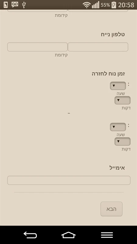
The two cells are not shown on the same line as shown on the computer.

5. And Field “Time”:
The same happens in the "Time" instead of displaying the two as one looks at the computer, they are displayed one below the other.
-
Welvin Support Team LeadReplied on January 21, 2017 at 7:26 AM
Inject the following custom CSS codes to the form:
@media screen and (max-width:768px){
[data-type="control_fullname"] .form-sub-label-container {
width: 49% !important;
}
[data-type="control_phone"] .form-sub-label-container {
width: 49% !important;
}
[data-type="control_time"] form-sub-label-container {
width: 17% !important;
}
div[id^="until"] {
text-align: center;
}
}
The result should be like this:
-
yedidyaReplied on January 21, 2017 at 2:14 PM
attached pictures of the problems in mobile:
Apart from the problems I was talking about, there is another problem: On the last page of the form, it presents a huge profit from field to field.
-
jonathanReplied on January 21, 2017 at 4:40 PM
We will address the form mobile responsive issue on the other thread here
https://www.jotform.com/answers/1041688
It has more response already and its only appropriate to continue with the discussion there.
-
yedidyaReplied on January 21, 2017 at 6:25 PM
The discussion you indicated - is related to the problems of RTL,
Support Representative passed the mobile responsive interest here so I responded to it because it is related to it.
-
liyamReplied on January 22, 2017 at 2:43 AM
Thanks for your response, yedidya. As how I see on the other thread, the problem has been addressed. If I am mistaken, please let us know.
Thanks.
-
yedidyaReplied on January 22, 2017 at 8:20 AM
No, the problem has not been addressed. It does not display well on mobile (you can see in the pictures I attached above)
Thanks.
-
Welvin Support Team LeadReplied on January 22, 2017 at 9:56 AM
I am now fixing this on your form. Please do not make any changes until I give you an update here. Thanks
-
Welvin Support Team LeadReplied on January 22, 2017 at 10:02 AM
I've fixed it. Please check again.
-
yedidyaReplied on January 23, 2017 at 6:30 AM
Many thanks for the help.
I see it amended, remains just a little something.
Field "time" on a computer is shown from left to right as it should, but in Mobile shown opposite.
In "first and last name" - autofill browser to not recognize and presents supplementary option.
Thanks again.
-
Welvin Support Team LeadReplied on January 23, 2017 at 7:55 AM
I've fixed it. There was a CSS that incorrectly aligned the field.
As for the autofill, can you take a screenshot and post it here? It should work since the inputs are also right to left.
-
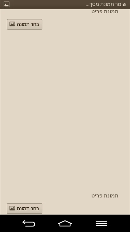
yedidyaReplied on January 23, 2017 at 11:52 AM
Screenshot attached:
-
Welvin Support Team LeadReplied on January 23, 2017 at 1:00 PM
I don't see autofill in your screenshot. Can you explain what's the issue? The way I understand that autofill is like this https://support.google.com/chrome/answer/142893?co=GENIE.Platform%3DAndroid&hl=en and since you also mentioned "browser". Isn't this what you mean?
-
yedidyaReplied on January 23, 2017 at 2:47 PM
Yes, that's what I mean. If I go into the fields "Address" and "Telephone" and further, it shows me "auto-fill", but when I got in the "First Name" or "Last Name" It's not showing me. I think we should set it somewhere in CSS form, for Google Chrome able to identify.
Thanks.
-
yedidyaReplied on January 23, 2017 at 2:57 PM
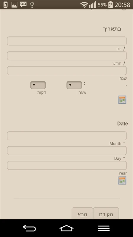
Another problem, they solved it for me a few days ago, but apparently after further changes you have made it back again.
1. The diagonal lines of the date is not in place.
2. Location of the hour is not good. It should be on the left, and minutes should be on the right.
Attached a picture.
- Templates
- Integrations
- Products
- PRODUCTS
- Form Builder
- Jotform Enterprise
- Jotform Apps
- Store Builder
- Jotform Tables
- Jotform Inbox
- Jotform Mobile App
- Jotform Approvals
- Report Builder
- Smart PDF Forms
- PDF Editor
- Jotform Sign
- Jotform for Salesforce Discover Now
- Support
- GET HELP
- Contact Support
- Help Center
- FAQ
- Dedicated Support
Get a dedicated support team with Jotform Enterprise.
Contact Sales - Professional ServicesExplore