-
igenmediaAsked on December 13, 2016 at 12:04 PM
-
JanReplied on December 13, 2016 at 1:07 PM
Please try inserting the Mobile Responsive widget to your form. In the Form Builder, please click the "More Fields" section and then search form "Mobile Responsive". After that, please drag it to the form. Here's a screen capture:

If the issue persists, please re-embed the form using the iFrame method. Here's a guide: https://www.jotform.com/help/148-Getting-the-form-iFrame-code.
Hope that helps. If you're still having issues, let us know. Thank you.
-
igenmediaReplied on December 13, 2016 at 1:54 PM
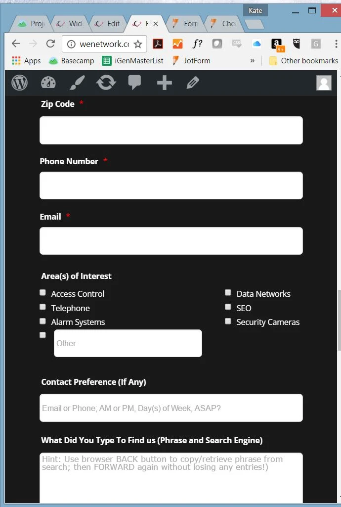
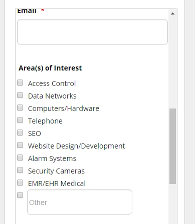
I tried that but still no change. Is there a way to have checkboxes go into a single line when get to a specific resolution
-
JanReplied on December 13, 2016 at 3:11 PM
I understand what you need. Please give me more time to work on this. I will contact you once I am done creating the CSS for the form. Thank you for your patience.
-
JanReplied on December 13, 2016 at 3:43 PM
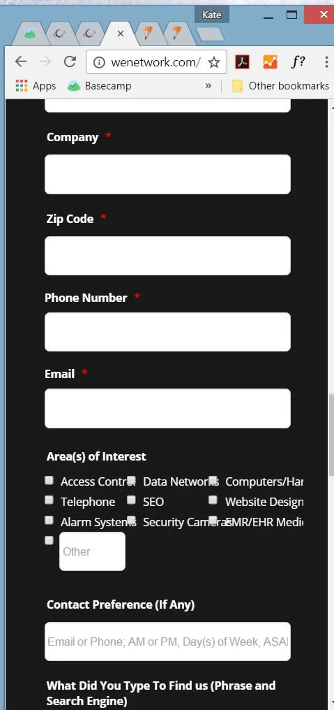
Thank you for waiting. It is possible to position them in one column when it is being viewed in a smaller screen. Here's a CSS code that will help you with that:
@media only screen and (max-width: 40em) {
.form-multiple-column[data-columncount="3"] .form-radio-item, .form-multiple-column[data-columncount="3"] .form-checkbox-item {
width: 100% !important;
}#input_10 {
width: 70% !important;
margin-left: 1% !important;
}}
Here's a guide on How-to-Inject-Custom-CSS-Codes. Here's the result:
If you have any questions, let us know. Thank you.